- Data Hub
- Using Data Hub
- Navigate Data Hub
We continuously strive to improve and simplify navigating our portal, and to have easy and streamlined experiences when navigating around the portal.
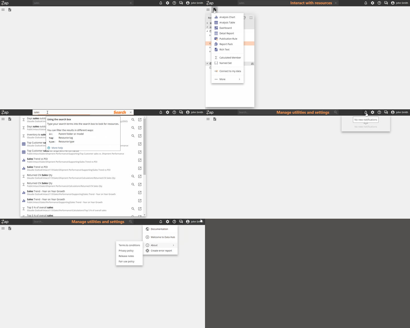
The main portal has 3 functional areas:
TOP LEFT: Interact with resources.
TOP CENTRE: Search for resources.
TOP RIGHT: Manage Data Hub utilities and settings for the environment and personal profile.
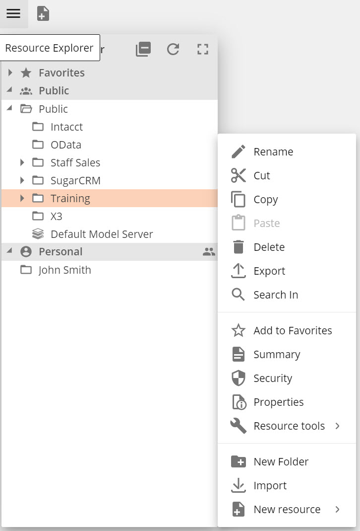
Expands by default to give you direct access to the existing resource structure.
Drag, hold, and drop to move resources.
Double click to open a resource. Use shift and ctrl click as you would in windows to select groups of resources or folders.
Maximize the Resource Explorer to display more information such as Description, Last Modified by/date, and Created by/date.
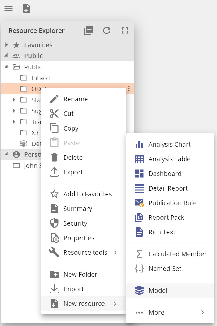
A Right-click menu or clicking the ellipses is available on an resource, which gives all available functions relevant to the selected resource.
 |
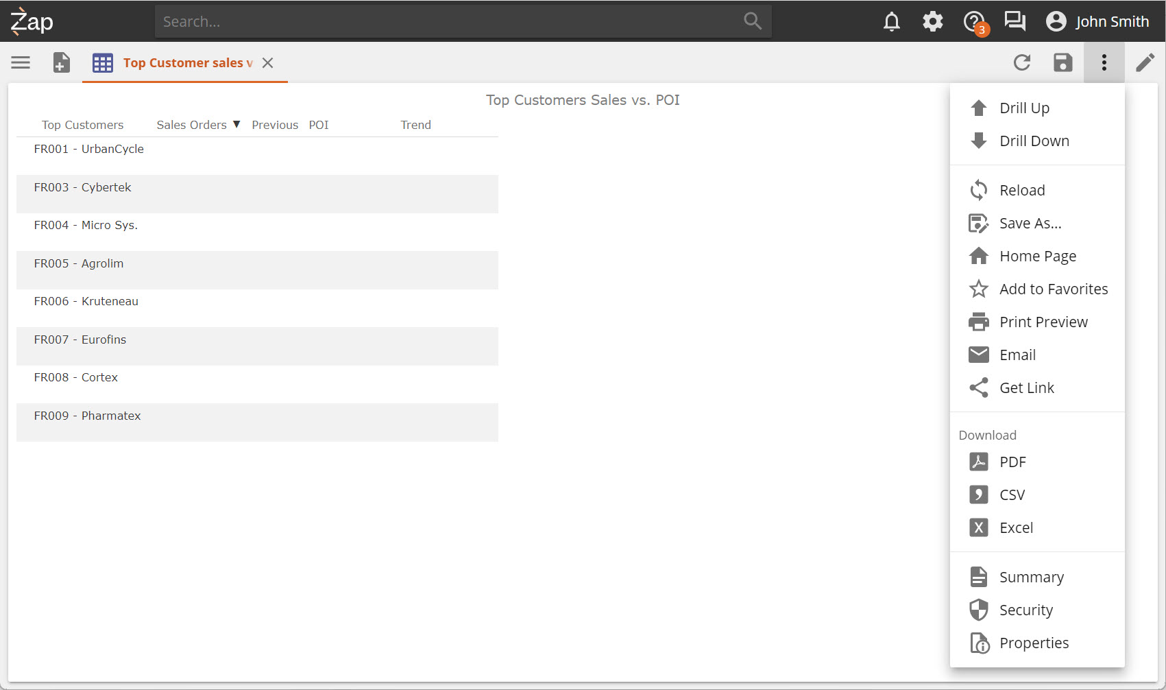
Once a resource is opened, the toolbar and options menu will provide a rich set of functions relevant to the open resource.
Detailed information is available on all the resource options and functions from the Data Hub toolbar
 |
Create any new resource via:
Clicking on New resource, or,
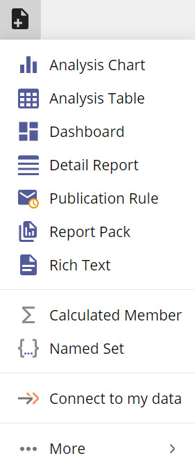
Right click inside Resource Explorer and adding a new resource directly to a folder.
Designing resources can be divided into two main categories:
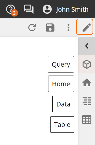
Analytic resources. In design mode, a vertical design panel appears on the right of the screen, with tabs containing relevant functions for the open resource.
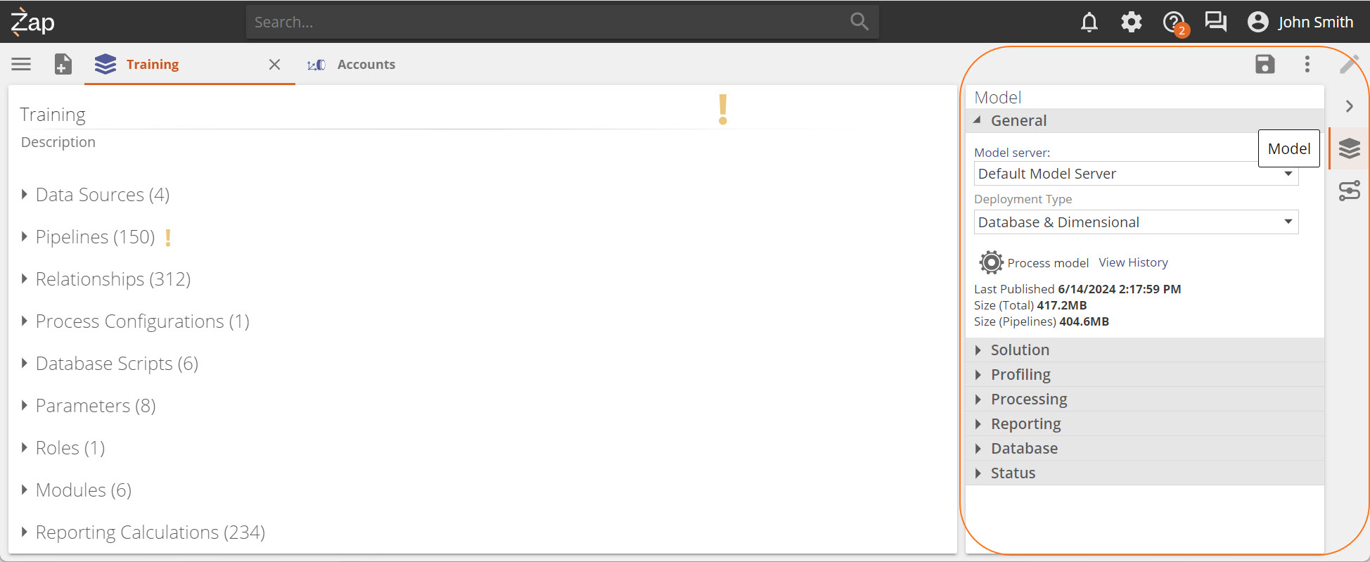
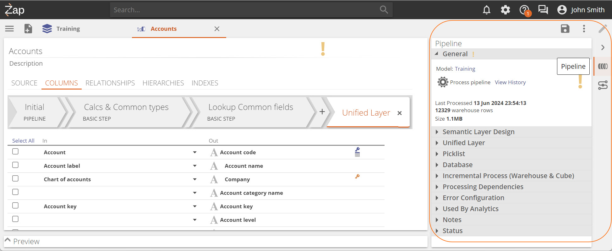
Modeling resources. When designing a data model and its components, all functionality is available through the Data model screen. Based on the elements you are working on, a design panel will become available with relevant function sections.
Detailed information is available about interacting with model interface elements. In addition easy instructions are available for How to work with the modeling elements, supplemented by in-depth modeling reference explanations
Model design panel
Pipeline design panel
Resource Search is centered in the Title bar for optimum usability and accessibility. When not selected, its background color is dark.
To search:
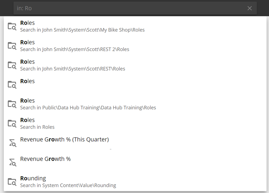
Start typing the name of the resource you are looking for in the search bar.
Clicking on a result opens the Resource Explorer and focuses on the selected resource enabling more actions.
Clicking on the icon to the right opens the resource.
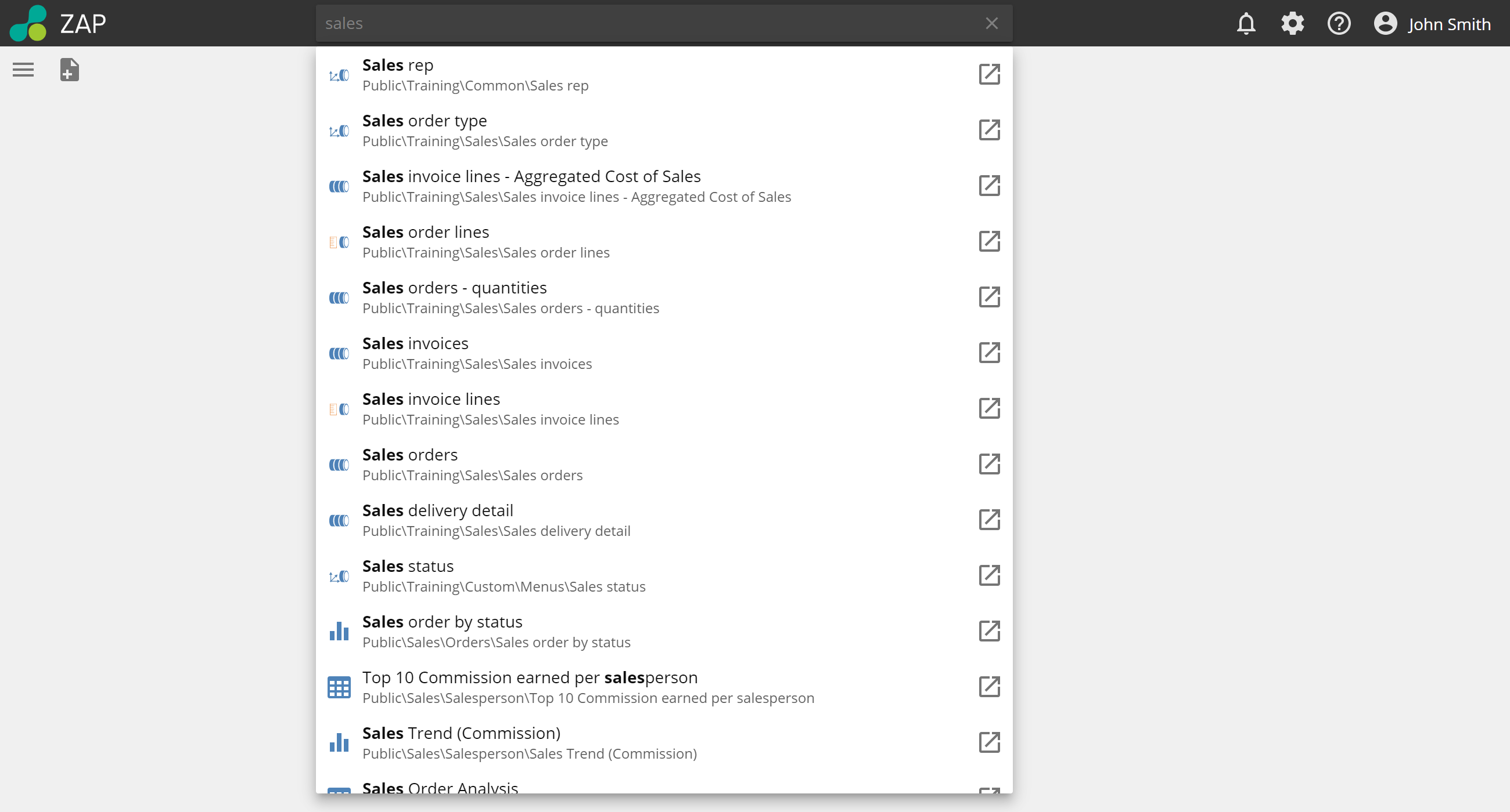 |
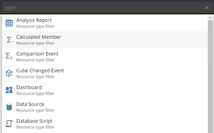
By adding filters to your search terms, you can focus your search on only those areas you want. Type the search filter and the resource to return your results.
Search filter | Function | Example | |
|---|---|---|---|
in: | Searches within a parent folder or model. |
| |
tag: | Searches within resource tags that are applied to resources. |
| |
type: | Searches for a type of resource. |
|
Notifications will show any system notification e.g. when the system goes down for updates.
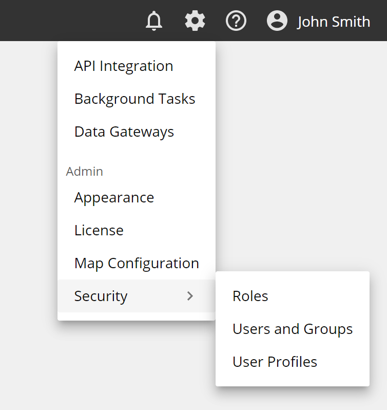
Settings for the application is available in a simple drop-down menu that displays over resources and allows you to open multiple settings pages as separate tabs. The options displayed will depend on the assigned role of the user.
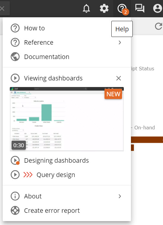
Help provides links to online documentation and shows In-app videos and tutorials to guide you on completing tasks.
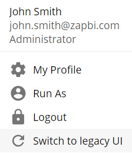
Profile allows you to edit your own profile, use the "Run as" function, logout or change to the legacy UI.
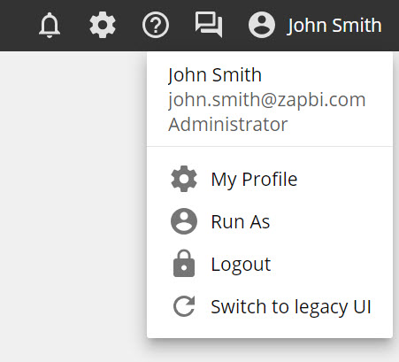
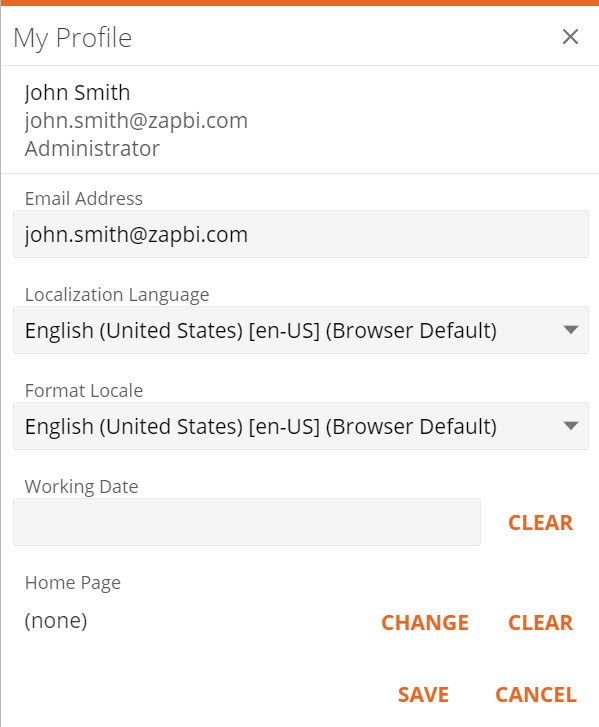
Selecting My Profile will open a pop-up where you can edit your personal details.
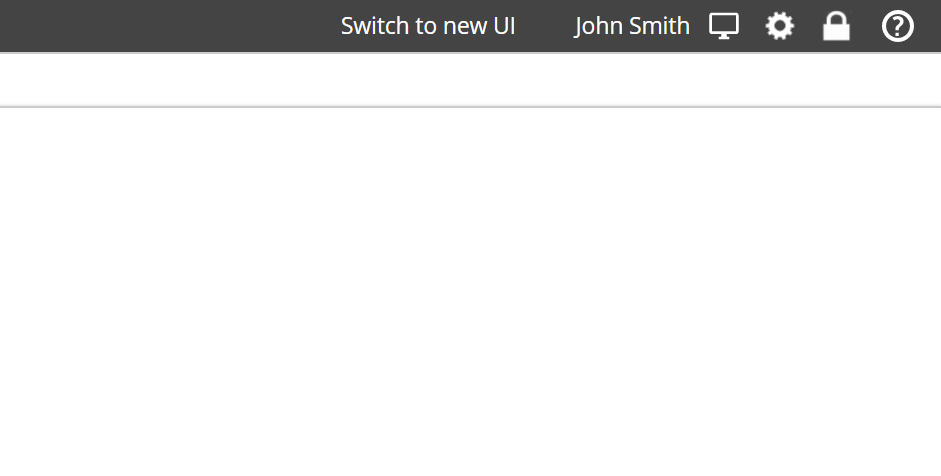
Switching between the old and new UI is easily done by using the provided links. Switch to new UI in the title bar of the old UI, or Switch to legacy UI in the User Profile Dropdown of the new UI.
