Create an analysis chart
Chart types display data in different ways. The type of chart used depends on the type of data being viewed.
Steps
Click New resource > Chart.
Once the chart design canvas opens, navigate to the right side of the screen and click on the Query Design tab.
If this is the first experience in a new Data Hub environment, specify the Cube Server, Database , and Cube to use for this chart.
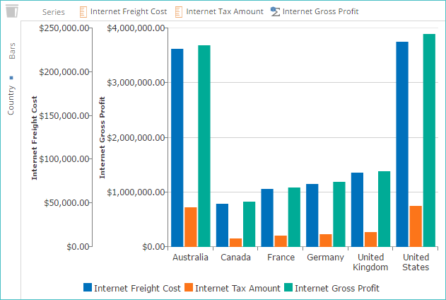
Drag elements from the Dimension Tree onto the Series and Bars placeholders.
Note
The default chart type is a Column chart.
Click Save.
Specify the name and folder location for the chart. Click OK.
Create a map chart
Note
Map charts will only return values if geographical data such as zip/postal codes are present.
Bubble map chart
A map bubble chart overlays corresponding analysis data. This format is useful for viewing data in terms of specific geographical locations.
Create or open a chart.
Click Edit if you have opened a chart.
On the Chart panel, click Chart Type > Maps.
Map shape chart
A map shape chart uses predefined shape resources (such as postal codes). The analysis data is used to color the corresponding shapes on the map.
Create or open a chart.
Click Edit if you have opened a chart.
On the Chart panel, click Chart Type > Shapes.
Click on Shape Resources.
Click on US Folder.
Select US States.
Drag Sales Measure to Series.
Drag State from the Customer Dimension to Locations.
Hover over the desired US state.
Create a combination chart
A combination chart combines multiple chart types within the same chart by showing different chart types for different series.
Create or open a chart.
Click Edit if you have opened a chart.
Select the series that will use the new chart type.
Note
The series can be selected using one of these methods:
Click a series entry in your chart's legend. Display the legend with the legend drop-down in the Style section of the Chart panel.
Display the pivot table (using the pivot table toggle in the home panel) and select one or more column headers in the pivot table.
On the Design panel, click Series Chart Type and select the chart type you want to display for the data.
Click Save.
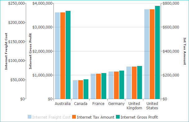
Create a two-vertical axis chart
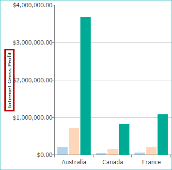
Add a chart title to the existing vertical axis
Select from the options on the chart's legend.
On the Axes panel, select Primary Vertical Axis, and click Axis Title.
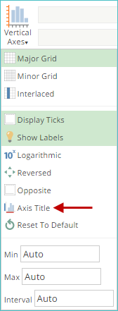
On the Axis Title dialog box, enter text and click OK.
Add a second vertical axis to the chart
On the chart's legend, click the required series.
On the Axes panel, click the Vertical Axis drop-down.
Select New Axis.
Add a title to the second vertical axis
On the Axes panel select Vertical Axis #2 and click Axis Title.
On the Axis Title dialog box, enter text and click OK.
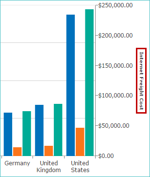
Move the new axis to the left side of the chart
Verify that the correct series is still selected or click it in the chart's legend.
On the Axes panel, click Opposite.
Edit the decimal places
On the chart's legend, click the required series.
On the Axes panel under Number Formatting:
Select the required number format.
Select the units to display.
Set the number of decimal places and a currency symbol if Currency is set as number format.
Click Save.
Specify chart data independent of placeholders
Simplify the appearance of a chart by displaying only specific series and series items.
Verify that the correct chart is open.
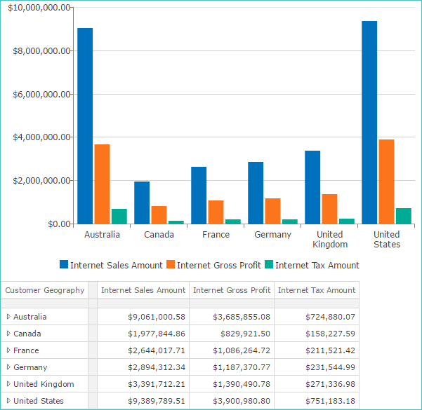
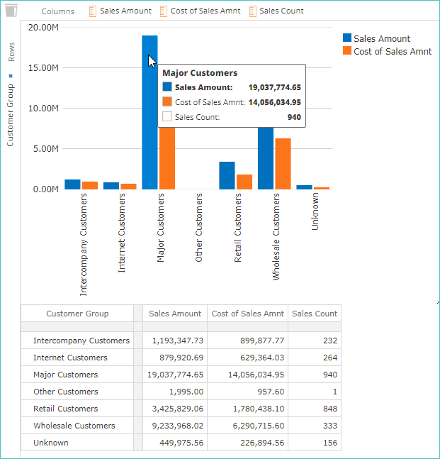
On the Home panel, click the Table toggle to reveal the chart's corresponding pivot table below the chart.
Select the series that you want to display by either of the following actions.
Click series in the chart.
Click series or cells in the table.
Note
To select multiple series, hold Shift or Ctrl when you click.
Hover over the chart to reveal hidden information on the corresponding infotips.
Click the Select Data toggle on the Chart panel.
Click Save.
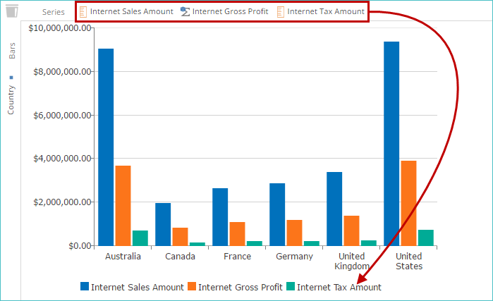
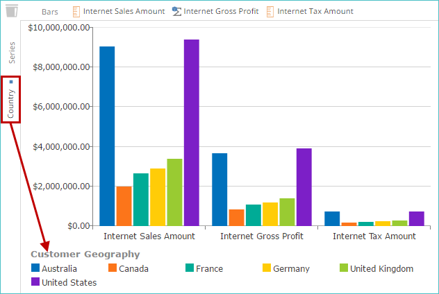
Swap rows and columns for chart series
Swap a chart's horizontal axis and legend entries.
Switch between using the Columns and Rows placeholders to determine series data in a chart.
Verify that the correct chart is open.
Select specific data to display (and swap) in the chart.
On the Chart panel, click the Swap Series toggle. The items on the Rows placeholder are now used to create the chart's series (the legend entries) and the entries on the Columns placeholder are now used to create the entries on the horizontal axis.
Note
To return the chart to its original configuration, click the Swap Series toggle again.
Click Save.