Analysis charts
Overview
Charts are graphical representations of a set or multiple sets of data. They are often useful in the understanding of trends based on large quantities of data and their relationship with each other. Charts use graphical components like bars, lines, diagrams, maps and more to illustrate the overview and trends of the data in a meaningful way.
Charts uses data from the Dimension tree. They can have filters and slicers to make data displayed more relevant, e.g. filtering data only for a particular sales region, and adding a slicer gives the consumer the ability to change the data they see based on different questions they have, e.g. total sales but for different years or regions respectively.
Chart formatting and styles can further enhance the presentation of the data.
Chart types
Data Hub provides many different types of charts, each displaying data in different ways. The type of data being displayed could often determine the type of chart to use.
Chart types are available on the chart panel.
Column Charts
Data points appear as vertically-oriented columns. Three different types are available:
Standard column charts
Stacked column charts
100% stacked column charts
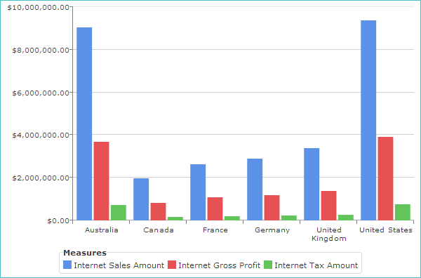
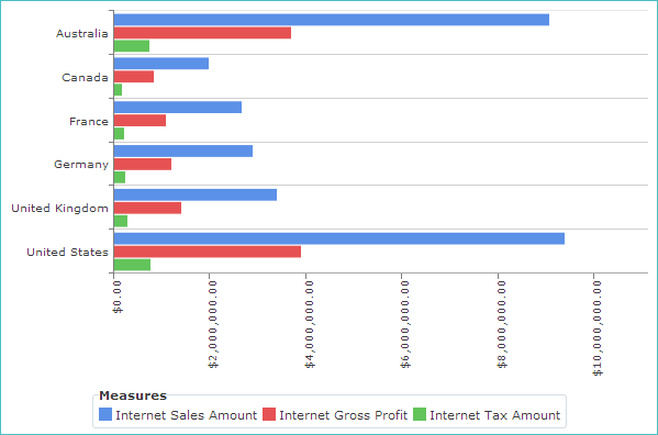
Standard Column Charts
These charts have one column for each cell in the analysis, also known as "clustered" charts.
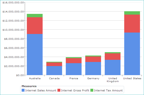
Stacked Column Charts
These charts have one column for each horizontal axis point, and the values for each series are stacked up. The total length of the column represents the total value for its horizontal axis point. Stacked types are useful when the series values add to a total.
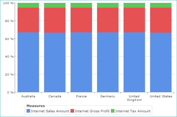
100% Stacked Column Charts
These charts are similar to the stacked types except that the values shown are percentages of the total for each horizontal axis point. Thus, every stacked column is the same height: 100%. These chart types are useful for showing contributions to a total from different sources.
Bar Charts
Data points appear as horizontally-oriented bars. Three different types are available:
Standard bar chart
Stacked bar chart
100% stacked bar chart
Standard Bar Charts
These have one bar for each cell in the analysis, also known as "clustered" charts.
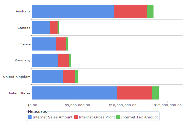
Stacked Bar Charts
These have one bar for each horizontal axis point, and the values for each series are stacked up. The total length of the bar represents the total value for its horizontal axis point. Stacked types are useful when the series values add to a total.
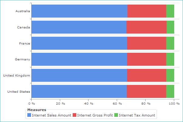
100% Stacked Bar Charts
These are similar to the stacked types except that the values shown are percentages of the total for each horizontal axis point. Thus, every stacked bar is the same height: 100%. These chart types are useful for showing contributions to a total from different sources.
Area Charts
Area charts look like line charts, but with the area below the line filled in. Three different types are available:
Standard area charts
Stacked area charts
100% stacked area charts
Standard Area Charts
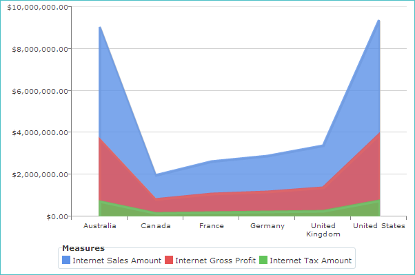
Stacked Area Charts
100% Stacked Area Charts
Line Charts
Line charts display a series of data points connected by straight line segments. The data points appear as vertices between the line segments.
They are particularly useful when there are many horizontal axis points, such as a long time series.
Spline Charts
Spline charts, also known as smoothed line charts, are like line charts in that they display a series of data points connected by lines. However, rather than using straight line segments, as line charts do, spline charts use smoothed lines obtained by fitting a cardinal spline curve to the data points. The resulting smoothed curve may offer a more realistic representation of trends in the data than a line chart.
They are particularly useful when there are many horizontal axis points, such as a long time series.
Marker Charts
These types of charts are often combined with a standard column or bar chart (via the Series Chart Type button on the Design ribbon). Two different types are available:
Column marker charts
Bar marker charts
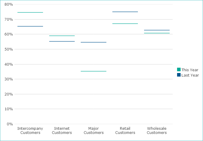
Column Marker Charts
This is similar to a standard column chart, but the value is shown as a line corresponding to the top of the filled column.
In the following example, a simple column marker chart is shown.
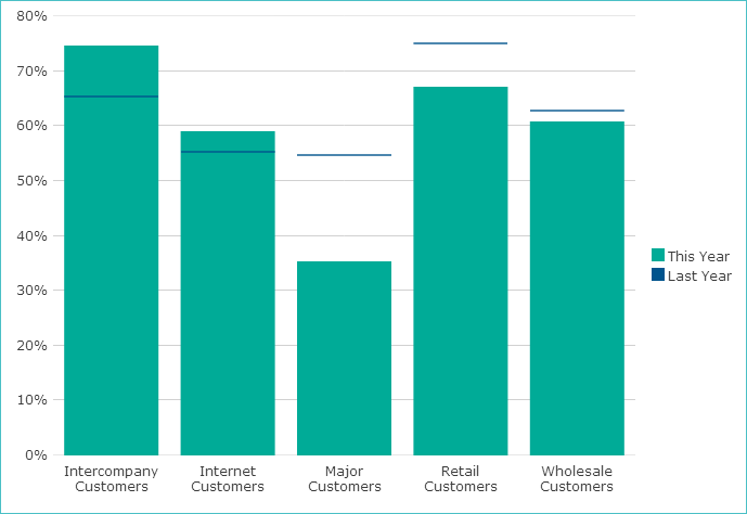
Column marker charts work effectively when additional series, displayed as stacked columns, are added.
In the following example, the chart's This Year series has been changed to a standard column chart.
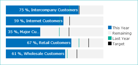
Bar Marker Charts
This is similar to a standard bar chart, but the value is shown as a line corresponding to the right of the filled bar.

Bar marker charts work effectively when additional series, displayed as stacked bars, are added. In the following example, the chart's This Year and Remaining series has been changed to stacked bar charts.
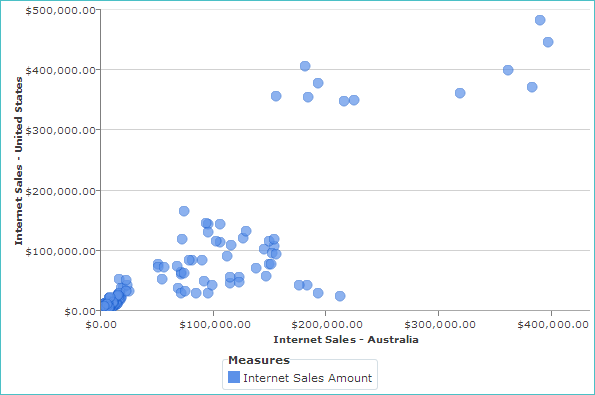
Point Charts
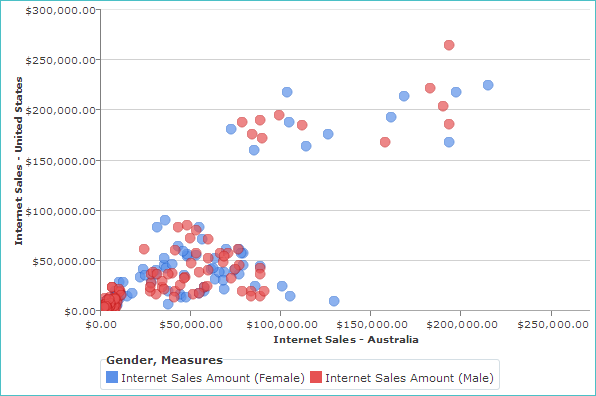
Point charts (also known as scatter charts, scattergrams, or XY charts) use individual points to show values for two series simultaneously on a chart. The point locations are determined by the intersection of horizontal and vertical axis data, each axis representing one of the series. The pattern of points indicates the relationship (if any) between the series.
The first measure in each placeholder (Row and Column) is used to determine the series that will be assigned to the horizontal and vertical axis respectively, and hence the location of the points. All other data is ignored.
In the following example chart, the Internet Sales Amount (per product) is shown for two countries: Australia and the United States. Values for Australia are on the horizontal axis, while values for the United States are on the vertical axis (determined by the order of the countries on the Columns placeholder). A point is present for each product, with its location determined by the intersection of its Australia and United States Internet Sales Amount values.
Note
Hover your mouse pointer over any point to see its relevant details.
Adding a tab containing a hierarchy or level to a placeholder before the measure used for the series will produce multiple series. Each series is plotted with points of a different color. In the following example, adding a Gender level before the Internet Sales Amount measure produces two versions of the original Internet Sales Amount series: one for Female and one for Male.
Bubble Charts
Bubble charts are very similar to point charts, in that they use individual points to show values for two series simultaneously on a chart. The point locations are determined by the intersection of horizontal and vertical axis data, each axis representing one series. The pattern of points indicates the relationship (if any) between the series.
However, bubble charts also use a third series to assign an independent value to each point, which determines the diameter of the bubble (the larger the value, the larger the bubble). This allows relationships between any of the three series to be detected.
In the following example chart, the Internet Sales Amount (per product) is shown for two countries: Australia and the United States. Values for Australia are on the horizontal axis, while values for the United States are on the vertical axis (determined by the order of the countries on the Columns placeholder).
A bubble is present for each product, with its location determined by the intersection of its Australia and United States Internet Sales Amount values, with the combined Internet Sales Amount values for the two countries determining the size of the bubble.
Note
You can hover your mouse pointer over any bubble to see details about that bubble.
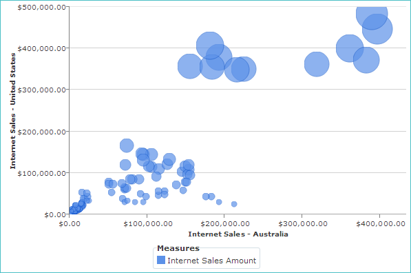
Overlapping bubbles are transparent, allowing you to better see bubbles that lay close to one another. Also, each bubble uses a dark border to allow you to better see individual bubble, especially when many bubbles are located close to one another.
The default bubble size for all bubbles is automatically determined when the chart is created. However, you can change the scale of the bubbles, making them all larger or smaller, by using the Size drop-down list on the Design ribbon.
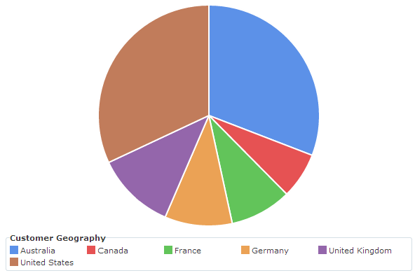
Pie Charts
A pie chart represents a single data series as portions (sectors) of a circle. If multiple series are present, only the first series is used to construct the pie chart; the other series are shown in tool tips that appear when hovering on a segment. Multiple pie charts, one for each series, may be displayed using the Small multiples feature.
 |
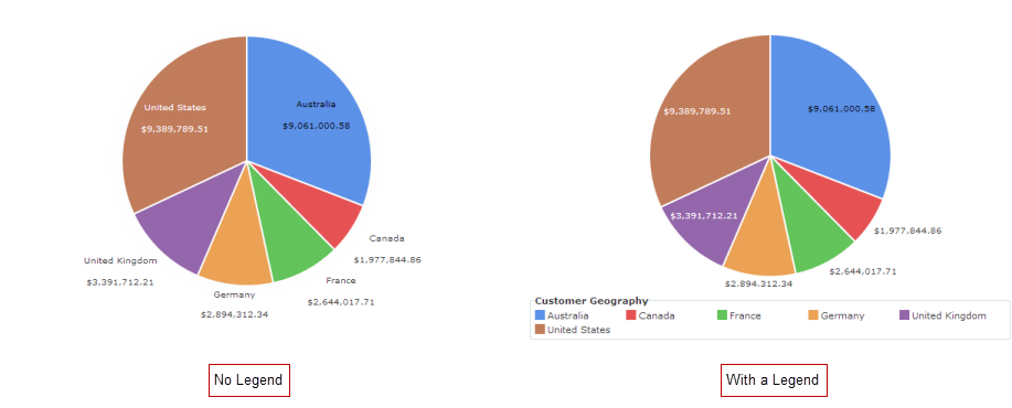
Legend and Label Behavior
If the pie chart doesn’t have a legend, segment labels also display the segment's name; otherwise, only the segment value is shown.
 |
Label Placement
Whenever possible (if there is enough room), labels are now placed inside sectors.
 |
Segment Ordering
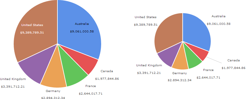
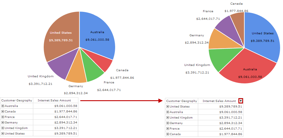
The order of sectors is determined using the order established in the pie chart's underlying pivot table.
In the following example, the Internet Sales Amount column has been sorted in descending order. Pie chart sectors are always presented clockwise from the "12 o'clock" position.
 |
Controlling Segment Label Appearance and Placement
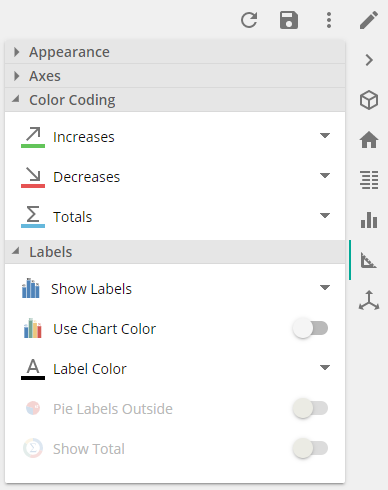
Segment labels are not shown by default, but can be activated using the Show Labels button on the Design ribbon.
Furthermore, you can force all segment labels to display outside of the chart's sectors, even if they fit inside the sectors, using the Pie Labels Outside button on the Design ribbon.
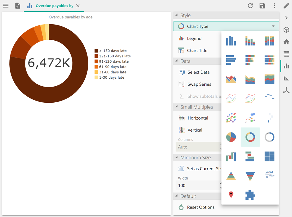
Donut Charts
A donut chart resembles a standard pie chart. However, a blank area appears in the middle of the chart, which can be used to display the total value of the data displayed in the chart. You can choose to show or hide this value.
Like pie charts, donut charts are useful when the segments displayed add up to a meaningful whole, such as sales in various territories that add up to the total sales.
 |
With the exception of the central total value display, donut charts can be manipulated in the same way as a pie chart. You can perform the following actions to adjust the appearance of the chart:
You can choose to either display or hide the total value in the center of the chart as described in Displaying the Total in a Donut Chart.
Segment labels are not shown by default, but can be activated using the Show Labels button on the DESIGN ribbon.
You can move selected sectors away from the center of a chart, detaching them from the main chart and allowing them to stand out more using the Explode pie segments button.
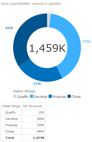
Circular Gauge Charts
A circular gauge chart resembles a standard pie chart. However, a blank area appears in the middle of the chart, which can be used to display the value of the first series. The chart automatically sizes so that the full number can be displayed in the middle, without wrapping. Additional series are displayed as lines within the chart, with the corresponding labels showing the name of the series, the categories, or the values (as specified).
Note
You can configure the labels, controlling what is displayed, using the Show Labels button on the Design panel.
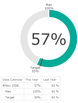 |
This type of chart is useful in the following scenarios:
As a replacement for KPI resources, allowing for easier readability and improved visualization results.
For charts that display 100% status progress (for example, Sales vs. Target progress in a quarter).
For Percent KPI charts with non-100% targets (for example, Gross Profit might be 25% compared to a Target of 20%).
For various other status progress charts (for example, day 5 of 90, or 45 days remaining out of 120 total).
You can also use additional series as a way to extend the information displayed on the chart (by placing a "pin" on the chart). For example:
Adding comparative relative time series (such as same day last year)
Custom targets (such as the target in the example above)
A maximum value (as in the example above)
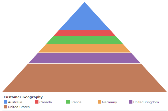
Pyramid Charts
A pyramid chart works like a pie chart, with only one series shown per pyramid. They are useful for displaying values that add to a total.
Important
Pyramid charts may be misleading, as it is the vertical height of each series item that is proportional to the underlying value, not its area.
In the example below, the series item for the United States has a much larger area than the series item for Australia, although the underlying values for the two countries are almost identical.
 |
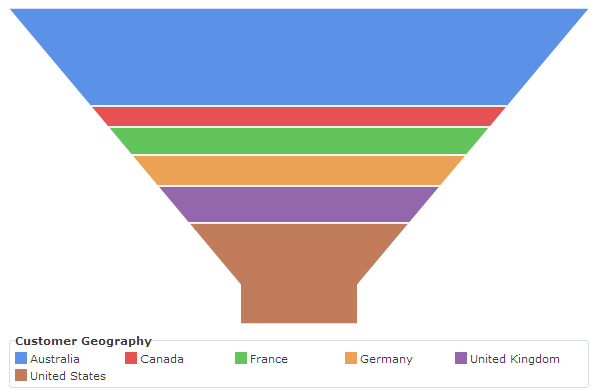
Funnel Charts
Funnel charts are basically upside-down pyramid charts. They are often used to show the relationships between leads, opportunities, calls, sales, and invoices.
Important
Funnel charts may be misleading, as it is the vertical height of each series item that is proportional to the underlying value, not its area.
For example, a series item for Australia might have a larger area than the series item for the United States, although the underlying values for the two countries are almost identical.
 |
Treemaps
Treemaps display hierarchical data as a set of nested rectangles. Each member of the hierarchy is given a rectangle, which is then tiled with smaller rectangles representing its children. Each member's rectangle has an area proportional to the value of a specific measure for the member, as defined for the chart.
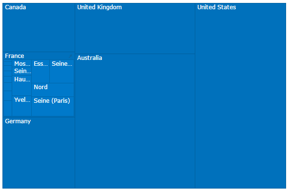 |
Treemaps make efficient use of space. They can legibly display many items on the screen simultaneously. They are also great visualizations for spotting outliers and what makes up those outliers.
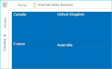
In Data Hub, treemaps are created using a measure and a level from the Dimension Tree, placed on opposite axes (one in the Series placeholder, the other in the Nodes placeholder), as shown below.
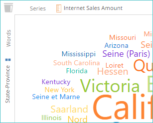
Word Clouds
A word cloud is a visual, textual representation of data. The chart is made up of tags, which are usually single words. The importance of each tag is shown by varying the tag's font size and, optionally, its color (in other words, the size of each word is based on the value of the corresponding measure).
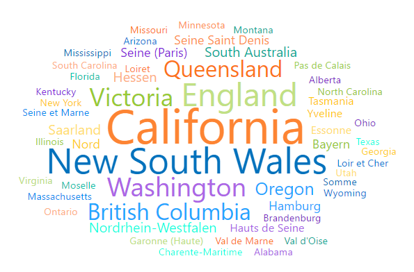
This format is useful for quickly perceiving the most prominent members. Word clouds are a great way to display an overall picture of a metric. Further analysis and investigation may then be done.
In Data Hub, word clouds are created using one measure and one dimension item, as shown below.
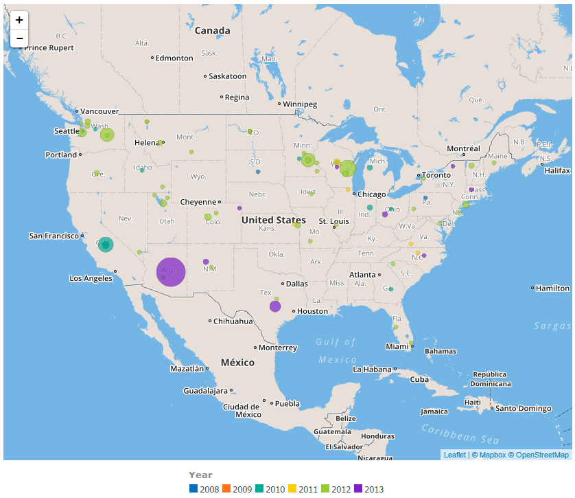
Map Charts
Two types of map charts are available in Data Hub: map bubbles and map shapes. Both types overlay analysis data on a map, but they do so using different methods (with one using different size bubbles while the other uses various shapes).
Map Bubble Charts
A map bubble chart looks like a bubble chart but overlays the corresponding analysis data on a map. This format is useful for viewing data in terms of specific geographical locations. For example, visualizing stock levels at warehouses, or the severity of overtime delivery incidents at specific customer addresses.
In the following example, chart has been created showing outbreaks of whooping cough in the United States. The bubbles represent both the scale of the outbreak (size of bubble) and year of the outbreak (bubble's color).
 |
Important
For this chart type to function, the selected member properties must contain latitude and longitude details.
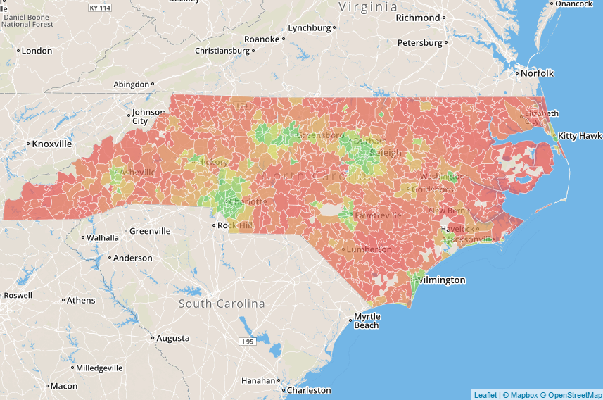
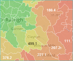
Map Shape Charts
A map shapes chart uses predefined shape resources (containing entities such as states, counties, provinces, or postal codes). The analysis data is used to color the corresponding shapes on the map.
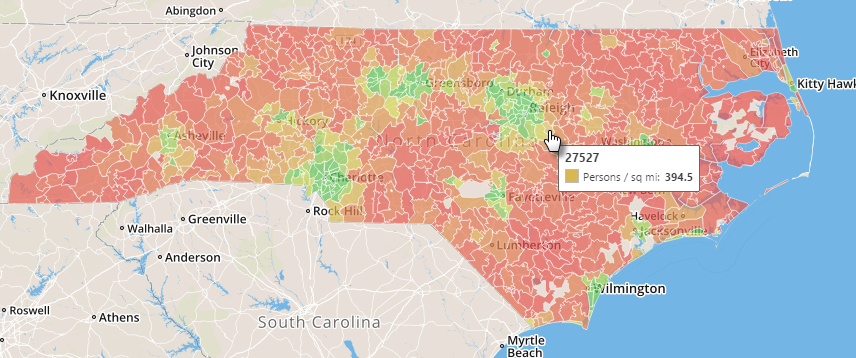
In the following example, the zip codes within the state of North Carolina have been used to display population density data. Heat map formatting shows the population density of each zip code from high (green) to low (red).
 |
Note
If labels are enabled (via the Show Labels button on the Design panel), they are displayed unless an individual shape is too small to support the label clearly. In this case, the label is hidden. In the following example, some labels are shown, while those for smaller shapes do not appear.
 |
You can also hover over individual shapes to view all series values.
 |
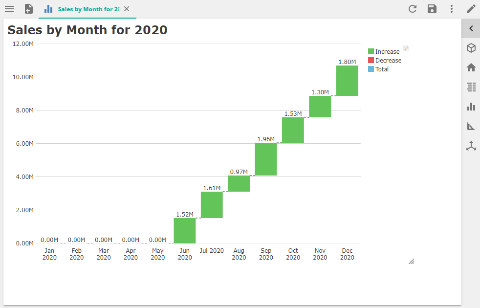
Waterfall Charts
The waterfall, also known as a bridge or cascade, chart is used to portray how an initial value is affected by a series of intermediate positive or negative values. Usually the initial and the final values (end points) are represented by whole columns, while the intermediate values are shown as floating columns that begin based on the value of the previous column. The columns can be color-coded for distinguishing between positive and negative values.
Like other chart types, the Waterfall chart is fully interactive and supports drill up, drill down and, drill through as well as expanding hierarchy members from the pivot table.
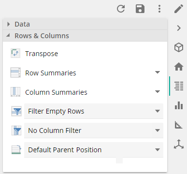
Totals are automatically created based on Totals and/or Subtotals (using the Row and/or Column Summaries on the Rows & Columns section of the Data panel).
Note
Although this chart type cannot be combined with another series chart type, additional series display in tooltips.
This chart type also supports multiple attributes on rows (or columns), however, totals will only show if Row/Column totals are used.
The chart respects the order of members in the pivot table:
To show an ascending waterfall chart, use the Column/Row sort right click option
For expanded hierarchies, because parent members display before children by default, use the Default parent position option on the Data panel to display totals.
There are 3 color default codes on the chart:
Green - to indicate increases
Red - to indicate decreases
Blue - to indicate totals
These colors can be changed in the Color Coding section of the Design panel
Use the Show subtotals as totals option in the Chart panel to display the total of expanded parent members or a subtotal as a delta, based on the value of the previous sibling member.
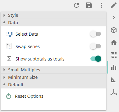 |
Chart placeholders
Placeholders are used to define the information that appears in the corresponding chart. When working with charts, these placeholders are dynamically labeled and change based on the type of chart being viewed or created. This dynamic labeling is designed to be more intuitive.
Important
In this online help system, every attempt is made to use the labels that are present for the type of chart being used in the current example or topic. However, when discussing generic usage, the labels for bar charts are used.
If the corresponding pivot table for a chart is shown (using the Table button on the VIEW ribbon), the Columns/Rows placeholder naming scheme is used for all chart types.
Inputs in the Columns Placeholder
Several chart types (Point, Bubble, Map Bubble, Map Shape) require multiple inputs. This is achieved by dragging more than one tab onto the Series placeholder.
If one of these chart types is selected, and the corresponding pivot table is not displayed, the Series placeholder label will display the items required on the placeholder, in order. In addition, hovering over the placeholder displays an info tip with details of each required input.
Chart titles and chart legends
You can add a text title or change an existing text title using the Chart Title button on the CHART panel.
Legend Appearance and Title
When using charts, you can determine if your chart will use a legend, where it will be located (in relation to the chart), and what title, if any, the legend will use.
In general, a chart legend is always displayed, unless you select the None option in the legend drop down from the Chart panel. The Legend drop down controls whether the legend is visible or not, as well as its location.
You can edit a chart legend's title directly from the legend itself. When you hover over the legend's title, a text box appears surrounding the title text.
If you click within this text box, a cursor appears, allowing you to edit the existing legend's title or add one
Tip
Click the  button to remove the existing title.
Chart labels
Chart labels, when displayed, are intelligently placed on charts in such as way as to avoid overlapping, including the use of lines connecting the labels to their corresponding chart entries.
Several customization options for chart labels are available, allowing you some control over the appearance and placement of labels, including the ability to hide labels completely.
Automatic text color formatting
To increase chart label visibility, labels automatically use either white or black text based on the background color of the series item on which they are located, or if they are inside or outside of a series item. Labels on dark-colored series items use white text, while labels on light-colored series items use black text.
Notice how the label color on the top portion of the column automatically changes when a darker color is used (via the Selection Color button).
Pie Chart Labels
When using a pie chart, additional label behavior should be noted.
Showing Chart Labels
You can easily display or hide labels in a chart using the Show Labels button on the DESIGN ribbon. When the button is highlighted, as shown below, at least one label option has been selected and is displayed.
Click the button to show label options.
Options:
Series. Displays the measure entry associated with the series item, and matches the information displayed in the legend.
Category. Displays the member name associated with the series item.
Value. Displays the values associated with the series item.
If an option is highlighted, it is currently being displayed in the chart. You can toggle each listed option, choosing to either display it or not display it in conjunction with the other options. For example, you can choose to show a chart's values and category details, but to not display a chart's series details.
Specify the color of chart labels
You can specify whether the chart's labels use the existing segment colors or a specific color using two buttons on the DESIGN screen.
If you want to use the current segment colors for the chart's labels, click the Use Chart Color button.
When this button is clicked, not only are the label colors updated to use the corresponding segment colors, the Color button is also dimmed and cannot be used.
If you want to choose a specific color for the chart's labels, first verify that the Use Chart Color button is not clicked. Then click the Color button.
⚠ Important You must first deactivate the Use Chart Color button before clicking the Color button, or else the Color button will be dimmed (not available). |
When the Color button is clicked, you can select the color that you want to use.
After you select a color, the chart's labels are updated, but the segment colors retain their original colors. In the following example, a donut chart's labels use black-colored text for the label colors instead of the various segment colors.
Moving pie labels outside of sectors
By default, Data Hub automatically determines the placement of labels for pie charts. Whenever possible, labels are placed within sectors. If a label is determined to be too large for a segment, it is placed outside of that segment.
However, you can force all labels to be placed outside of a pie chart's sectors, even if they would fit within the sectors, using the Pie Labels Outside button on the DESIGN screen.
When the Pie Labels Outside button is clicked, all of the labels are forced outside of the sectors.
Display the total in a donut chart
You can control the display of a donut chart's total value (the value that appears in the center of the chart) using the Show Total button on the DESIGN screen.
When the total is displayed (the Show Total button is active), it appears in the center of the chart.
When the total is not displayed (the Show Total button is not active), the center of the chart is blank.
Format numbers in labels
You can format the numbers that appear in axis labels, and in chart data labels if they are displayed, by formatting the numbers in the chart's underlying pivot table. When you update the formatting of the numbers in the pivot table, the chart data labels and axis labels are automatically updated to match.
To format the numbers displayed on chart, you must first select the data you want to format on the chart's pivot table or via the chart's legend. After you select the data, the settings in the Number Style group on the TABLE screen become active.
Chart axes
Chart axis labels
Chart axis labels, when displayed, are intelligently placed in such as way as to avoid overlapping. This placement includes turning the labels horizontally or vertically for a better fit, or truncating the labels with ellipses (...) when the label name cannot be displayed in full.
Format chart axes
You can format existing chart axes, (e.g. add titles or shift axis position, add multiple axes (horizontal and vertical) to a chart.
Numerous options allow you to format horizontal and vertical axes on a chart. These options are available from AXIS screen.
Select an axis from the Axes drop-down list (on the left side of the ribbon). Highlighted buttons will dynamically adjust. This means that now all buttons will be available. (Some will be grayed-out.)
Format options:
Display Ticks. When selected, lines with tick marks appear as part of the axis.
Show Labels. Allows you to specify if an axis's labels are displayed or hidden.
Logarithmic. Applies logarithmic scaling to the axis. Logarithmic scaling uses intervals corresponding to orders of magnitude (powers of ten) rather than the usual linear scale. For example, instead of tick marks for values 1, 2, 3 and 4, a logarithmic scale will display tick marks for 1, 10, 100 and 1000. Logarithmic scaling is useful when the values being displayed cover a large range of values, when a few outliers compress the scale of the majority of the data, making trends harder to spot, or when ratios are involved.
Reversed. Flips the entire chart left to right (Horizontal Axes button) or top to bottom (Vertical Axes button).
Opposite. Moves the axis to the opposite side of the chart. Horizontal axes are moved from the left to the right of the chart. Vertical axes are moved from the bottom to the top. Clicking Opposite again reverses the move.
Axis Title. Allows you to create, edit, or remove a title for the axis using the Axis Title dialog box. Axis titles always appear on the outer edge of the axis.
Reset To Default. Resets all options for the selected axis to the default.
Remove. Allows you to remove the selected axis from your chart. For more information, see Removing a New Axis.
Min. Allows you to specify the lower value for the axis. You can enter a new value directly in the corresponding text box or use the spin box to cycle through a range of values. By default, this range is automatically determined (the Auto setting).
Max. Allows you to specify the upper value for the axis. You can enter a new value directly in the corresponding text box or use the spin box to cycle through a range of values. By default, this range is automatically determined (the Auto setting).
Interval. Allows you to change the distance (value) between major grid lines (and axis labels) on the axis. You can enter a new value directly in the corresponding text box or use the spin box to cycle through a range of values. By default, this range is automatically determined (the Auto setting).
Note
To return Min, Max, or Interval settings to their default (Auto) setting, use the Reset to Default option.
Using multiple axes in a chart
By default, the first items listed in both the Series and Bar placeholders are used to determine a chart's axes. However, you can assign a series to a new or existing axis using the Axes drop-down lists on the DESIGN ribbon.
Note
The names of these placeholders vary based on the type of chart being viewed.
Add a new axis
To add a new axis to a chart, specify the appropriate series and then add the new axis as a vertical or horizontal axis.
The legend entry and the corresponding chart data are selected, and the other series and data are dimmed.
On the chart's legend, click the series that will be represented on the new axis.
On the DESIGN screen, select New Axis from the appropriate drop-down list, based on the type of new axis you want to create (horizontal or vertical).
Example - Create a new horizontal axis. Specify the lines and shading options (grid options) for the axis. Available options:
Format the new axis, as desired. |
Remove an axis
You can remove a new axis from your chart using the AXIS ribbon.
Select the ribbon you want to remove from the Axes drop-down list on the left side of the ribbon, then click the Remove button.
Drill up, drill down and drill through
Drill up, Drill down and Drill through gives you the ability to change the granularity of reports as required.
Drill down
Is like “walking through different levels of a hierarchy, from the top down”. For hierarchical data where values are grouped into levels, drilling down moves from one level down to the next.
Common hierarchies:
Date based data – Year, quarter, month and day.
Geographical data – Country, State, Postal code, City.
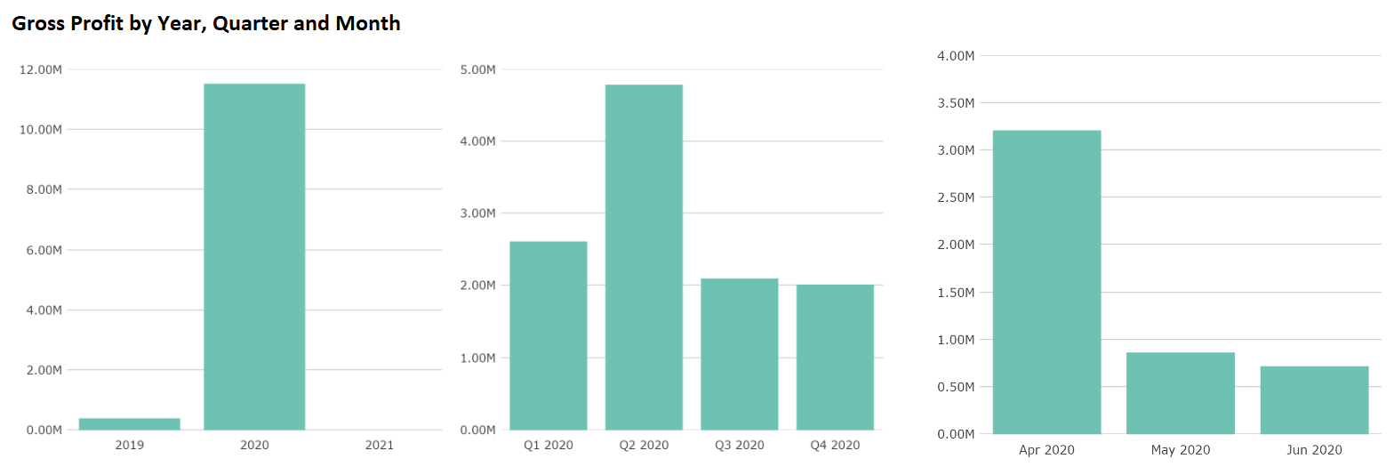
Sales by Month drilled drilled down to Sales by Day.
Double-clicking a chart series item, such as a column or pie segment, drills down to display a chart composed of the item's child members (if they exist). Otherwise, for leaf-level members, double-clicking displays a drill through report (to display the underlying transactions behind a number).
Note
This double-click feature, and its corresponding right-click feature, which is described below, is not available for the following chart types: all area charts, line, and spline. The behavior is also slightly different when using treemaps.
Right-clicking a portion of a chart and selecting Drill Down from the menu the appears. When using the right-click method, the chart feature that is right-clicked is automatically used as the drill down item.
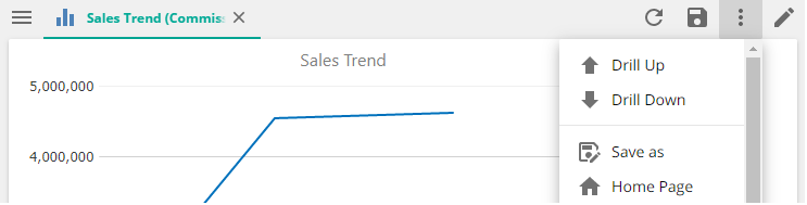
After you execute a drill-down via the double-click method, you can return to the original chart by right-clicking the chart and selecting Drill Up from the menu that appears.
If you want to drill down or drill up on an entire chart, instead of a selection within the chart, you can use the Drill Up and Drill Down buttons on the resource context menu.
Drill through
For leaf-level members, double-clicking a chart series item, such as a column or pie segment, displays a drill through report (to display the underlying transactions behind a number), called a detail report
You can also right-click a chart item and select Create Detail Report from the menu that appears.
Manipulating Treemaps
Treemaps have additional interactive features, beyond those available for other charts, allowing you to perform the following actions, as desired:
Selecting a rectangle
When a rectangle is selected in a treemap, a dark border appears around it, and the other rectangles are not made transparent, as with other chart types.
In the following example, the United States rectangle is selected.
Once a rectangle is selected, you can change its color using the Selection Color button (as described in Specifying the Color of Series or Series Items in a Chart) or the Pivot Table Formatting button (as described in Automatically Formatting Charts from Pivot Table Formats). You can also apply conditional formatting, such as a heat map, as described in Configuring the Heat Map Conditional Formatting Option.
Drilling down and drilling up in a Treemap
The behavior when drilling down or drilling up in a treemap is similar to the behavior in other charts. However, there are two distinct differences:
The drill down takes place within the selected rectangle, and the overall chart retains its original layout.
Additional options exist for manipulating rectangles during the overall drill down/drill up process.
For more information on drilling down or drilling up in other chart types, see Drilling-Down on a Chart.
Note
Double-click in a rectangle to drill down to a lower level. The member's children are displayed within the rectangle, and the rest of the chart is unchanged.
In the example below, the Australia rectangle has been double-clicked.
Note
You can return to the original level by double-clicking the rectangle's header (title) bar.
Drill-up or drill-down by right-clicking a rectangle and selecting the appropriate option. The resulting rectangles fill the entire chart area. This option works the same as other chart types.
Viewing a member's children in a Treemap
When using a treemap, you can display the children of a specific member using the entire chart area.
Click the small arrow icon in the upper right corner of the rectangle that contains the member whose children you want to view. After clicking the icon, the entire chart now consists of only the selected member and its children. This feature allows you to view the data in more detail.
In the following example, notice how the Tasmania entry is now more easily read.
To return to the original chart layout, click the small, curved dash icon that appears to the right of a rectangle's header.
Tool tips in Treemaps
Hover over a rectangle to display its value in a rich tool tip. The first value, in bold, is the measure that is used to draw the chart. If additional measures are included in the underlying pivot table, their values are displayed as well. For more information on tool tips, see Using Tool Tips.
When using line or spline charts, you can zoom in on the time axis to display a subset of the data points.
For example, in the following multiple-year chart, you can select a limited time period (such as a sales spike) by clicking and dragging horizontally directly within the chart area.
When you release the mouse button, the selected date range is expanded to show more detail.
Once zoomed in on a portion of a chart, you can use the Drill Up and Drill Down buttons on the DATA ribbon to perform additional analysis.
In the following example, a drill down has been performed on the previous chart, which allows you to see more detail (daily data in this case) for just the selected (zoomed) time range.
Tip: You can perform additional zooms, combined with the drill-down feature, to view increasingly granular detail, provided there is data in your cube to display.
When your analysis is complete, you can return to the chart's original, non-zoomed view by clicking the Reset Zoom link.
Note
If you have zoomed and drilled-down, click the Drill Up button on the DATA ribbon until you have returned to the starting level, and then click the Reset Zoom link to return to the original chart.
Appearance settings
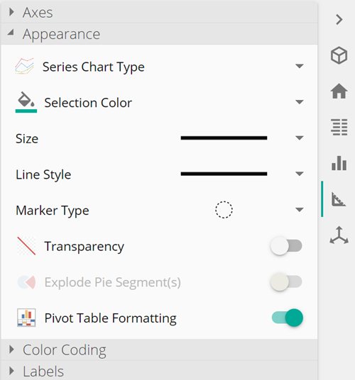
Specifying the color of Series and Series Items in a Chart
You can change the colors of individual series in a chart, if you would rather the series not use the default colors provided, using the Selection Color button in the Appearance section on the DESIGN panel. You can also change the color of individual series items (bars, lines, bubbles, pie sectors, etc.) within a series.
Note
If you're working with a treemap, you can select individual rectangles for updating, or alter the color of the entire treemap (if no rectangles are selected).
Series can be selected by clicking them directly on a chart or via the chart's pivot table. If you are selecting an entire series, you can do so from either the chart's legend or the chart's pivot table. If you are selecting individual series items within a series, you must click them directly on the chart.
If you're working with a treemap, you can select individual rectangles for updating, or alter the color of the entire treemap (if no rectangles are selected).
Note
You can select multiple series items or series by CTRL-clicking them.
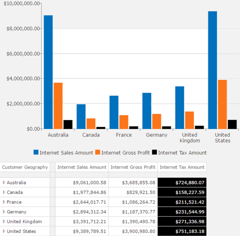
In the following example, the bar representing the Internet Sales Amount for Germany has been given a unique color (black).
When you click the Selection Color button, a simple set of colors is immediately displayed. However, you can click the More Colors option to view more detailed color settings, such as an extensive color palate, as well as RGB, HSB, and hex triplet (#) color definitions.
Note
To change a series or individual series item back to its original, default color, click the Default option.
Changing the Size (Width) of Certain Chart Series Items
You can change the size or width of lines, splines, points, and bubbles using the Size drop-down list in the Appearance section on the DESIGN panel.
You can change the size of these chart elements using either of the following methods:
Change all items in the current chart by simply selecting an option from Size drop-down list.
Note
When using bubble and point charts, you can only change the size of all bubbles or points. You cannot change the size of single items.
Change individual items by selecting them (on the chart itself or from the chart's pivot table) and then selecting an option from the Size drop-down list. When you select a single item, the other items on the chart are made transparent.
In the following example, the line representing Internet Gross Profit has been given the thickest line possible. The other two lines continue to use the default line width (the second thinnest option).
Making chart series items transparent
You can make any series or individual series item in a chart transparent using the Transparency toggle in the Appearance section on the DESIGN panel. A transparent item appears dimmed with the original color faded out.
Important
This option is not available with treemaps.
To remove the transparency, click the transparent series or series item and click the Transparent toggle again.
In the following example, the CY 2002 series is made transparent to better see the other series in the stacked column chart.
Number in Image Description
Regular series
Transparent series
Exploding Pie chart sectors
You can move selected pie sectors away from the center of a pie chart, detaching them from the main chart and allowing them to stand out more using the Explode pie segments button on the Design panel.
When opening a pie chart, the sectors are connected to each other. Select the sectors you want to move away with on of these methods:
Select the sectors you want to move away with one of these methods:
Tip
You can CTRL-click the chart or pivot table to select multiple pie sectors.
Click the sectors directly on the pie chart
Click the entries in the chart's pivot table that correspond to the pie chart sectors
On the Design panel, click the Explode pie segments button.
Note
Clicking the Explode pie segments button again moves the sectors back towards the center of the pie chart. Just be sure that the sectors you want to move are still selected before clicking the button again.
For more information on working with a chart's pivot table, see selecting data from a chart's pivot table
Formatting charts from pivot table formats
You can automatically apply certain pivot table formatting to the chart using the Pivot Table Formatting button on the DESIGN ribbon.
When this feature is enabled (as shown in the above example), any background color formatting (including conditional formatting) applied to cells in a chart's pivot table is automatically applied to the corresponding items in the chart. This feature is enabled by default.
In the following example, with the feature enabled, the background color for one of the chart's table columns has been changed to black (with the text changed to white as well). Notice that the corresponding data in the chart has also been changed.
However, if the same table formatting is performed with the Pivot Table Formatting feature disabled, only the table is updated. The chart retains its default color scheme, as shown below.
Note
You can also enable or disable this feature after applying formatting to a pivot table, and the chart will be updated based on your selection.
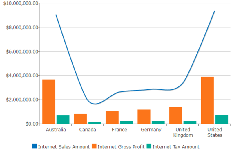
Combination charts
You can use multiple chart types within the same chart using the Series Chart Type button on the Design panel.
Using multiple chart types within a chart may improve the appearance and usefulness of a chart. For instance, a chart may be more readable if one or more series are displayed as splines while others are displayed as bars.
Note
This feature is often used in conjunction with a secondary vertical axis.
You can use multiple chart types within the same chart using the Series Chart Type button on the Design panel.
More than one series can be selected at a time by using CTRL-click on the legend or pivot table headings
All non-selected legend entries, and their corresponding chart series items, become transparent.
Note
You can return to the original chart type for any series by clicking the series and then selecting the chart type used by the rest of the chart. You can also use the Reset Options button on the CHART panel. However, this button will also reset other chart changes that you may have made (as described in Resetting a Chart).
Limitations
Since not all chart types support creating combination charts, you should review the following information before attempting to use this feature.
You cannot create combination charts when the main chart is any of the following types:
100% Stacked Column Word Cloud
100% Stacked Bar Pie
100% Stacked Area Pyramid
Treemap Funnel
Bubble
When the main chart is a Point chart, you can only use Line and Spline charts as secondary charts.
When the main chart is a Column, Stacked Column, Area, Stacked Area, Line, or Spline chart, you can use the following charts as a secondary chart:
Column Line
Stacked Column Spline
Area Point
Stacked Area
When the main chart is a Bar chart, you can only use a Stacked Bar chart as a secondary chart.
When the main chart is a Stacked Bar chart, you can only use a Bar chart as a secondary chart.
Small multiples
A small multiple (also known as a trellis chart, lattice chart, or panel chart) is a grid of small, similar charts, which are arranged for easy comparison.
Proceed to the following subtopics for more information:
Small multiples are useful for viewing "cluttered" charts that contain a large amount of information and are difficult to read. This feature allows you to instead divide the information among several smaller, simpler charts.
Note
All Data Hub chart types can use this feature.
An example of small multiples is shown below.
Proceed to the following subtopics for more information that may be helpful when working with small multiples:
General Small Multiple Behavior
When creating small multiples, it is helpful to understand which chart types behave in the same manner.
In ZAP Data Hub, charts can be grouped as follows, based on the behavior of small multiples:
Columns charts (all three options), bars charts (all three options), area charts (all three options), line charts, and spline charts
Point and bubble charts.
For detailed information on the behavior of these chart types when using small multiples, see About Using Point and Bubble Charts.
Treemaps, word clouds, pie charts, funnel charts, and pyramid charts
For detailed information on the behavior of these chart types when using small multiples, see About Using Pie Charts, Pyramid Charts, Funnel Charts, Treemaps, and Word Clouds.
Horizontal and Vertical Buttons
The Create small multiples buttons, located on the CHART panel, are used to create small multiples. However, the exact behavior of these buttons is affected by the use of the placeholders used to create the initial, single chart.
Note
These two buttons are often referred to simply as the "Horizontal" and "Vertical" buttons, based on the alignment of the arrow on the button itself.
For more information on using these buttons, see Creating Small Multiples.
The following behavior should be noted before attempting to create small multiples:
The term horizontal, as shown by the arrow on the upper ("Horizontal") button, represents where the measures are located on your chart. Although this may refer to the Series placeholder, which runs horizontally across the application, it may also refer to the Bars placeholder, even though this placeholder runs vertically on the interface, if that is where the measures are placed.
Note
The names of these placeholders vary based on the type of chart being viewed. For more information, see About Chart Placeholders.
In the following example, notice that the charts are the same, even though the contents of the Series and Bars placeholders are reversed, since the charts are created based on the location of the measures.
Number in Image Description
1 Horizontal Small Multiples using Series Placeholder
2 Horizontal Small Multiples using Bars Placeholder
Similarly, the term vertical, as shown by the arrow on the lower ("Vertical") button, represents the non-measure placeholder on your chart, even if the Columns placeholder is the non-measure placeholder.
In the following example, notice that the charts are the same, even though the contents of the Series and Bars placeholders are reversed, since the charts are created based on the location of the non-measure items.
Number in Image Description
1 Vertical Small Multiples using Bars Placeholder
2 Vertical Small Multiples using Series Placeholder
No matter the placement of measure (on the Bars or Series placeholder), the flow of the small multiples is always horizontal when the "Horizontal" button is clicked and vertical when the "Vertical" button is clicked.
In the following example, horizontal small multiples have been created based on the items in the Series placeholder, since it contains the measures. Notice how the charts themselves, based on the alphabetic entries in the Country level, flow horizontally even though the contents of the vertical (Series) placeholder are used to create them.
Similarly, in the following example, vertical small multiples have been created, but the Bars placeholder, which runs horizontally on the application, is used since it does not contain the measures. Notice how the charts themselves, based on the Calendar Year level, flow vertically.
If the Swap Series button is active, each of the above statements is reversed.
Using a Chart's Pivot Table to Understand Small Multiple Creation
Although in many cases you can determine how small multiples are created simply by examining the Series and Bars placeholders, it is recommended that you view a chart's pivot table to fully understand how ZAP Data Hub creates small multiples.
Note
The names of these placeholders vary based on the type of chart being viewed. For more information, see About Chart Placeholders.
In the following example, simply examining the Bars placeholder tab allows you to easily see how the small multiples are created. The first tab on the placeholder (Calendar Year) is used to create the charts, since this tab represents a single hierarchy (level). Notice how each chart displays a heading for the year on which it is based.
However, in the following example, the first tab in the Bars placeholder simply represents a member of the hierarchy used in the previous example (the Calendar Year level). By only examining the contents of the placeholder, you may incorrectly assume that only the first member would be used to create the small multiples. Instead, all members from the same hierarchy (the Calendar Year level), if they are added to the Bars placeholder, are used, and the resulting small multiples are exactly the same as previously created using just the Calendar Year level (as shown above).
By examining the chart's pivot table (click the Table button on the VIEW ribbon), you can see that, regardless of whether you use a hierarchy or individual members of that hierarchy, the first column of the table is identical. This column is what is used to create the small multiples. Since this table is the same, whether you use the hierarchy itself (in this example, the Calendar Year level) or the individual members of the hierarchy (the CY 2001, CY 2002, CY 2003, and CY 2004 members), the resulting small multiples are also identical.
Swap Series in Small Multiples
As described in Swapping Rows and Columns for Chart Series, you can swap a chart's horizontal axis and legend entries using the Swap Series button on the CHART ribbon.
However, using this option reverses the placeholder usage behavior when creating small multiples (that is, which placeholders are used when clicking the "Horizontal" or "Vertical" buttons on the CHART ribbon). For more information on the normal, typical behavior of placeholders when creating small multiples, see About the Horizontal and Vertical Buttons.
Note
The flow of the small multiples is not affected when the Swap Series button is used. Only the placeholder usage is reversed.
In the following example, standard small multiples have been created using the "Vertical" button, and are based on the Calendar Year level in the Bars placeholder (the placeholder that does not contain measures). Notice that the charts flow vertically.
If you click the Swap Series button, the same initial chart now creates vertical small multiples based on the Country level in the Bars placeholder (the placeholder that contains measures, which is not the standard behavior). However, the small multiples themselves still flow vertically.
Using Pie Charts, Pyramid Charts, Funnel Charts, Treemaps, and Word Clouds
When creating small multiples using pie, pyramid, or funnel charts, as well as treemaps and word clouds, you may, at times, experience results that can appear to be problems with the application. However, by reviewing the topics in this section, and gaining a better understanding of how small multiples are created when using these types of charts, you will be able to better use the small multiples feature.
The topics in this section are divided based on the type of small multiple you are creating (horizontal, vertical, or both horizontal and vertical at the same time).
Important
In the examples in the following topics, only pie charts are mentioned specifically. However, the behavior applies to all chart types mentioned above: pie charts, pyramid charts, funnel charts, treemaps, and word clouds. For more information on which chart types behave similarly when using small multiples, see About General Small Multiple Behavior.
Horizontal Small Multiples
If you are using a pie chart, and you create horizontal small multiples when a single measure (or no measure) is defined, the pie chart does not seem to change. The only visible difference is that a title appears above the chart.
This behavior is expected, since horizontal small multiples create charts based on the defined measures, and a single measure will create a single chart, while no measure creates a single chart using the designated default measure.
Note
When no measure if defined, a default is used and can be determined by examining the chart's pivot table (click the Table button on the VIEW ribbon).
If you add a second measure, an additional pie chart is created, which better represents the expected behavior when creating small multiples.
Note
When small multiples are not created, any additional measures only appear in the main chart's infotips as described in Using Tool Tips.
Vertical Small Multiples
If you are using a pie chart, and you create vertical small multiples when only a single hierarchy is defined, the result is several pie charts that are not subdivided into sectors.
This behavior is expected, since each chart represents a single data point and does not have multiple data points (sectors) to display. However, seeing these results can initially be confusing.
Note
When no measure if defined, a default is used and can be determined by examining the chart's pivot table (click the Table button on the VIEW ribbon).
Adding an additional hierarchy (and a measure, if none is present) makes the small multiples more useful.
Horizontal and Vertical Small Multiples
If you are using a pie chart and you create horizontal and vertical small multiples at the same time, the following behavior should be noted:
If you have multiple measures, a column is created for each measure.
If you have multiple hierarchies, an individual row is created for each element in the first hierarchy.
The contents of the other hierarchies are shown in the charts themselves.
In the following example, two measures and two hierarchies are used to create horizontal and vertical small multiples (by clicking both the "Horizontal" and "Vertical" buttons on the CHART ribbon).
It can be helpful to also examine the chart's pivot table (via the Table button on the VIEW ribbon) to see how the small multiples are created.
In the table above, the Customer Geography column is used to define the number of small multiple rows (via the "Vertical" button), while the measures (Internet Sales Amount and Internet Gross Profit) are used to determine the number of columns (via the "Horizontal" button). The second column in the table, Gender, is used to create the individual sectors in each pie chart.
Using Point and Bubble Charts
When creating small multiples using point or bubble charts, it is highly recommended that you use the chart's pivot table to fully understand how the small multiples are being created. Although the overall creation of small multiples with point and bubble charts is similar to the creation when using other chart types, there are subtle differences that, if not understood, may cause confusion.
Important: In the examples in this section, only bubble charts are mentioned specifically. However, the behavior applies to both point and bubble charts. For more information on which chart types behave similarly when using small multiples, see About General Small Multiple Behavior.
Example Chart
The following chart is used as a starting point throughout this section. This chart shows the Internet Sales Amount per product in two countries: Australia and the United States. Values for Australia are on the horizontal axis, while values for the United States are on the vertical axis (determined by the order of the countries on the Columns placeholder). A bubble is present for each product, with its location determined by the intersection of its Australia and United States Internet Sales Amount values, with the combined Internet Sales Amount values for the two countries determining the size of the bubble. You can hover over any bubble, as shown below, to see details about that individual bubble.
Horizontal Small Multiples With a Single Measure
If you are using a point or bubble chart, and you create horizontal small multiples when a single measure (or no measure) is defined, the chart does not seem to change. The only visible difference is that a title appears above the chart.
This behavior is expected, since horizontal small multiple create charts based on the number of specified measures, and a single measure will create a single chart. At the same time, a chart with no measure creates a single chart using the designated default measure.
Tip: When no measure if defined, a default is used and can be determined by examining the chart's pivot table (click the Table button on the VIEW ribbon).
If you add a second measure, an additional chart is created, which better represents the expected behavior when creating small multiples.
Using a Pie/Bubble Chart's Pivot Table With Small Multiples - Horizontal
When creating horizontal small multiples from a point or bubble chart, it is a best practice to use the chart's pivot table to better understand how the charts are generated.
In the following example, based on a slightly altered version of the example chart described in About the Example Chart, horizontal small multiples have been created (with Internet Gross Profit added to the X, Y, Size, Details placeholder). Since two measures are being used, two small multiples are created.
By examining the chart's pivot table (which can be displayed by clicking the Table button on the VIEW ribbon), you can more easily see how the small multiples were created.
Note
When the pivot table is displayed, the placeholder names change, and the Columns/Rows placeholder naming scheme is used. For more information, see About Chart Placeholders.
A portion of the pivot table is shown below.
The measures, which determine the number of small multiples created, are represented as columns in the table.
If additional columns were present (because more measures were used to create the original chart), more small multiples would be created - one for each additional measure.
Each bubble represents a product in the Product column, with the location determined by the intersection of the corresponding measure values. The size of the bubble is based on the combined value of the corresponding measure values.
Tip
You can click a row in the pivot table to highlight only the corresponding bubbles in all small multiples. The two bubbles in the example below are highlighted.
If you add an additional DIMENSION TREE item (hierarchy, member, etc.) prior to the measures, an additional level is added to the small multiples.
In the following example, the Gender level has been added to the chart. Notice how the small multiples are now determined using this new level (because it comes first on the placeholder). So, instead of having a chart for each measure, you now have a chart for each gender (one for male and one for female). The measures, which were formerly used to determine the number of small multiples, are now moved to individual series on each small multiple (displayed below the charts).
Again, if you examine the chart's pivot table, you can more easily see the hierarchy, with Gender (Female and Male) coming first.
Note
Only a portion of the pivot table is shown below.
The measures appear next, with each measure having an entry under each Gender column.
Finally the individual countries appear, with each of the two countries having an entry under each measure.
Using a Pie/Bubble Chart's Pivot Table With Small Multiples - Vertical
When creating vertical small multiples from a point or bubble chart, it is a best practice to use the chart's pivot table to better understand how the charts are generated.
In the following example, based on a slightly altered version of the example chart described in About the Example Chart, vertical small multiples have been created (with Commute Distance replacing Product in the Rows placeholder).
Notice that five small multiples were created. A quick look at the pivot table provides an explanation for this number, since there are five rows (categories) in the Commute Distance column.
If you add an additional DIMENSION TREE item (hierarchy, member, etc.) before the existing item used to create the vertical measure, an additional level is added to the small multiples.
In the following example, the Gender level has been added to the chart. Notice how the small multiples are now determined using this new level (because it comes first on the placeholder). So, instead of having a chart for each of the five categories under Commute Distance, you now have a chart for each gender (one for male and one for female). The Commute Distance categories, which were formerly used to determine the number of small multiples, are now only displayed on the charts as bubbles, with their values accessible via infotips when you hover over a bubble (as shown below).
Once again, a quick look at the chart's pivot table shows you the two categories under the Gender level. Also, the Commute Distance categories have been "pushed to the right," which means they are now used to create the bubbles on the chart .
Legends Replacing an Axis
When creating small multiples where only a single item exists in a placeholder, it is not necessary to show two chart axes. Essentially, the legend for the small multiples replaces the unnecessary axis.
In the following example, a chart has been created with only a single level (Calendar Year) in the Bars placeholder.
If you create vertical small multiples, a chart is created for each year. However, there is no additional value to display on the small multiples' horizontal axes. Instead, the legend provides the necessary information (in this example, which country and measure are represented by each column).
Selection Behavior
If you are using small multiples, the behavior when selecting chart data differs slightly from the behavior exhibited in regular charts (as described in Selecting Chart Data).
When a legend entry, an entire pivot table row or column, or individual pivot table cells are clicked, the related items are selected on each small multiple.
In the following example, the United States series has been selected in the legend. Notice that the United States columns have been selected in each small multiple and in the corresponding pivot table.
Number in Image Description
1 Legend Entry Clicked
2 Columns Automatically Selected
In the following example, the CY 2002 row has been selected in the pivot table. Notice that the corresponding columns in each small multiple have been selected.
Number in Image Description
1 Row Clicked
2 Corresponding Columns Selected
In the following example, the Internet Sales Amount/Germany in CY 2003 has been selected in the pivot table, and the corresponding entry in the Internet Sales Amount small multiple is highlighted. However, notice that the corresponding column in the Internet Gross Profit small multiple (for Germany in CY 2003) is selected as well, but the cell is not highlighted in the table.
Number in Image Description
1 Individual Cell Clicked, and Chart Column Selected
2 Corresponding Column in Other Small Multiple Also Highlighted
When working with treemaps, any expansion done in one chart is automatically repeated in all other charts. In the following example, the CY 2004 rectangle in the Internet Sales Amount chart has been expanded (double-clicked twice - once to display the semester, and once to display the quarters). Notice that the corresponding rectangle in the Internet Gross Profit chart is also expanded.
Creating Small Multiples
Small multiples are created using the buttons in the Small Multiples group on the CHART panel.
Small multiples use the first dimension attribute located on the Columns placeholder for the horizontal multiplier, and/or the first dimension attribute on the Rows placeholder for the vertical multiplier. You can create small multiples using just the horizontal axis, just the vertical axis, or both axes at the same time.
Tip
Review the information in About the Horizontal and Vertical Buttons before using these buttons as described below. Otherwise, the results produced when using the buttons may be unexpected and potentially confusing.
Once you have created or opened the appropriate chart, you can create small multiples using any of the following methods:
Click the Horizontal (upper) button to create small multiples based on the contents of the placeholder (Rows or Columns) that contains your measures.
Note
To fully understand what data is used to determine how the placeholder's contents are used to create the small multiples, including how the chart's pivot table can be used to better understand the process, see About Using a Chart's Pivot Table to Understand Small Multiple Creation.
In the following example, the small multiples would be created based on the Country level for a bar chart.
Click the Vertical (lower) button to create small multiples based on the contents of the placeholder (Rows or Columns) that does not contain your measures.
Note
To fully understand what data is used to determine how the placeholder's contents are used to create the small multiples, including how the chart's pivot table can be used to better understand the process, see About Using a Chart's Pivot Table to Understand Small Multiple Creation.
In the following example, the small multiples would be created based on the Calendar Year level for a bar chart.
Click both the Horizontal and Vertical buttons to create small multiples based on the contents of both the Columns and Rows placeholders, as described above.
In the following example, the small multiples would be created based on both the Country (horizontal) and Calendar Year (vertical) levels for a bar chart.
Controlling the Displayed Number of Rows and Columns
Once you have created the small multiples, you can control the number of columns and rows used when multiplying.
ZAP Data Hub automatically determines the best number of columns and rows to use. However, if a single multiplier (either horizontal or vertical) is used, the number of columns and rows can be manually changed, if desired.
In the following example, since horizontal multiples are being created, the Columns spin box is accessible.
Note
You cannot manually alter the number of rows and columns displayed if you create small multiples horizontally and vertically (at the same time).
In this example, vertical and horizontal small multiples are first created (one at a time) from the same initial chart. After that, small multiples are created both horizontally and vertically at the same time. This example uses the following chart as its starting point. As you can see, the displayed information is somewhat difficult to read as a single, large chart. 1. On the CHART panel, in the Small Multiples group, click the "Vertical" button. Since the small multiples were created vertically, the number of charts created is based upon the first entry in the Bars placeholder (Calendar Year), and four small charts are displayed (one for each year). Notice that the top of each small multiple is labeled with a different calendar year. 2. On the CHART panel, click the "Vertical" button again to return to the original chart. 3. Click the "Horizontal" button. The small multiples are now created based upon the first entry in the Series placeholder (Country), and six small charts are displayed (one for each country). 4. On the CHART panel, click the "Vertical" button again. The small multiples are now being created both horizontally and vertically, so they are created based upon the first entry in both the Columns placeholder (Country) and Rows placeholder (Calendar Year). As a result, twenty-four individual charts are created, since a chart is made for each country and each year. In other words, six individual countries multiplied by four different years. |
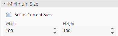
Chart minimum sizes
If resizing a chart to a very small size, it may become difficult to interpret, since the chart's text labels will remain a constant size and could interfere with the display of the chart itself. To prevent this issue, designers can set a minimum size in pixels for the chart using the Set as Current Size button and adjacent Width and Height drop downs under the minimum size section of the Chart design pane.
Legend and Text resizing behavior
Using the Set as Current Size button and corresponding spin boxes doesn't just affect the sizing of the chart's image. It also impacts the text used on a chart's axis, legend, and labels. The exact impact varies depending on whether or not you size your chart more than or less than the set minimum size.
Increasing the chart's size above the minimum size rescales the chart's bars, axes, etc., but the font size used for axis and legend text remains the same.
If the chart size is reduced below the minimum size, the entire chart, including the text, is scaled.
Setting the minimum size
The easiest way to change the minimum size is to resize the chart to an acceptable minimum size, and then click the Set as Current Size button. This action sets the pixel dimensions of the current chart size as the minimum size.
Note
The minimum chart size defaults to 100 pixels x 100 pixels. However, you will usually want to set their own values for the minimum size.
You may also set a minimum size by typing or selecting pixel values directly in the Width and Height spin boxes.
Once a useful minimum size has been set for the chart, reducing the chart's size below the minimum maintains the chart's general appearance, and prevents the text labels from swamping the rest of the chart, as shown below.
Note
Using this technique may result in charts with very small text sizes that may be hard to read. It's useful to note that segment infotips are not resized. Therefore, if a chart is very small and text or labels cannot be read easily, you can still hover over segments of the chart and see their value in the infotips that appear, as shown below.
In the following example, the chart and associated labels did not resize well, and the chart is very difficult to read.  Using the new minimum chart size feature, you can set the minimum size to 384 pixels x 195 pixels (as shown below). Now, when you resize the chart, it will remain readable.  |
Resetting a chart
You can remove custom formatting from a chart, returning it to its original state, using the Reset Options button on the CHART panel.
It should be noted that the following items are not affected by this command (and are, therefore, not returned to their original setting):
Chart type. If you changed chart types, this command does not revert to the original chart type.
Pivot table sorting. Sorting performed on the chart's pivot table must be changed directly on the pivot table.
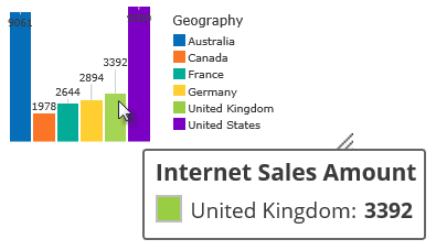
Tooltips
Tool tips show informative text when you hover your mouse pointer over data in a chart.
In most charts, tool tips show the value of all used measures and are color-coded to match the series colors of the corresponding chart. The measure used to control the chart display is bolded.
When a line, spline, area or point chart is used, all series values are displayed in the tool tips when hovering over a series data point. This feature provides a powerful way to compare data interactively.
Chart types that are only based on a specific number of measures (such as treemaps, word clouds, bubble charts, and pie charts) display all other measures from the same axis placeholder, providing more information and fostering additional data discoveries.
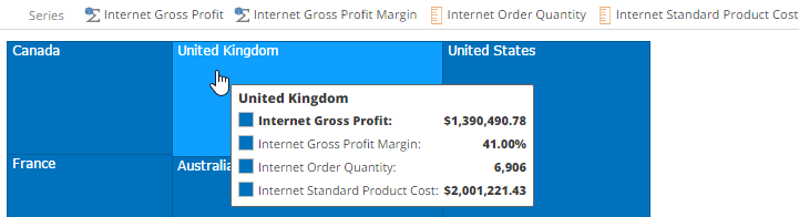
The following example shows a treemap that is based on the first measure (Internet Gross Profit). Notice that the tool tip also displays three other measures from the Series placeholder (Internet Gross Profit Margin, Internet Order Quantity, and Internet Standard Product Cost).
Specifying chart data independent of placeholders
Swapping rows and columns for chart series
You can swap a chart's horizontal axis and legend entries using the Swap Series button on the CHART ribbon.
This feature allows you to switch between using the Columns and Rows placeholders to determine series data in a chart.
You can simplify the appearance of a chart by displaying only specific series and series items, hiding all other chart information, by using the Select Data button on the CHART ribbon.
Specifying data on a chart can be performed in two ways: directly on a chart or via a chart's legend. Some charts support both of these selection methods, while other only support one or the other. Data may also be selected from the chart's underlying pivot table for some chart types.
When data is selected in a chart, other data not associated with the selection is made partially transparent, to provide a better visual representation of exactly what information has been selected.
Note
Treemaps do not use this transparent feature. Instead selected rectangles are given a black border. For more information on selection behavior with treemaps, see Manipulating Treemaps.
Selecting data directly in a chart or via the legend
In charts that support it, you can select items directly on the chart, which allows you to select single items in the same series or on different series.
Tip: You can CTRL-click to select multiple series items on a chart.
In the following example, two columns in a column chart has been selected (clicked) directly on the chart, causing all other columns (and legend entries not associated with the selected columns) to become transparent. Notice that the two columns are not of the same series, so could not be selected in the same fashion via the chart's legend.
In charts that use legends, you can quickly select all data in a series by clicking the corresponding legend entry adjacent to the chart.
In the following example, the Internet Sales Amount legend entry has been selected (clicked), and all associated data (in this case, columns) on the chart is also automatically selected. All other legend entries and columns become transparent, showing that they are not selected.
Understanding selection behavior (All chart types)
The lists below describe the selection behavior for all chart types available in Data Hub.
Chart and Legend Selection
The following chart types allow you to select data both directly on the chart and via the chart's legend:
All Column charts (Columns, Stacked Columns, 100% Stacked Columns)
All Bar charts (Bar, Stacked Bars, 100% Stacked Bars)
Pie
Pyramid
Funnel
Chart-Only Selection
The following chart types allow you to select data only on the chart itself, not via the chart's legend:
Treemap
Point
Bubble
Word Cloud
Legend-Only Selection
The following chart types allow you to select data only on the chart's legend, not directly on the chart:
All area charts (Area, Stacked Area, 100% Stacked Area
Line
Spline
Selecting Data from a chart's pivot table
When a chart's pivot table is visible, you can use it to select data on the chart (for some chart types).
Note
For information on how to display a chart's pivot table, see About Viewing a Chart's Pivot Table.
You can always click a table heading to select the data in the corresponding column or row.
In the following example, the Internet Tax Amount column heading has been clicked, and the corresponding information on the chart has also been selected.
While designing a chart, you can click either the table heading or the corresponding row selector or column selector (the area between a table heading and the first cell in the row or column) to select the data in the corresponding column.
For more information on using column and row selectors, see Choosing Ranges of Cells in an Analysis.
In the following example, the Internet Tax Amount column selector has been clicked, which selects all of the contents in the column, and the corresponding information on the chart has also been selected.
Map charts
Customizing a Map Chart
This topic describes the customization options available for both map bubble and map shape charts.
Proceed to one of the topics below for more information:
Customizing a Map Bubble Chart
Customizing a Map Shape Chart
Customizing a Map Bubble Chart
You can also customize a map bubble chart using any of the following options, as desired:
Use the Size button on the DESIGN ribbon to customize the size of the bubbles to improve the overall display of the map.
Use the order of items on the Columns and Rows placeholders to control the display of the map. In the example above, the items in the Columns placeholder are arranged to show different colors for different years, as shown below.
You can reverse these entries to display a single color for all entries, since the bubbles are now based on the Cases measure. In this example, the original Year function placeholder item has been replaced with a the Year attribute.
Use the Show Label button on the DESIGN ribbon to view labels within individual bubbles, if the bubbles are large enough to contain the labels. Otherwise, the label is automatically hidden.
Customizing a Map Shape Chart
When creating this type of chart, an additional placeholder (called Shapes) is present, which allows you to define the shapes that the chart will use.
You can perform the following actions using this placeholder's context menu:
Right-click the placeholder label to create a new shape resource or select an existing shape resource for the chart.
Right-click a shape resource on the placeholder to open the shape resource or remove it from the placeholder.
Left-click a shape resource on the placeholder to open the SHAPE LOOKUP dialog box.
This dialog box allows you to choose which member property (for example, state, county, zip code, etc.) to use to map to the shape's key property. The shape's key property is chosen when the shape resource is created. Selecting the Automatic Mapping check box disables the drop-down for selecting a member property, and instead tries all available member properties to find a match with the shape's key property.
The shape resources themselves are stored in the Shapes subfolder, which can be found in the RESOURCE EXPLORER within the main System Content folder (shown below). Although ZAP Data Hub includes a limited number of predefined shape resources, as shown below, you can add shape resources based on custom shape files, as needed, to create custom shape charts.
Using Map Chart-specific Features
Several options are only available when using either the map bubble or map shape charts. These options are described below.
Using the MAPS Ribbon
The MAPS ribbon only appears when viewing a map bubble or map shape charts.
The following buttons are available:
Show Tiles. Controls whether or not to display map features on the chart.
Show Missing. Displays an icon if any data cannot be properly plotted on the map. When hovered over, the missing data appears in a tooltip.
Auto zoom. Controls whether to automatically zoom the chart to display all the data.
Viewer zoom. Controls whether the map can be zoomed in the ZAP Data Hub resource viewer or mobile views.
Theme. Specify the appearance of the map, including such options as Satellite and Pencil.