Analysis Resources
Analysis Reports
We previously introduced the fact that Analysis Tables and Analysis Charts are two different views of the underlying Analysis Reportresource type. Starting with an Analysis Table, you can hide the table and show the chart to translate it into an Analysis. The Resource Explorer would then use a different icon, but it’s still the same Analysis Report resource. You may also elect to show both the table and the chart, in which case the Resource Explorer would show the table icon.
As you translate a table to a chart or vice versa, formatting translates between the two, and placeholder contents remain unchanged, which is to say the query against the data model remains intact. We may call this the query design of the resource. The query design includes the Rows, Columns, Filters, and Slicer placeholders, in addition to the Conditional Formatting and Cell Calculation placeholder, which we will discuss under Analytic Functions.
Analysis Slicers
Let’s use this as a jumping-off point to discuss the Slicer placeholder in more depth, given it is an important component of the query design. To start with, you may be wondering how to choose between Slicer types. Returning to the Analysis Report we built earlier, right-click on the single tab in the Slicers placeholder to show the placeholder tab menu. You can see this in the following.
Given the Calendar YQMD Month level is from the Date dimension, we are presented with five options instead of the usual three. The two additional slicer types are:
Date range – which provides a Start and End drop-down
Time context – which only provides context to special Analysis Functions as we shall see
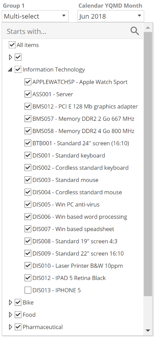
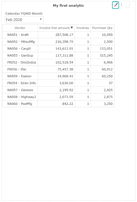
The Inline, Single-select, and Multi-select slicer types should all be self-explanatory. However, you may like to experiment with the Inline type to see how it present in your Analysis. For now, select the Multi-select option. Now expand the drop-down over the table, as in the following image.
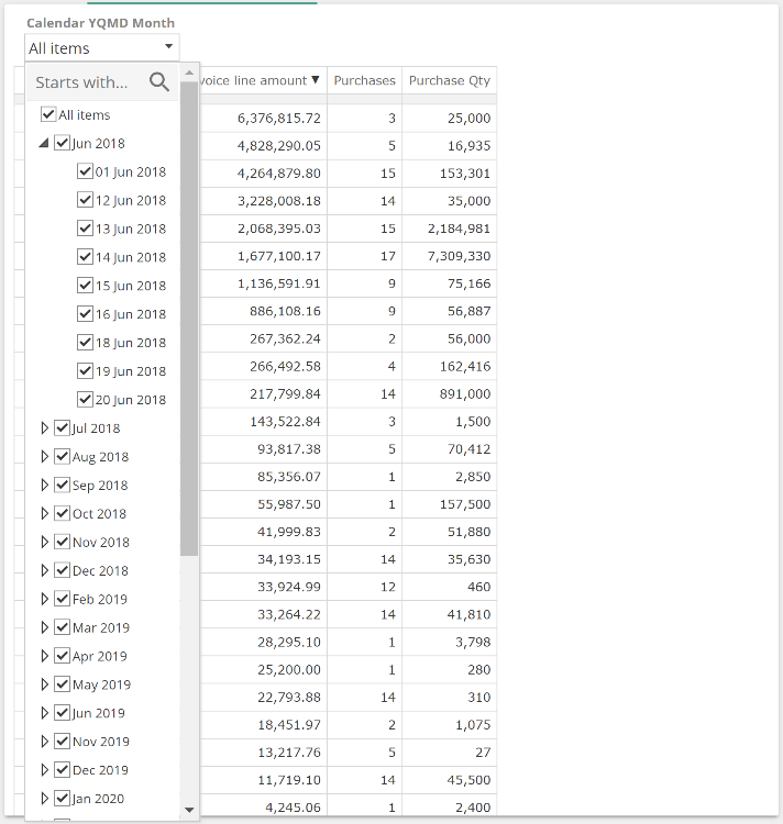
The first thing to note is that the default selection state for a Multi-select slicer is all checked. The second thing to note is that we can expand the individual months. Because we dragged the Calendar YQMD Month level from the Calendar YQMD hierarchy, we are automatically presented with a hierarchical slicer that can expand to any lower level in the hierarchy. Had we used an attribute instead (which only has a single level), this would not have resulted in a hierarchical slicer.
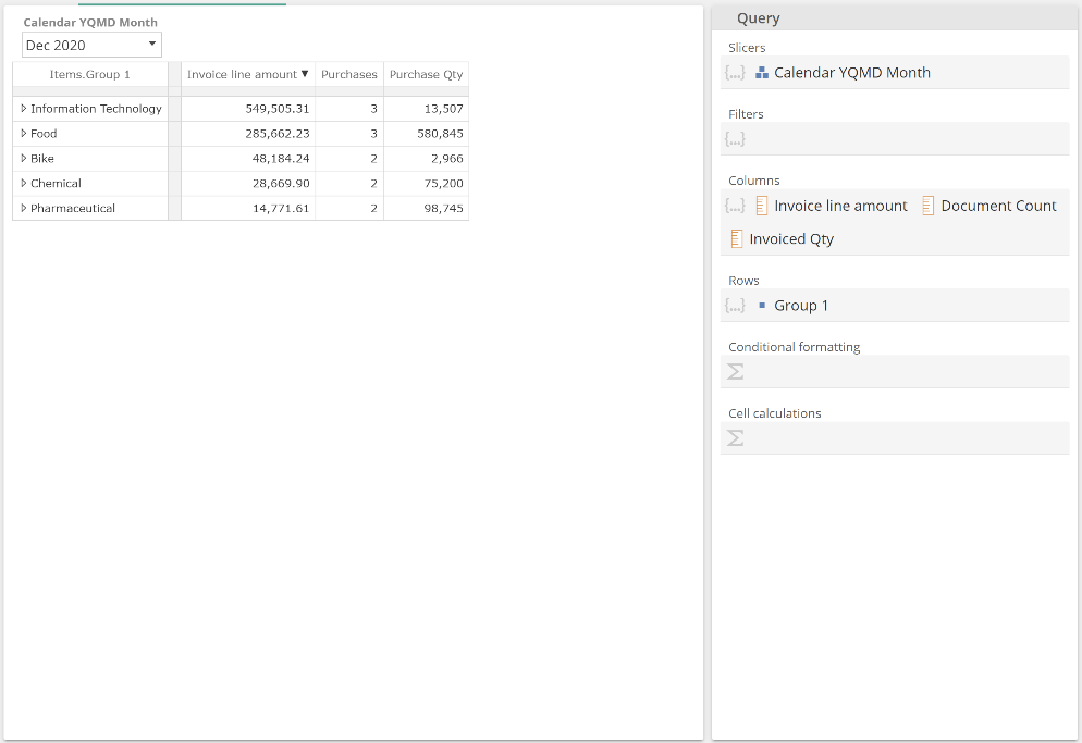
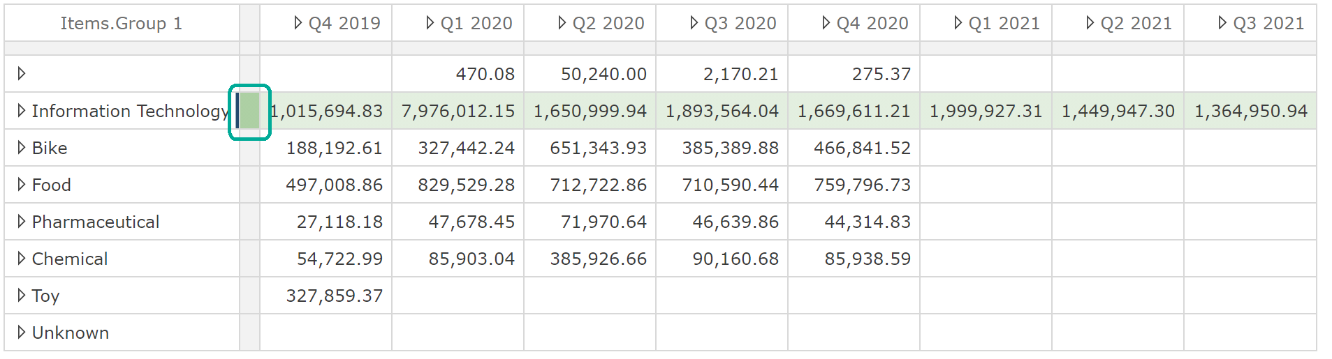
It is now time to pay particular attention to the date members under Jun 2018, or maybe it already struck you that there are more than nine days in most months. Slicers only show members with data. This auto-filtering is based on the measures on the Rows, Columns, and Filters placeholders of the Analysis Report. Let’s see what happens when we place another slicer before the existing Calendar YQMD Month slicer. We’ll use the same Group 1 level that we used previously from the Items.Group 1 hierarchy (and in turn Items dimension). Be sure to place the incoming level before the existing tab and then select only the Information Technology member, as in the following image.
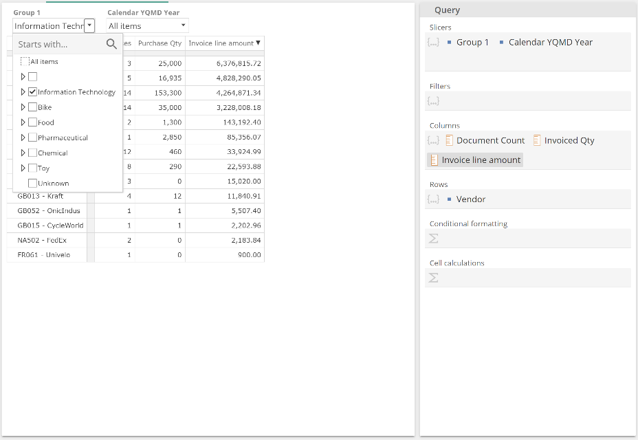
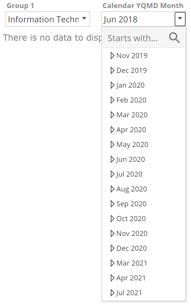
If we now show the Calendar Calendar YQMD Slicer drop-down we see that the Jun 2018 member is not in the list.
 |
We see here that Slicers only show members with data for the given measures on the Analysis Report and given selections on any prior slicer.
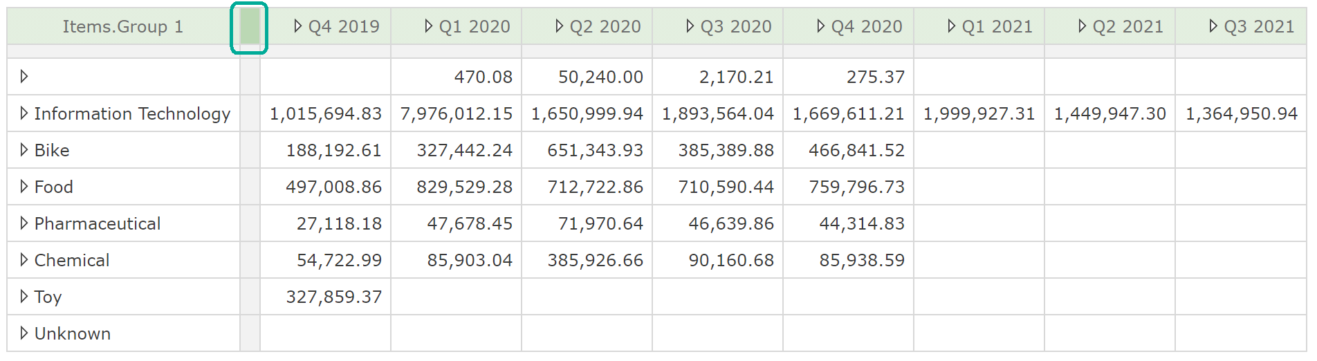
The last Analysis Report slicing concept we will introduce is four-state checkboxes. As the data of the underlying model updates over time, you may find the slicer members similarly updated. Let’s use our new (item) Group 1 slicer to discuss this point. We will make multiple slicer selections to aid the example, as in the following image.
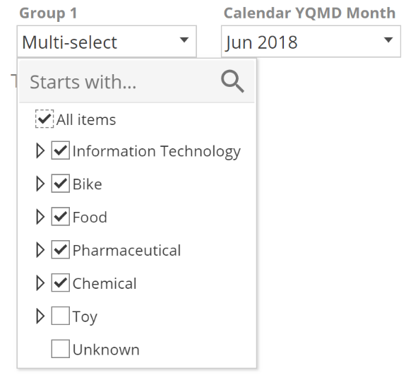 |
Let’s imagine a new group is introduced into the data, and we are opening the analytic for the first time since this introduction. Should the incoming group be included in the existing selections or not? That is, do we want all items, except Toy and Unknown OR only ever the selected items (Information Technology, Bike, Food, Pharmaceutical, and Chemical). Both options can be accommodated using the following techniques:
All items, except Toy and Unknown – first ensure the All items parent item is checked, now uncheckToy and Unknown. Observe that the All items parent’s border is now dashed and checked.
Only ever the selected items – first ensure the All items parent item is unchecked, now check Information Technology, Bike, Food, Pharmaceutical, and Chemical. Observe that the All Items parent’s border is now dashed and unchecked.
As you can see, by introducing dashed-checked and dashed-unchecked, we now have four states, and the two additional states give us the ability to manage how incoming members are treated. In this example, the All items option was the parent. It is also possible to use the same technique in a hierarchical slicer with a member serving as the parent. For example, we may wish to decide between the all-except and selected-only states for the children of the Information Technology member. The following image provides an example where we have elected for all InformationTechnology children except DIS013 (dashed and checked).
 |
We will introduce additional resource and function-specific slicer functionality in future sections, but for now, let’s quickly define a drill-through target for our Analysis Report.
Analysis Report drill-through targets
Recall that we defined the drilling-through navigating to different resources to provide an alternate view of the selected data. Let’s first create a trivial alternate view. Take My first analytic and swap the Vendor level for the same Group 1, as in the following image.
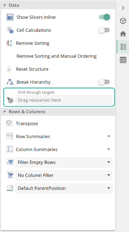
Save this resource as My first drill-through target. From the Edit menu, click Data to show the Data design panel.
 |
Note the Drill-through target's resource placeholder as in the following image.
 |
Now click the Resource Explorer button, navigate to your newly saved resource, then click and drag this resource to the Drill-through targetsresource placeholder, as in the following image.
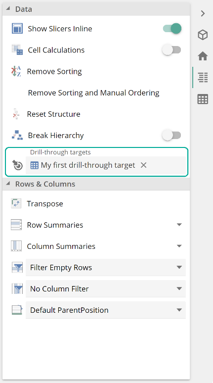 |
If you right-click on a row header, you will now see a new option in the header menu.
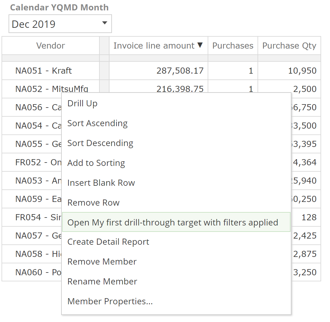 |
Selecting this option now presents an alternate view of the data. The view that you designed and saved as My first drill-through analytic.
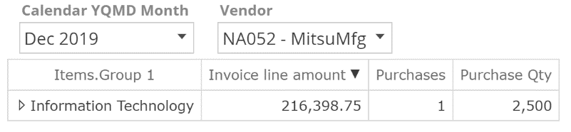 |
The first thing to note is that conveniently our Calendar YQMD Month slicer selection in My first analytic has transferred corresponding slicers in our target. You will also note that there is a new Vendorslicer, keeping in mind that My first drill-through targetdid not include a Vendor slicer. This is in place because the Rows, Columns placeholders of the starting Analysis Report are all translated into slicers on the drill-through target. Moreover, where possible, the selections themselves are transferred. From My first analytic, we right-clicked on NA052 – MitsuMfg, and you can see that this is now the default selection of the Vendor slicer in our alternate view. Some advanced Analysis Report designs preclude this transfer of selection, but this is beyond the scope of this document.
Our example presents a trivial alternate view, but the Drill-through targetsplaceholder supports most resource types, including dashboards. Whether or not a drill-through target is specified, the header menu will always offer the Create Detail Report option we saw in the Consuming analytics section. The generated Detail Report provides the most granular presentation of data (recall our sand and sandstone analogy).
Analysis Tables
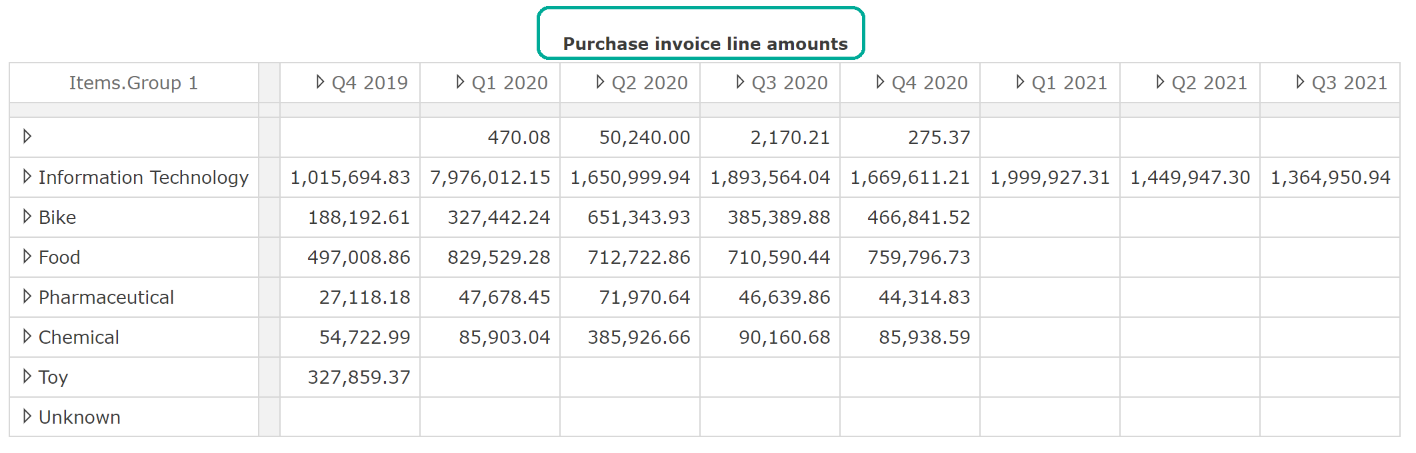
Let’s now talk to the specifics of configuring the table of an Analysis Report. To start with, recall that our first step to creating our previous table was to drag a measure to the Columns placeholder. You will always want to specify a measure in a table. That measure may be on either Rows or Columns. Less obviously, it may also be specified on the Filters placeholder. A measure on the Filters placeholder results in every cell of the table being for that measure, but there will be no header to indicate the name of the measure. This can be seen in the following example using our favorite levels.
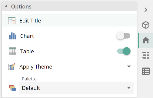
Note that there is no indication on the table itself that the values are Invoice line amounts. In such a scenario, you would usually name your resource appropriately. You may add a title at the top of your analytic using the Edit Title option from the Home panel as in the following.
 |
Another more advanced option is to omit the Analysis Report's measure and have it inherited from a containing dashboard or report pack. The containing resource would then specify the measure using its own Filter or similar placeholder, as we will see in future sections. Listing all these different techniques should serve to emphasize that a table (and a chart for that matter) requires that a measure be specified, even if that measure is inherited (as in the dashboard example).
Having said this, a measure-free Analysis Report is often the mid-point on a journey to a completed resource, and it is important that as a designer, you get feedback on this journey. For this reason, Data Hub will always attempt to generate a table for a given query design, and it may do so by inferring a measure based on the attributes in use. Where this is the case, Data Hub will display a warning.
Table formatting
Formatting in Data Hub is a matter of selecting cells and headers, then interacting with the relevant Table panel options. You can format multiple cells and headers at a time with Ctrl-click and Shift-click for cell or header ranges (as in Excel). Take a minute to familiarize yourself with the formatting options within the Table design panel by hovering over each icon.
 |
Tables also provide selectors. Selections made with the selectors are not equivalent to individual cell selection.
A column selector selects the whole column and not just the column's current cells.
A row selector selects the whole row and not just the row's current cells.
The all-column-headers selector selects all column headers, not just the current set of column headers.
The all-row-headers selector selects all row headers, not just the current set of row headers.
Select table selectors selects the whole table.
The combination of table, column, row, and cell selections allows you to overlay formats (in the order just provided), as in the following image.
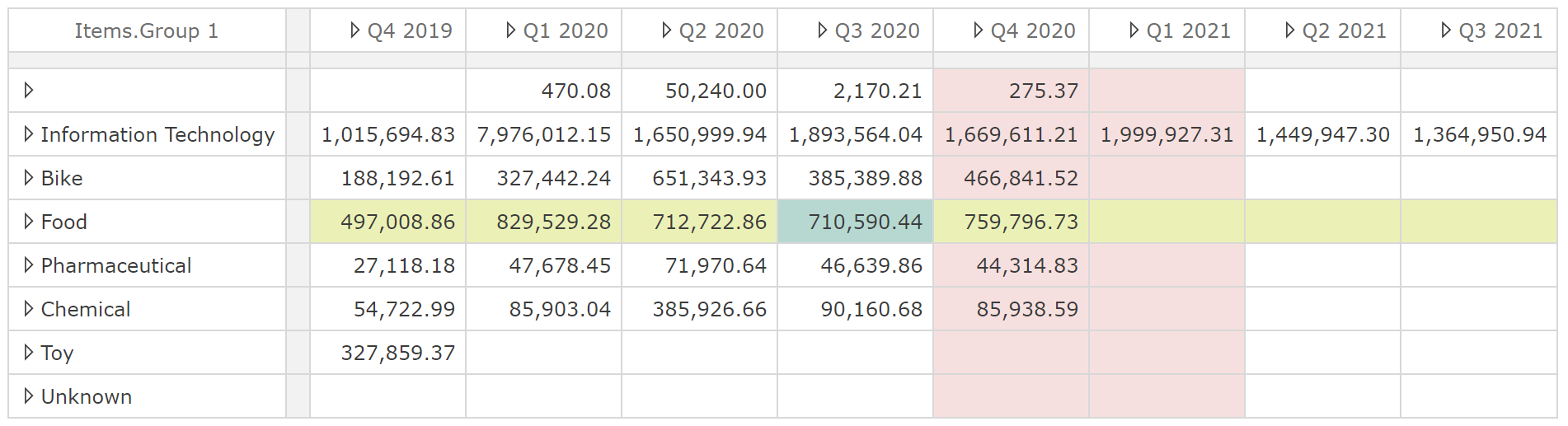
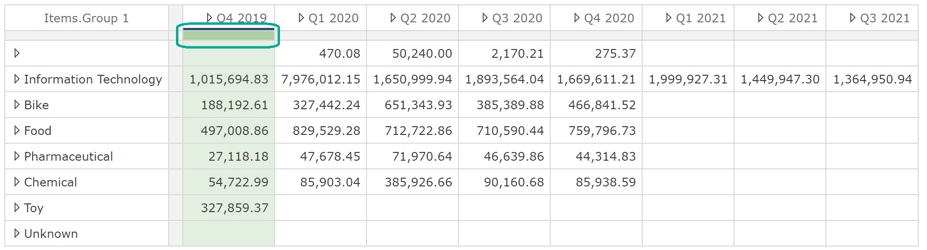
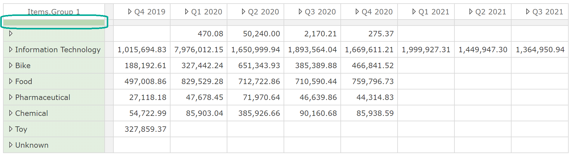
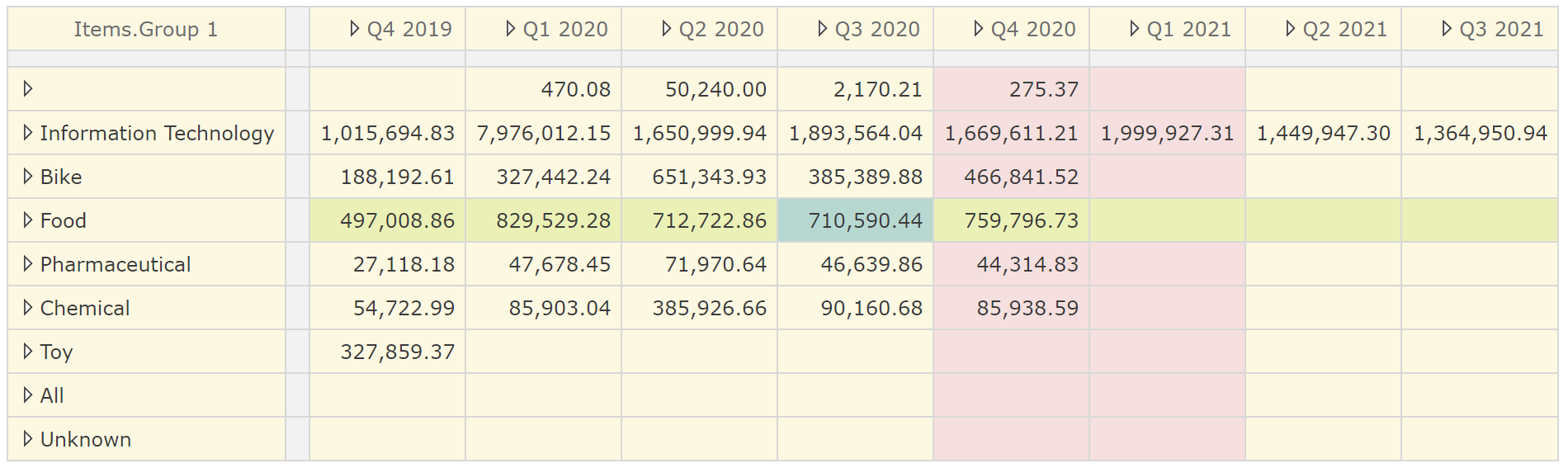
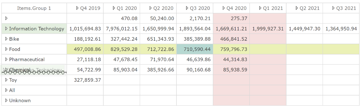
This example provides us an opportunity to introduce an important concept. Formatting is against the member or measure and not the row/column index. We can demonstrate this and another feature simultaneously, specifically blank rows/columns: Right-click Q3 2020 and select Insert Blank Column from the header menu. The result is shown in the following image.
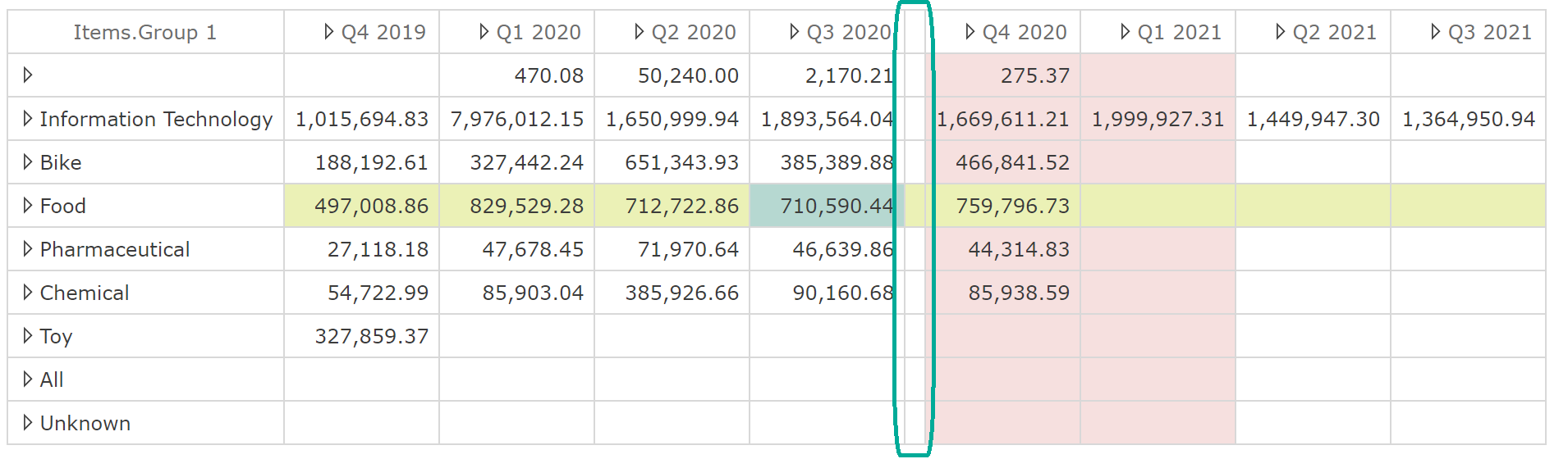
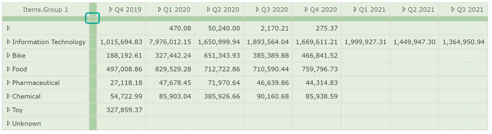
By inserting a blank column after Q3 2020, Q4 2020 is now the sixth column instead of the fifth (excluding the row-headers column). Importantly, this index change did not affect the formatting of Q4 2020 (or any column to the right of it) because, as stated, formatting is against the member or measure. This applies equally if a row/column is defined as a combination of members, as was the case when we combined item groups and vendors on the Rows placeholder.
This fact is obviously important when you add blank rows/columns to your tables. It’s also very useful when you change your table's query design. For example, you may have invested heavily in formatting before identifying a requirement to change the Rows placeholder. Row members that still exist on the table after the change will still be formatted in such a case.
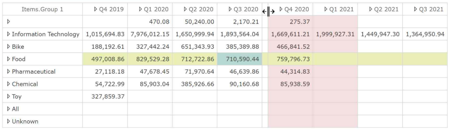
Blank rows/columns are of particular value for formatting statutory reports. They start quite thin, so the first thing you may like to do is resize them. You can resize any column or row by hovering over the right-hand border (or the lower border for rows). A resize icon will show, as in the following image.
If you choose to resize a non-blank column, the fixed-width may cause issues for new data values over time. You can restore a column to a dynamic (fit-to-contents) width by double-clicking the same border that you used to resize. Having inserted a blank column, you can also remove it from its header menu using the Remove Blank Column option. This brings us to removing columns and members. Both options are available from the header menu.
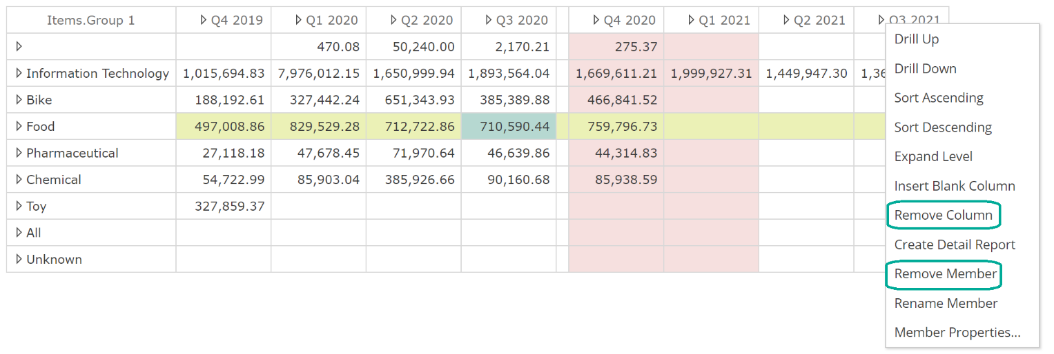
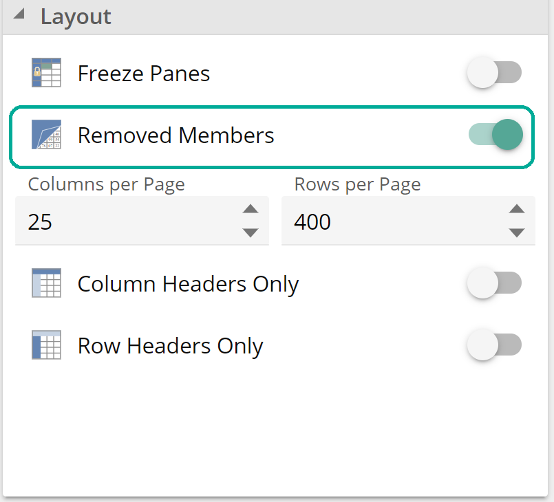
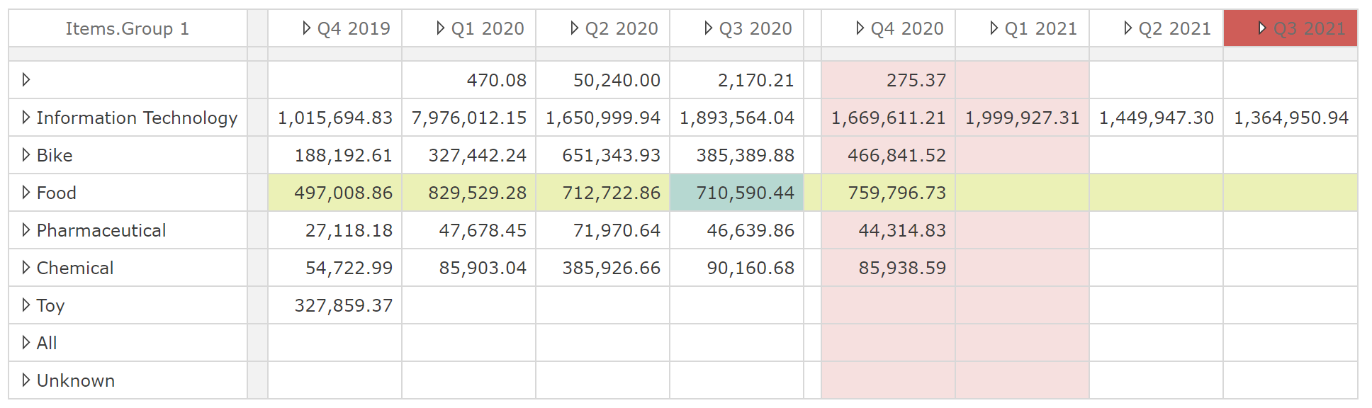
Remove Column works the same as Remove Blank Column. Whilst Remove Member will remove all occurrences of the member associated with that column (Q3 2021 in this case). Recall if we combine on a placeholder, each member of one hierarchy is combined with each member from the other. In this scenario, Remove Member ensures all given member combinations are removed from the rows or columns. You can reinstate columns and members by selecting Removed Member from the Table design panel, as in the following.
 |
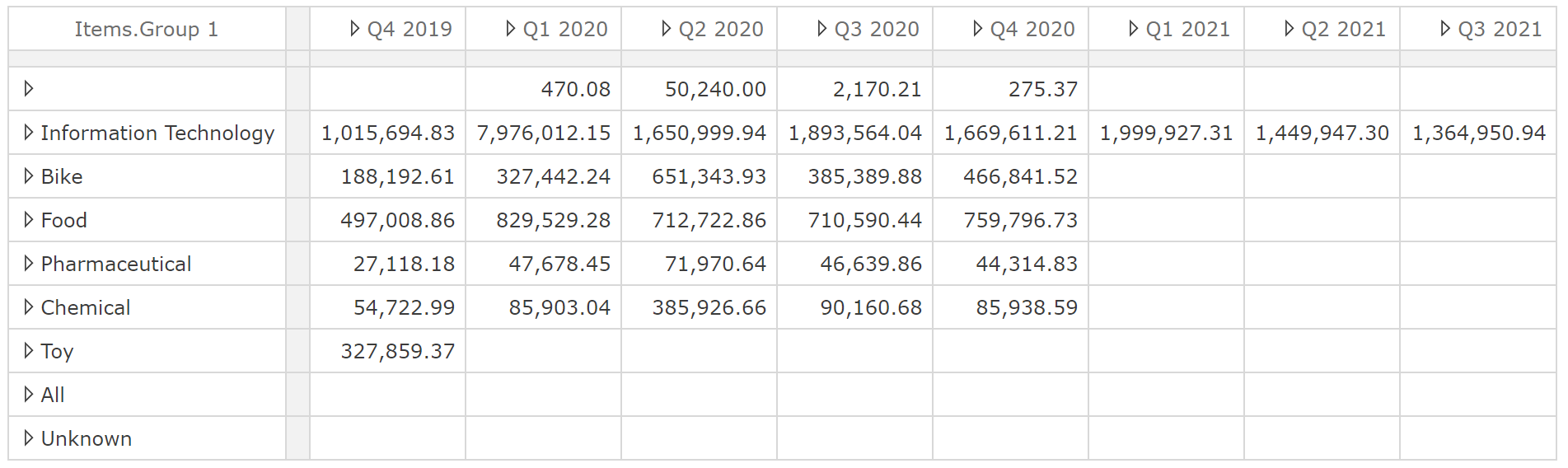
Assuming we had removed Q3 2021, the table would show as in the following, with removed members in red.
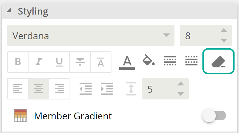
There a few more important points on formatting to cover, and then anything we haven’t covered should be intuitive based on what we’ve covered above. To start with, to clear formatting, you must first make a selection, then click the clear formatting button.
 |
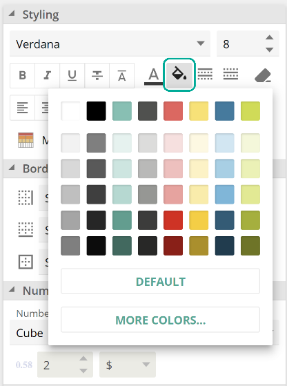
This is relatively simple; however, there are two subtleties to be aware of. To start with, given formatting is against the member or measure; it’s possible that a formatted member is not currently showing on the table. Clicking the clear formatting button without a selection will clear formatting for all member combinations currently showing. If you want to remove all formatting for a table, use the table selector. Recall if you use the table selector, any columns, row, and cell formatting will still be layered on top. However, when using the table selector to clear formatting, it will clear all table, column, row, and cell formatting. To illustrate this point, let’s first use the column selector to change the whole table’s background color to yellow. First, click the table selector.
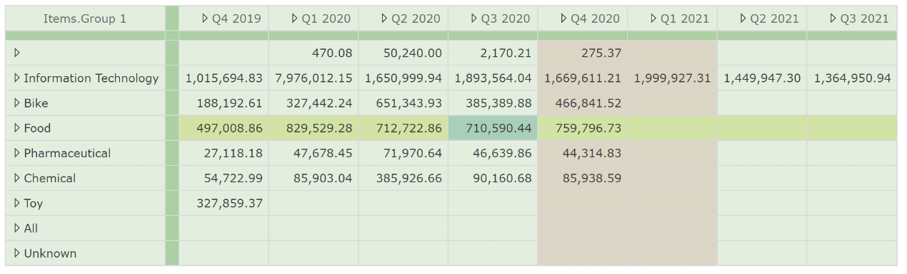
Apply a background color.
 |
And observe the results.
The table selection did not affect the existing row, column, and cell formatting. Now click the table selector again, followed by the clear formatting button. The result is shown in the following image.
If we combine the table selector with the clear formatting button it will, clear all row, column, and cell formatting, but at all other times, the table selector only affects table-level formatting (leaving the row, column, and cell formatting layers untouched).
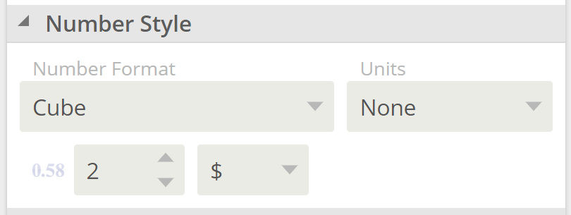
The Number Style options (from the image below) work the same as formatting.
 |
The only pertinent point here is that you cannot apply number formatting at the cell level. Take a minute to familiarise yourself with the Number Style options using the tooltips.
We haven’t yet discussed that there is also a cell menu available on right-click in addition to the row/column header menu. The available options should be familiar except for one.
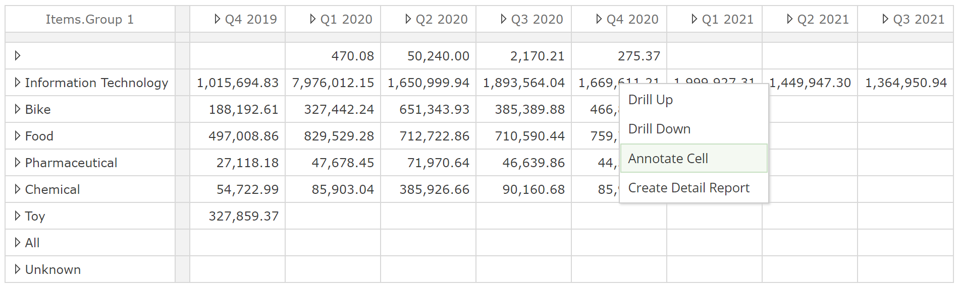
Annotate Cell allows you to provide commentary on individual cell values. As with formatting, annotations are against the member measure, but here we get to extend that concept a little because we can see formatting (all formatting) is actually against the member (or measure) combination on the table. In this case, it is against the combination of the Q4 2020 member and the Information Technology member. Importantly, the Invoice line amounts measure that is not visible on the table (because it is specified in the Filters placeholder) is not included in the formatting combination. This allows you to change the Filters and Slicer selections without affecting formatting. You may want to experiment with this concept to see how annotation is reflected. However, you will also find this operation is very intuitive as you continue to work with tables and charts.
And finally, having walked through all of the formatting options, you may be wondering how -one might configure conditional formatting and add sparklines (small in-cell charts). We will talk about this topic once we introduce Analytic Functions.
Table data
Let’s now talk to features that affect the data in the table's data beyond what the placeholders define. Consider that data includes row and column header contents. There is sensibly some overlap between this topic and the previous table formatting topic. We’ve already introduced a few features that already affect the table data (for example, remove member/column).
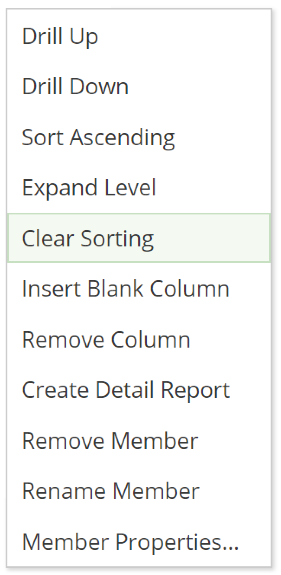
Let’s ease into this with something we’ve already introduced, sorting. Recall you can sort rows for a given row or column with the Sort Ascending and Sort Descending options from the header menu. Once sorting is applied, a Clear Sorting option will be available on the same menu.
 |
Clearing all sorting applied to a table is available from the Data design panel, as in the following image.
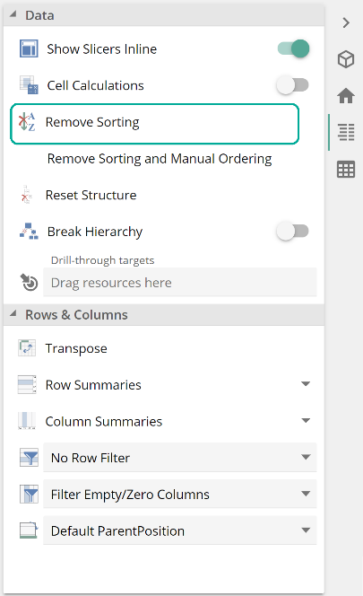 |
That’s easy. A more interesting option is the Remove Sorting and Manual Ordering button immediately below Remove Sorting. What is this manual ordering you speak of? Occasionally you may want to order the row or column headers manually, but not based on their data values (as that would be sorting). Pay particular note of how we’re differentiating ordering and sorting here. For example, let say we want to reorder the rows so that the Information Technology row is below the Chemical row. You do this by clicking and dragging the header below Chemical so that arrows appear, as in the following image.
This feature is particularly useful where levels are used on the Rows or Columns placeholders because levels do not control the order of members. Instead of using members to define rows or columns, you could have specified the required order of members in the placeholder itself. This leads us to an issue. If you choose to use reordering, and if your Rows or Columns placeholders have multiple tabs, you may find it difficult to reconcile your table with its definition. For this reason, we recommend that you use reordering judiciously, and you could say the same of the Rename Member option for similar reasons. Once you have applied reordering, you can remove all sorting and ordering with the Remove Sorting and Manual Ordering button. It is worth noting that if you want to change the order of members within a level, and not just on the table, this must be done in the model itself.
Returning quickly to sorting, recall in a previous example we combined two different hierarchies on the Rows placeholder to demonstrate how different hierarchies are combined on the table. Recall each Item.Group 1 member is combined with each Vendor member, so we now have vendor purchases for each item group. Previously we removed sorting to simplify the example, but let’s now look at the result when we reinstate sorting.
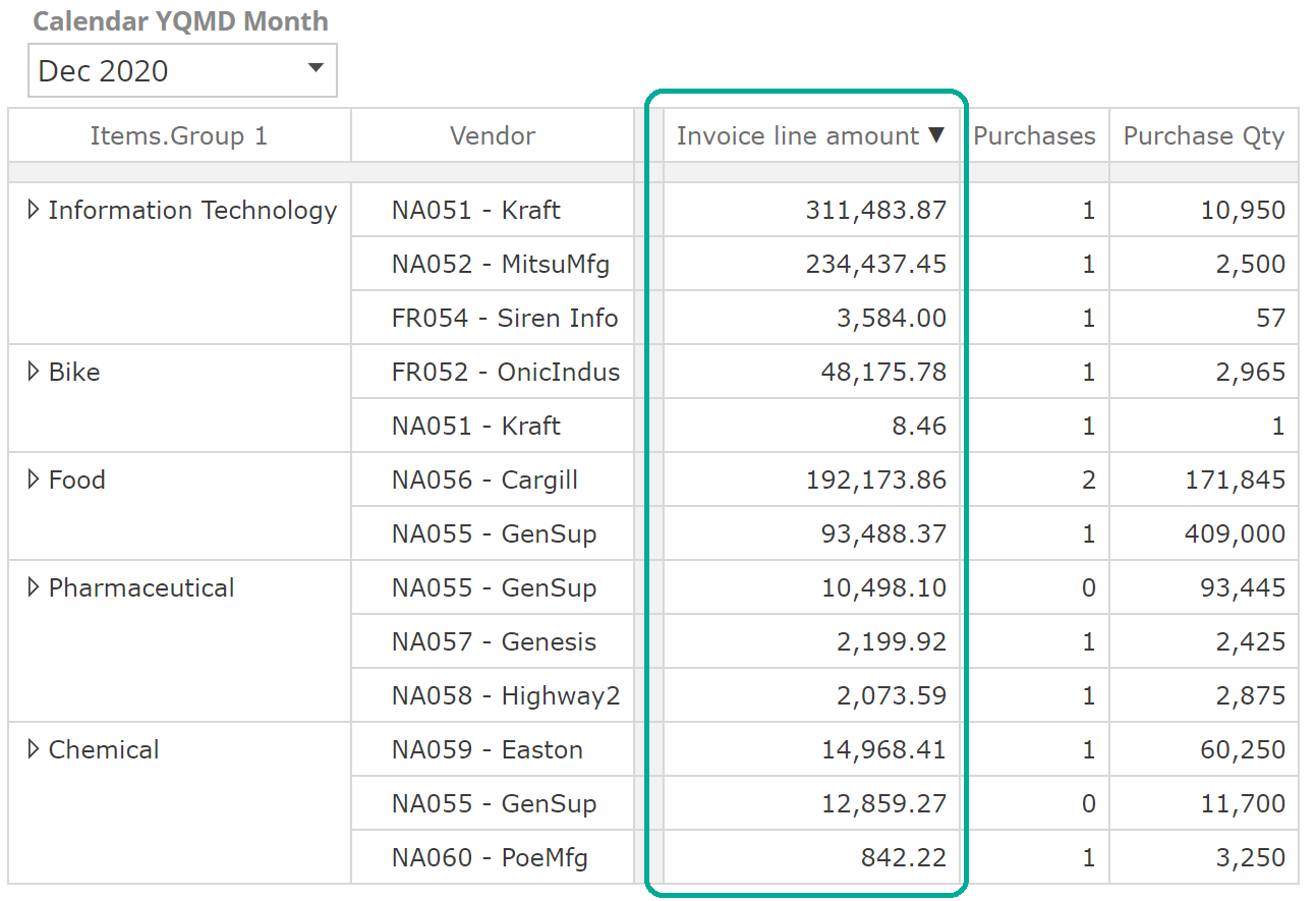 |
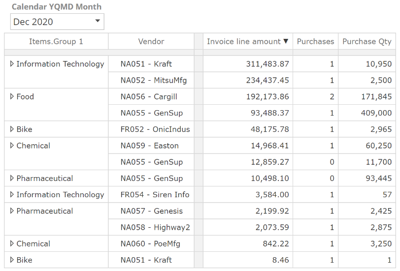
As you can see, the vendors are sorted within each item group's context. This may or may not be what you’re looking for. If this is not what you require for a given table, you can change this behavior with the Break Hierarchy option.
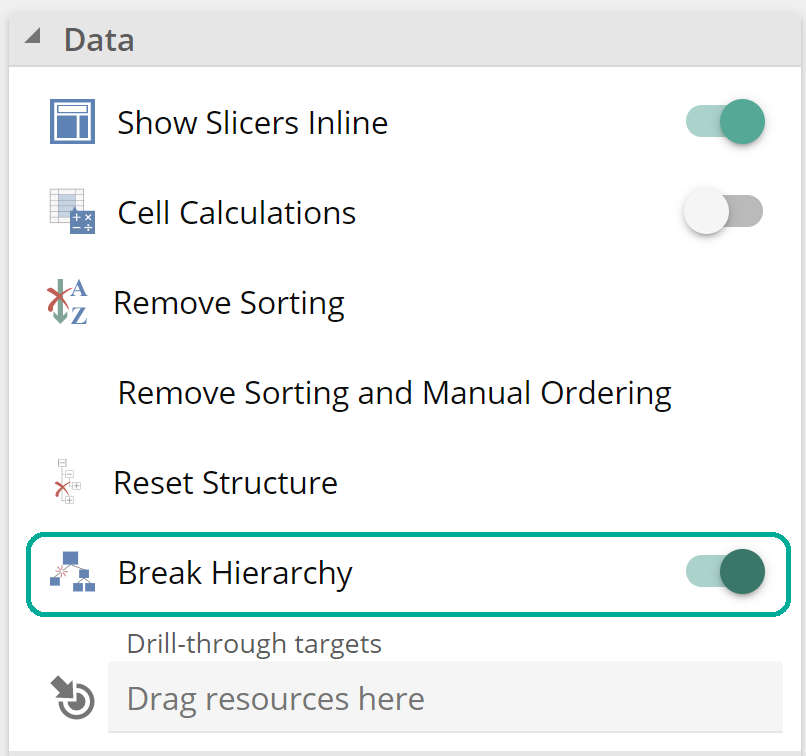 |
With this option enabled, the table now appears as in the following image.
Let’s now look at filtering the data. We will see advanced solutions to filtering once we introduce Analytic Functions, but the table itself can satisfy most filtering requirements through the following options from the Data design panel.
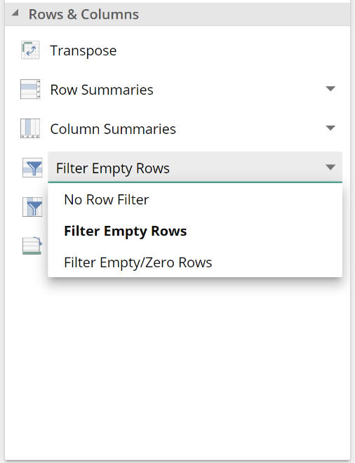 |
The default filter is Filter Empty Rows and No Column Filter for new Analysis Reports.
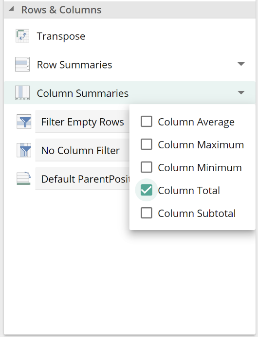
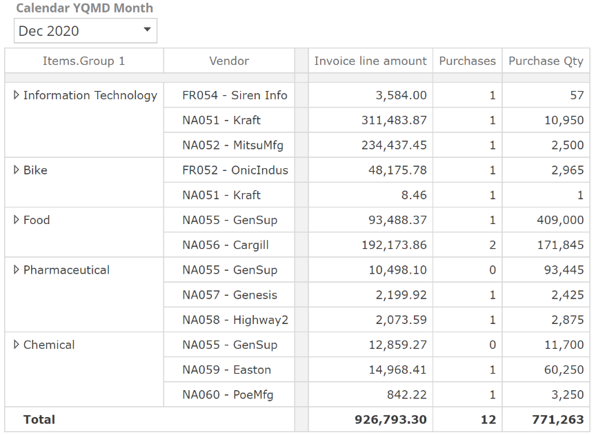
As with filters, we will see advanced summary capabilities in later sections, but let's look at what the table itself provides. We will take our previous example and apply a Column Total as in the following image.
 |
The result is as expected.
 |
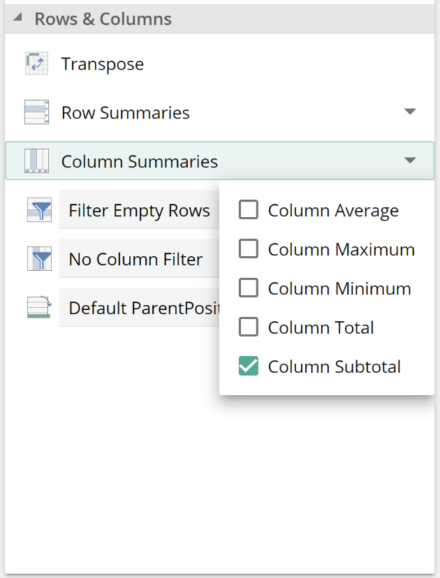
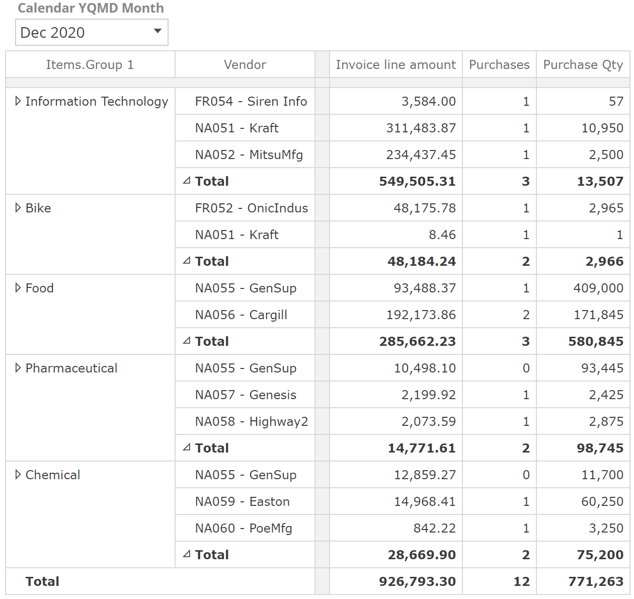
Column Subtotals are a little more interesting.
 |
The result is as follows.
 |
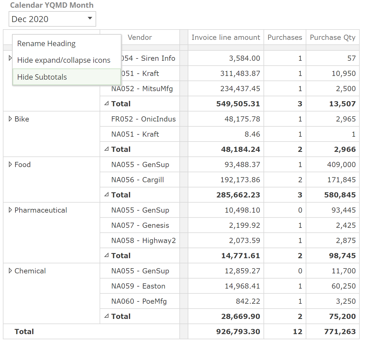
And what makes subtotals interesting is that you have control over which totals are provided. There is now a new option in each hierarchy's column header menu (keep in mind subtotals were applied to columns).
 |
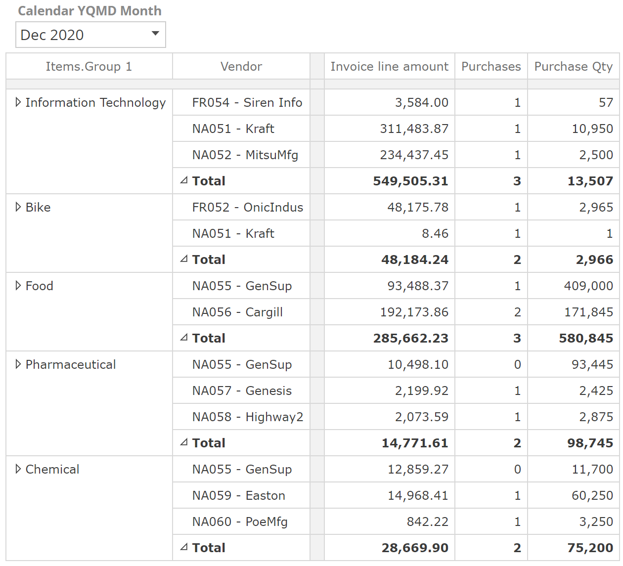
The result of hiding the Items.Group 1 subtotals are as follows.
 |
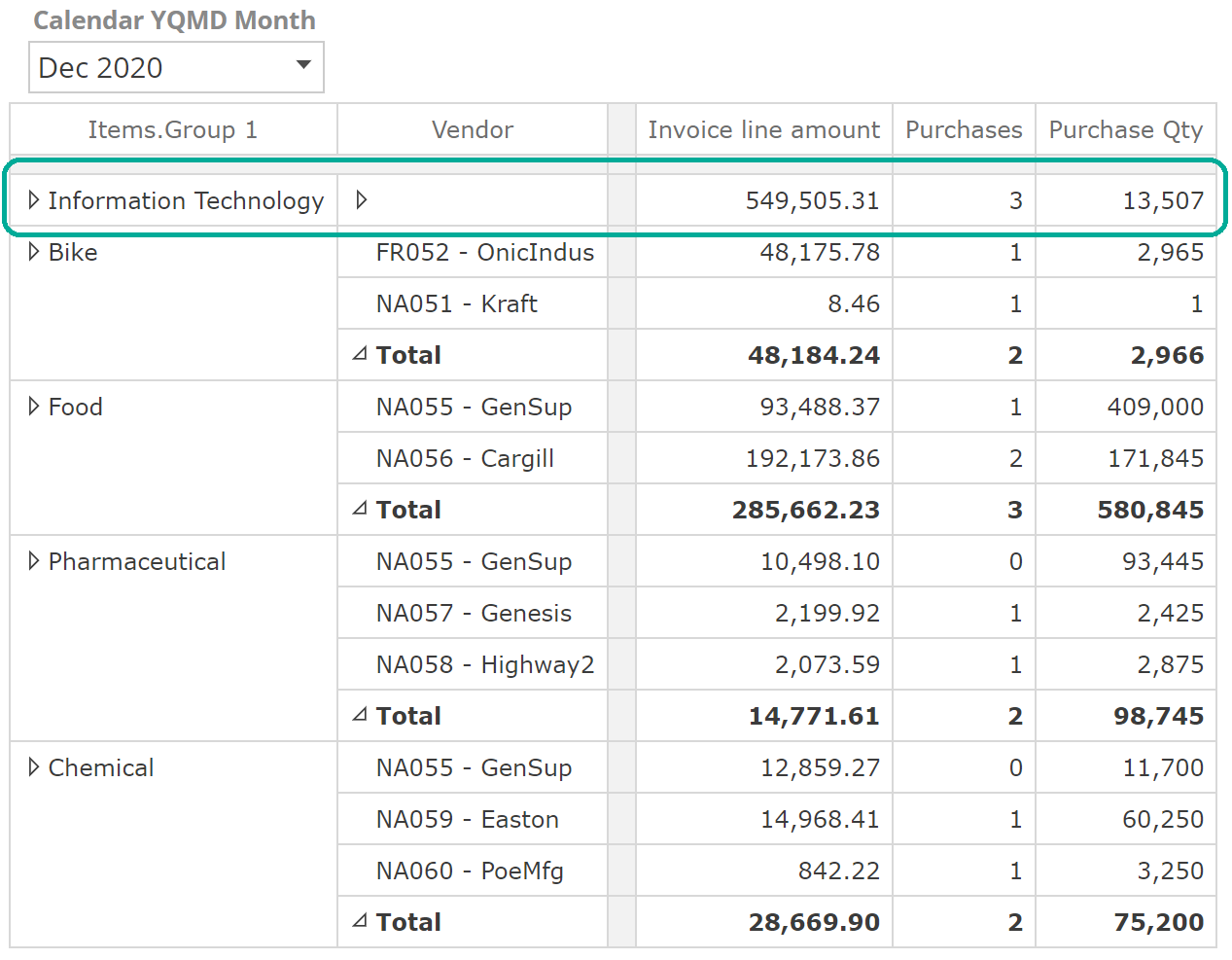
You can also collapse the members for a given subtotal by clicking on the small triangle in the relevant Total cell. In the following, we’ve collapsed the subtotal for Information Technology.
 |
There is also a new Collapse All Subtotals option on the right-click menu of all Total cells, should you want to collapse the members in bulk. You can see that introducing the ability to expand and collapse subtotals provide capabilities similar to what you expect with a hierarchy (recall how we were able to example, the quarter, month, and in turn, date members of the Calendar hierarchy). This is a useful capability, but it is important to be aware that subtotals' performance impact can be considerable because the Analysis Report has to perform calculations that the model is far better suited for. So as a heuristic here, if you find yourself using subtotals for many rows or across many different Analysis Reports, considering requesting model changes to add the relevant hierarchy instead.
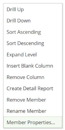
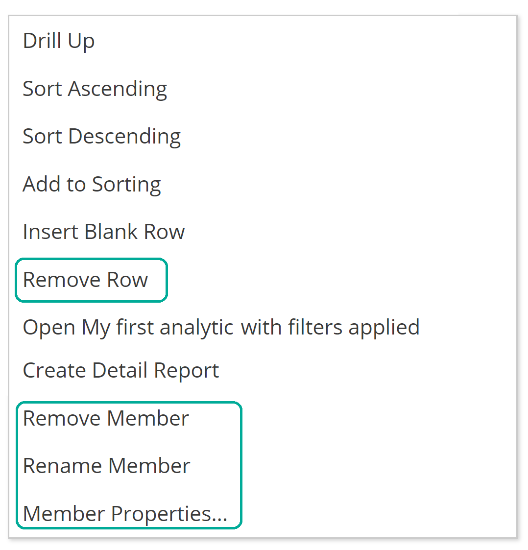
At this point, we’ve covered all the important items from the header context menu except one. As an aside, please refer to the documentation for anything not covered in this article. As of now, that outstanding menu item is Member Properties.
 |
But first, we need to introduce member properties. When we discussed the dimension tree, we alluded to a few additional item types to be introduced throughout this article. One such type is a member property. A member property is like an attribute in that it describes a measure; however, it cannot be used on rows, columns, or as a slicer. Instead, member properties are used to add information to header cells or include descriptive values in a table's cells. Let’s see a quick example before we discuss how they are used. We’ve taken our earlier vendor report and mixed it up a little in the following image.
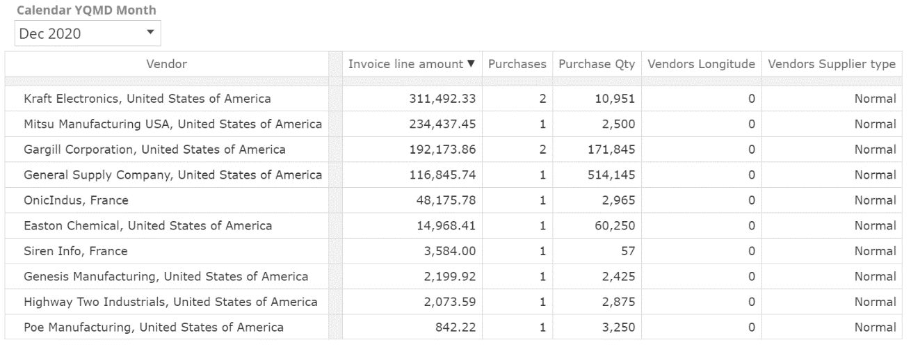
Note that the row headers now include the company name (not a code) and the country base. You can also see the Vendors Supplier Type column includes descriptive values instead of numeric values. So with these changes, we used member properties to describe the existing measures further, but the Vendor attribute is still used to differentiate the rows.
Let’s first look at the header rows. From the header menu, we selected Member Properties and then configured the Member Properties popup as in the following.
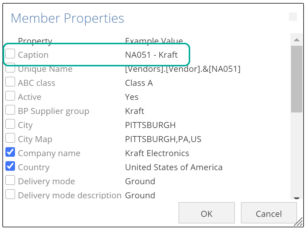 |
Note that Caption is now unchecked. Rows default to showing the attribute’s Caption (NA051 - Kraft), but here we’ve elected to show the Company name instead (Kraft Electronics). Country is checked. The result of these changes is the row headers for the previous image.
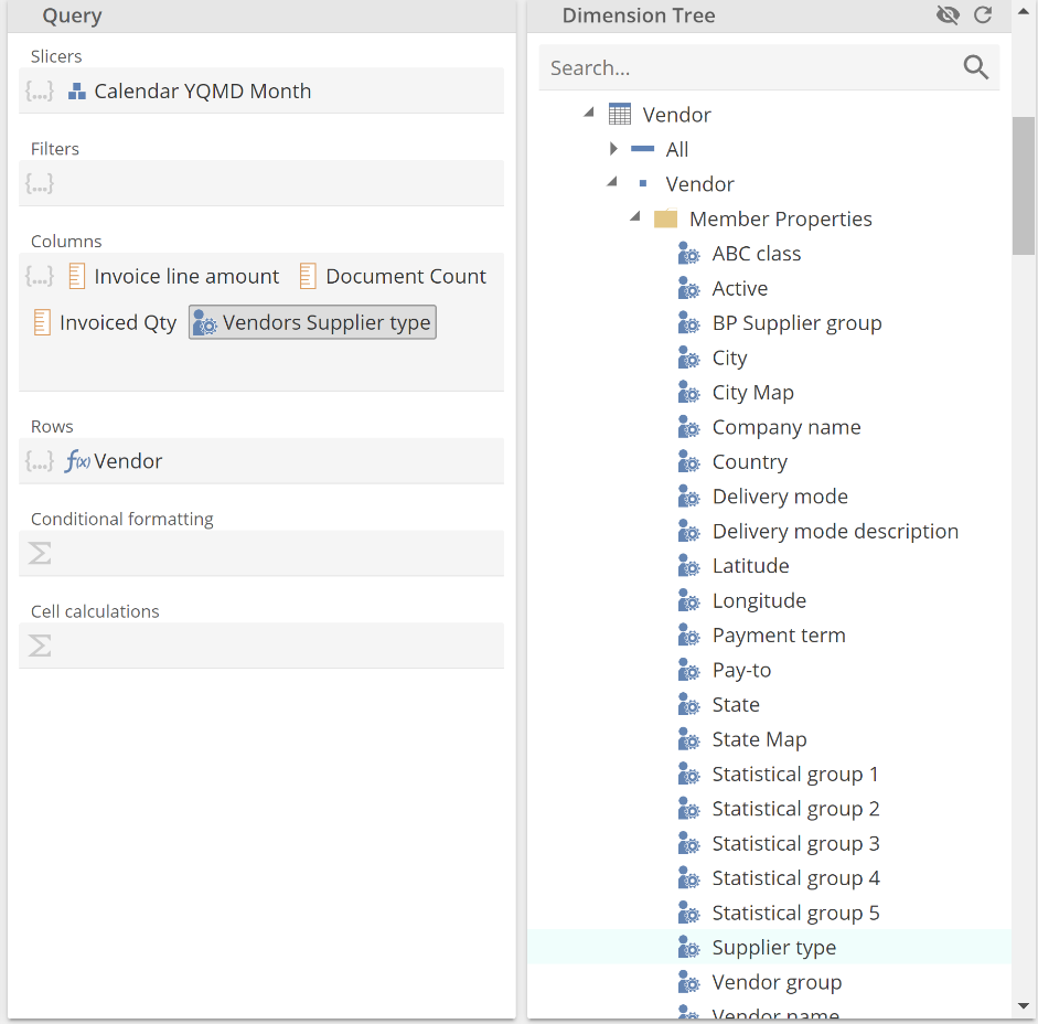
The new Vendors Supplier Type column was configured quite differently. The following Query design panel shows the Supplier type member property on the dimension tree and the Columns placeholder.
 |
Member properties serve the purpose of providing additional layout flexibility. Keep them in mind if you build a table against strict requirements, but more often than not, attributes alone will satisfy most of your layout needs.
Print Design model
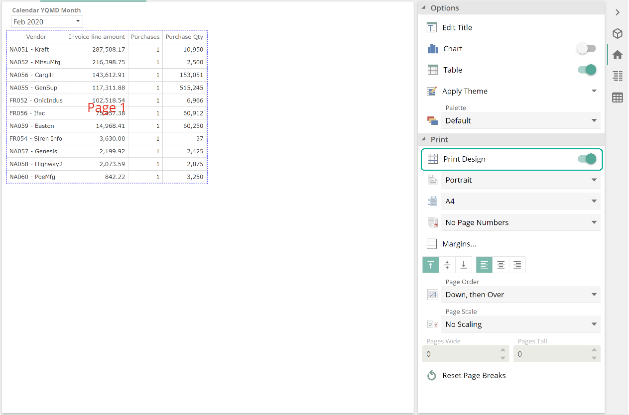
The last Analysis Report topic we will cover is the Print Design mode, which provides powerful tooling to control an Analysis Report's print layout, including pagination. You enable Print Design mode from the Print section of the Home design panel, as in the following image.
 |
We won’t talk about the specific options available. This section is only intended to make you aware of the feature. Should you require, documentation provides comprehensive guidance on all options.
Analysis charts
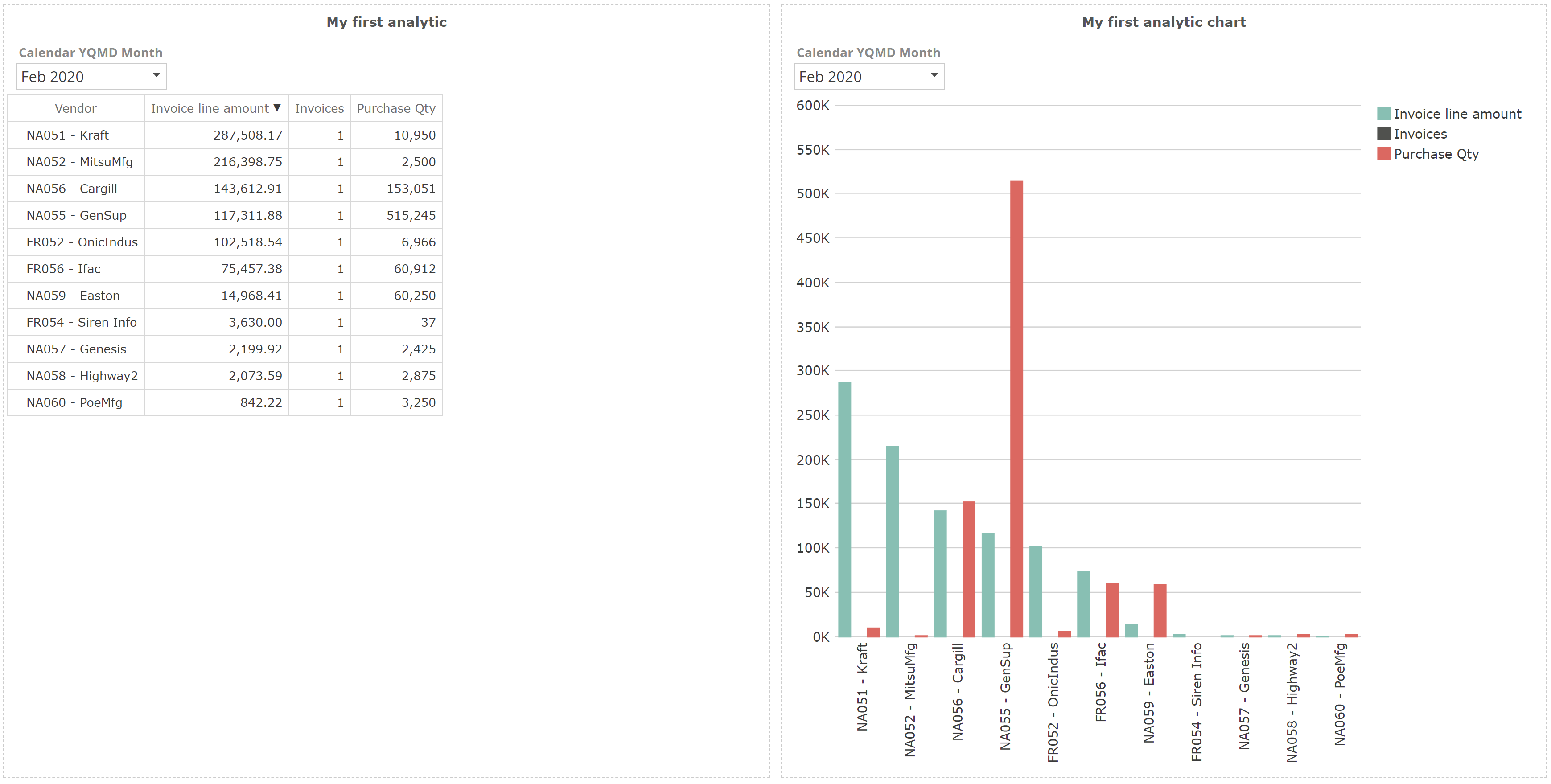
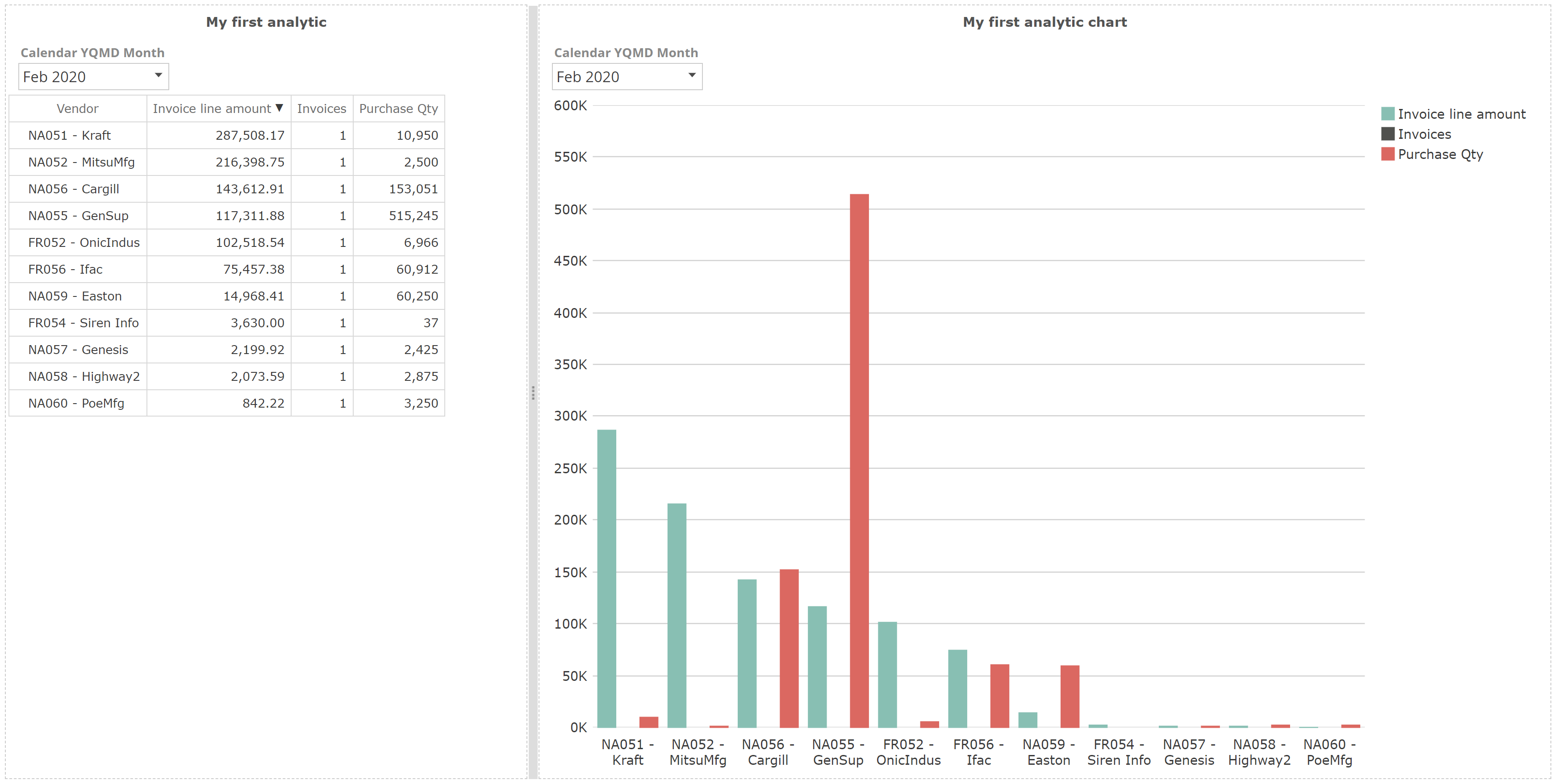
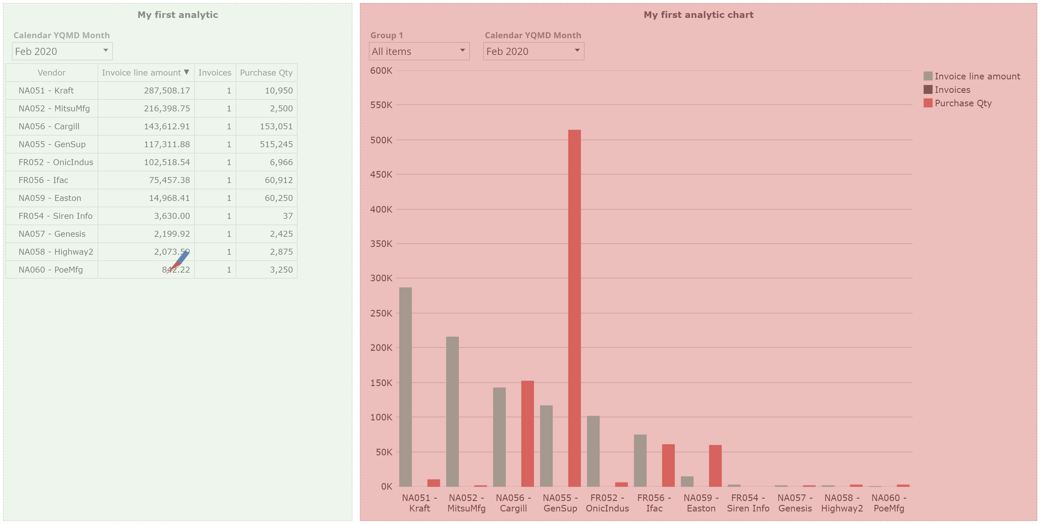
We turn now to charts. Let’s take My first analytic, which we saved some time back, and from the Home design panel disable Table, then enable Chart. The result should be as follows.
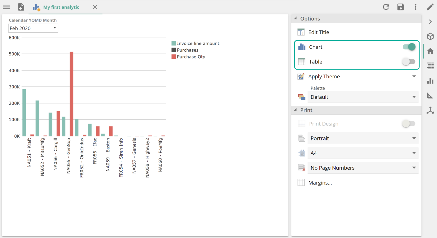 |
Let’s see how changing the view may have affected the Analysis Report's placeholders.
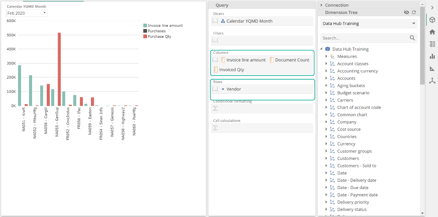 |
Before moving on save this resource as My first analytic chart for later use. The key thing to notice from this image is that the Rows and Columns placeholders have become Bars and Series. This is our lead-in to introducing series. A series is simply a series of values. Each value is within a series is described or categorized by the members of the Rows placeholder. Individual values within the series may render as bars, columns, or many other shapes, depending on the chart type. The purpose of a chart is to show one or more data across a category (for example, vendors or months) to allow the human eye to detect patterns better.
Our example shows three series: a series of Invoice line amount values (green), a series of Purchase values (black), and a series of Purchase Qty values (red). And each series of values is categorized by the Vendor attribute members.
Chart design panel
Let’s move right on to formatting our chart, which will help with understanding these concepts. To start with, the Chart design panel allows you to choose the Chart type, as in the following image.
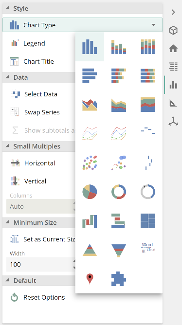 |
You can hover over each type for a description. The displayed query placeholders vary across chart types. For example, the Bars placeholder is replaced with the Segments placeholder for pie charts. The formatting options also differ across chart types. We will only address the major items from here with so many different combinations of features across the chart types. Please note the bottom two options are actually different map types before moving off chart types. Data Hub considers maps to be chart types. See the online documentation for information on how to configure map types.
From the Chart design panel, you can also configure Small Multiples, which allows you to create the chart's cells. In the following image, we’ve activated the Horizontal option to show our current chart's effect.
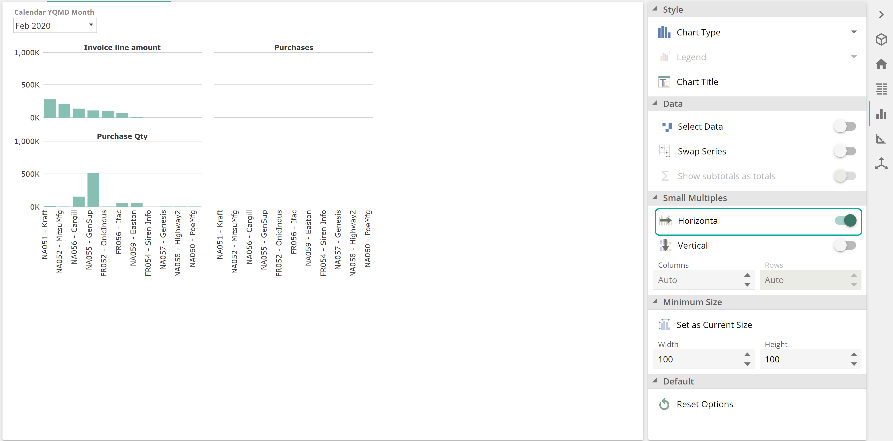 |
We won’t talk to the specifics of configuring Small Multiples, nor will we speak to the specifics of configuring many of the options in the Analysis Charts section. Again, all required information is available in the online documentation. Before moving off the Chart design panel, take a minute to review some of the other options available.
Design design panel
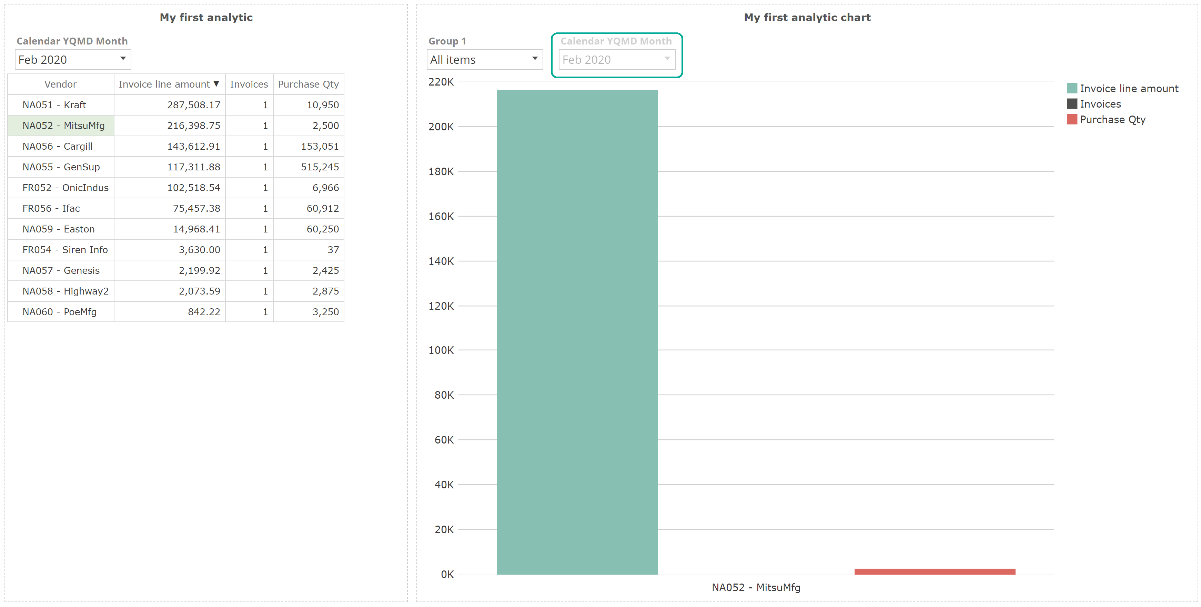
We turn to the Design design panel. At the top is the Axis section. To use any of the options in this section, you first need to select a chart series. Recall a series is a series of values, not a single value; therefore, selecting a single value (bar/column/slice) won’t suffice. You select a series from the legend, or if you are showing both the chart and the pivot, you may select the series by selecting its associated row or column on the table. The following image shows the Invoice line amount series is selected (the non-selected series are washed-out), and the Axes section options are now available.
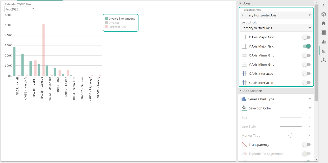 |
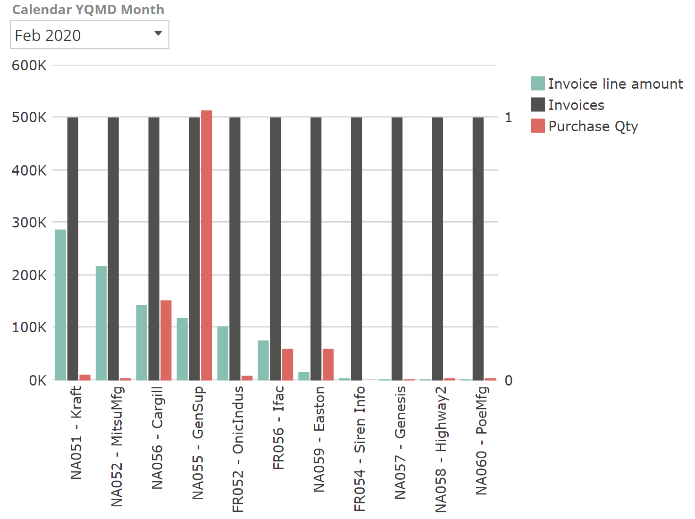
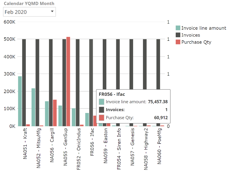
One subtlety here is that you need to show the chart legend or the associated table to select a series and make use of some of the options from the chart design panels. Returning to the Axes options, having selected a series, the Horizontal Axis and the Vertical Axis drop downs reflect the axes that the selected series is associated with. Often all series are associated with the single horizontal axis and the single vertical axis. Still, you may want to associate one of the series with a different axis because the data requires a different scale. In the image above, notice that the Invoices columns are not visible because the count of invoices is multiple orders of magnitude less than the dollar amount of those purchases or the number of items purchased. We resolve this by now selecting the Invoices series and selecting.
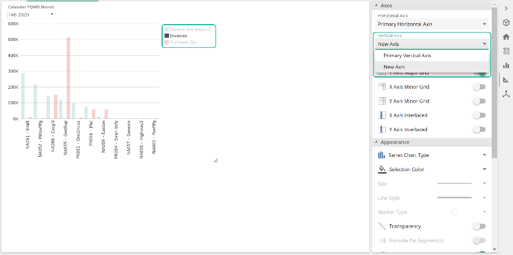 |
The chart now shows as follows, and we can see that we have only one invoice across all of our vendors for the selected month.
Before moving off the Axes section, take a minute to review some of the other options available. Now collapse the Axes section, so the Appearance section is at the top, as in the following image.
 |
As with the Axes section, most of the Appearance options require a series selection. However, the Selection Color and Transparency options allow you to control a single bar/column/slice's color and transparency. This section's most interesting option is the Series chart type, not to be confused with the (base) chart type we saw previously. While the chart type for our current example is Columns, we may choose to change the chart type of only the Invoices series as in the following.
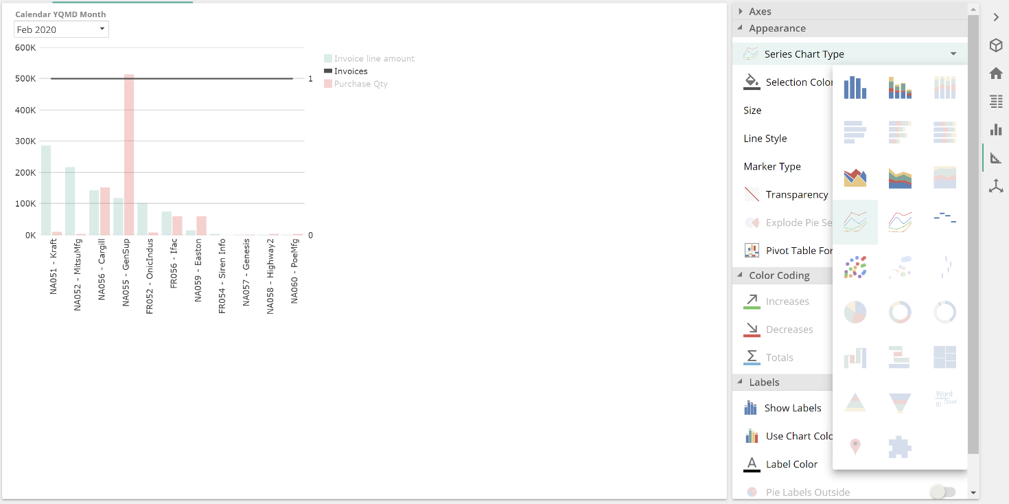 |
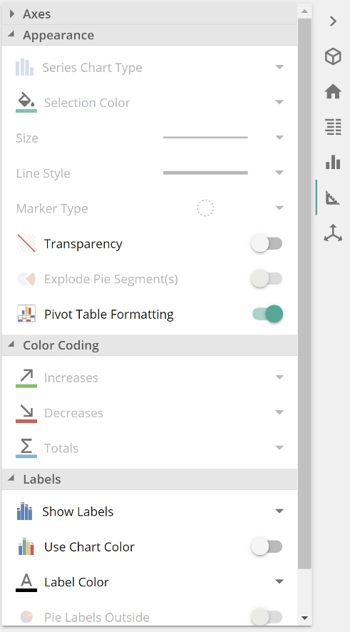
Another interesting option from the Appearance section is Pivot Table Formatting. This option synchronizes to the chart any applicable formatting changes made on the table, importantly including any conditional formation, which we’ll get to shortly.
There are two more sections on the Design design panel, the Color Coding section, which only applies to waterfall charts, and the Labels section. Labels apply differently by chart type. Take a few minutes to experiment with these sections.
Axes design panel
Finally, there is the Axes design panel. This panel provides options outside of the grid, not to be confused with the previous axis section, which controls the series-to-axis associate and formatting options within the grid.
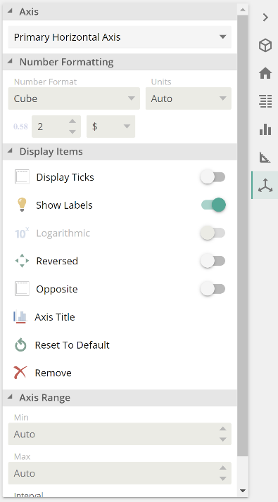 |
The important thing to note from this panel is that number formatting is only available for certain axes and depending on the chart type. For example, for the chart we’ve been working on, it only makes sense for number formatting to apply to the vertical axis (feel free to scan back and consider why).
Chart tooltips and working with members
There are two small items to cover off for charts. To start with, you can hover over a chart shape to show a tooltip that will include all series values for that given member combination, as in the following image.
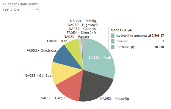
Depending on the chart type, any series not shown are available in these tooltips. This can be seen on the following pie chart equivalent of our example.
Finally, a few actions cannot be performed directly on the chart and instead require that the table be temporarily shown. These actions are all available on the table header menu and are highlighted in the following image.
 |
Dashboards
Dashboard layout
Given what we have covered to this point, we can move quickly through dashboard design, as most concepts should be very familiar. Functions again form the basis of any advanced dashboard analytics. And for the quick overview, the dashboard layout is the natural place to start. Create a new dashboard from the New resource button, and you’re presented with an empty canvas as in the following.
 |
This canvas represents a single cell. To customize our layout, we split this initial cell and its child cells in turn, moving cell boundaries to suit. There are two ways to split a cell, and we’ll focus on the most common, being to split-on-drop. Let’s get straight to our example to clarify what split-on-drop means. From the Resource Explorer, drag My first analytic to the center of the canvas’ single cell, but do not drop. Your screen should appear as in the following image.
 |
The icon you’re seeing indicates the selected resource will consume the specified cell. However, given we haven’t dropped yet, move your mouse to the right, the top, the bottom, and then to the left of the cell. The image below shows the result of hovering over the cell's left side, having still not dropped.
 |
At this point, drop, and you will see the result is that the initial cell has been split vertically, and the left cell is populated with My first analytic. As you saw, by moving to different regions of the initial cell, you could have instead elected to populate the right split-cell or a top or bottom split-cell. Now complete our trivialized dashboard by dragging My first analytic chart to the existing right cell. That is, do not split this time. The result is as follows.
 |
And we now have our first dashboard. In this case, we have two different presentations of the same data. This is sensibly a little contrived, but it will serve us well for an imminent discussion. Notice that the table remains at the same size as when designed, while the chart has been elongated to fit its cell. Let's reduce the resulting blank space by dragging the middle shared cell boundary to the left, as in the following.
 |
Note that the relevant border is highlighted during resizing. And that’s it. We’ve covered the basics of dashboard design.
Obviously, you’ll want to delete cells on occasion. To delete a cell, you must first select it. If you hover over any cell's top-right, a checkbox will appear. Select this checkbox, then to delete, you would click on Delete from Design panel (but don’t as we’ll continue to work with what we have). The Del key also works as a hotkey for deleting cells. The first time you click deletes the cell contents. The second time deletes the cell itself, merging it back in with its sibling cell.
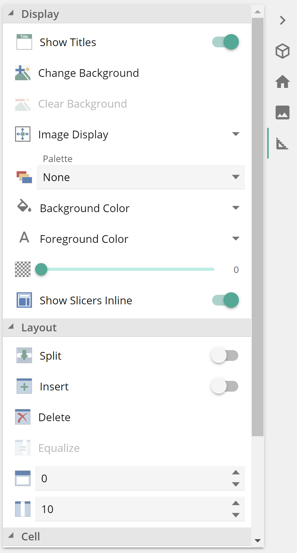
The Design panel includes other options to control other dashboard facts such as cell titles, colors, and background images. It also includes additional layout control, including equalize, padding, spacing, and alignment options, as in the following image.
 |
We will leave the investigation of these features to the reader, as with the Print Design and screen sizing options from the View design panel. For guidance on any of these features, refer to the Dashboards article from the online documentation.
Dashboard slicing and filtering
Dashboard filtering and slicing work the same as for Analysis Reports, but with some extended capabilities, specifically:
Cell slicing and filtering – by selecting a cell using the cell’s top-right checkbox, it is possible to apply slicing and filtering to only that cell.
Inter-cell slicing – it is possible to configure one cell to slice another cell.
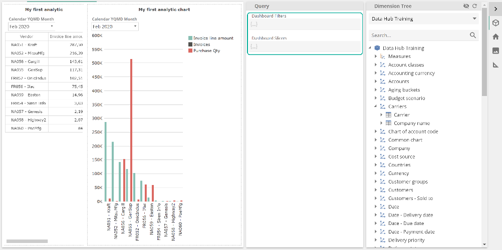
Let’s review these in turn, but first, if you expand, the Query design panel will see the Dashboard filters and slicers placeholders equivalent to what we saw for Analysis Reports.
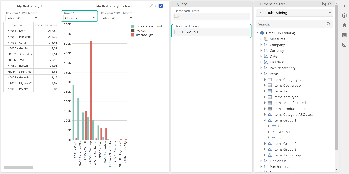 |
If you now select the My first analytic chart cell, you will see placeholders specific to that cell. And if you populate the Slicers cell, this will result in a new Slicers to the left of the cell’s existing Slicer(s), as in the following.
 |
Now collapse the Query design panel, and let’s configure inter-cell slicing. Hover to the top right of the My first analytic cell and click on the slicer icon, as in the following.
 |
By selecting this cell, we enter inter-cell slicing design mode and identify the selected cell as the slicing cell. This slicing cell will now be shaded green. You then toggle the sliced cells by clicking anywhere within their borders’, shading them dark red. In the following image, the left cell now slices the right cell.
 |
You toggle back out of inter-cell slicing design mode by clicking anywhere in the slicing (green) cell. We’re back to our newly created dashboard, however, if you now click on a row within the My first analytic cell, you will see that it filters the My first analytic chart to the selection. This is particularly easy to see because of our choice of resources.
You will also see that we’ve highlighted the disabled Slicer in the My first analytic chart. Because the left cell (with its own Calendar YQMD Month) Slicer is now inter-cell slicing the right cell, we have a conflict. Importantly this only happens where Slicers use the same hierarchy (Calendar YQMD Month in this case). Where you encounter this, the outer Slicer will apply, and the inner Slicer will be disabled. The outer Slicer is that defined in the containing resource. There may be multiple layers of slicing between the dashboard and contained Analysis Reports for extremely intricate analytics. In such a case, you may find that the simple outer-Slicer-applies rule does not fully describe the behavior you see, and you should refer to this article for further detail on the interplay between different levels of Slicers and filters.
Rich Texts, Images, and Webpage resources
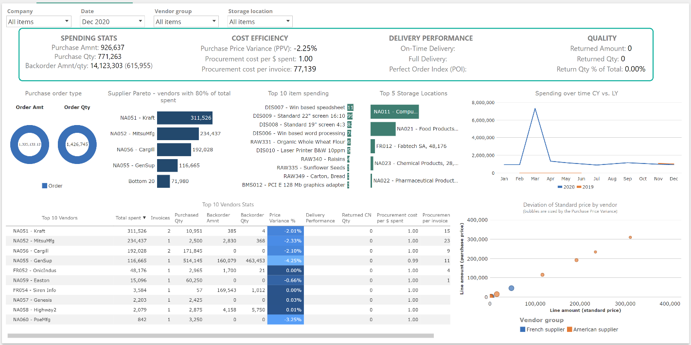
Rich Text resources are the means to create textual cells in a dashboard (or Report Pack, as we will see). From our original Purchasing manager dashboard, there was a row of four Rich Text resources along the top.
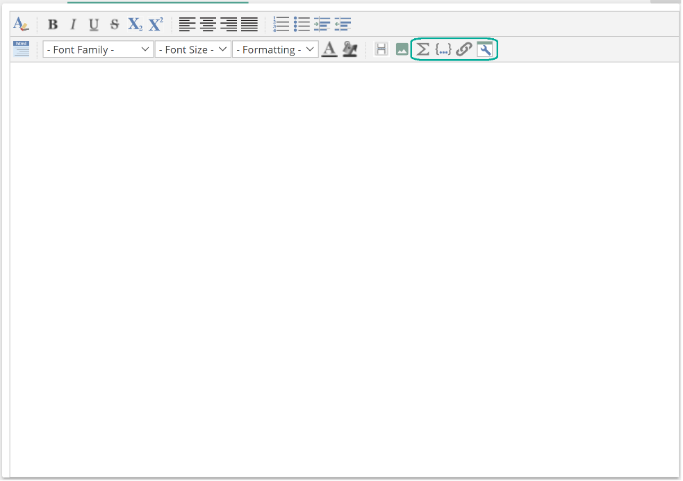 |
What’s particularly interesting about this series of four Rich Text resources is that each contains dynamic values. For example, the SPENDING STATS Rich Text includes a dynamic value for Purchase Amount. This value is generated by a Calculated Member. You may insert Calculated Members, Named Sets, links-back-to-resources, and other dynamic fields from the Rich Text toolbar, as in the following image.
 |
For more information on configuring Rich Text resources, refer to the Rich Text resources article from the online documentation.
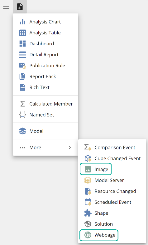
Similar to Rich Text resources, the Image and Webpage resources are intended for use in dashboard cells. As with all resources, resources are created from the New resource button.
They may then be used in dashboards (or Report Packs) in the same way as any other resource. For more information on configuring Rich Text resources, refer to the Image and web page resources from the online documentation.