Fundamental concepts
An introductory example
Time to build our first analytic, and for this, we’ll create a reproduction of the bottom left cell from the Purchase manager dashboard. We’ll introduce some concepts in passing, then walk through all the fundamental concepts in full. The purpose of this exercise is to demonstrate how easy it is to create basic analytics and provide you with a feel for the experience before we get a little theoretical.
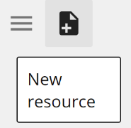
To create a new resource, click the New resource button on the Toolbar. If you are ever in doubt as to the purpose of a button, hover for the tooltip as in the following image.
 |
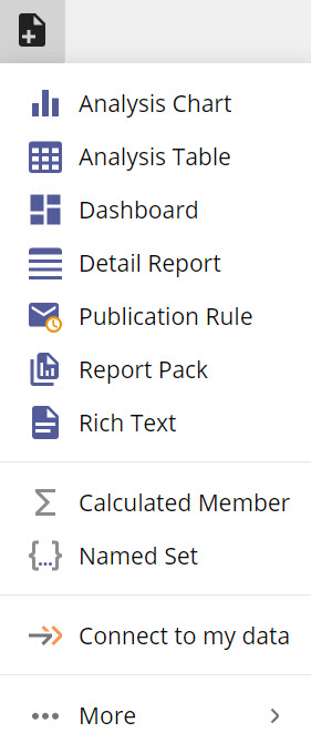
From the New resource menu, select Analysis Table.
 |
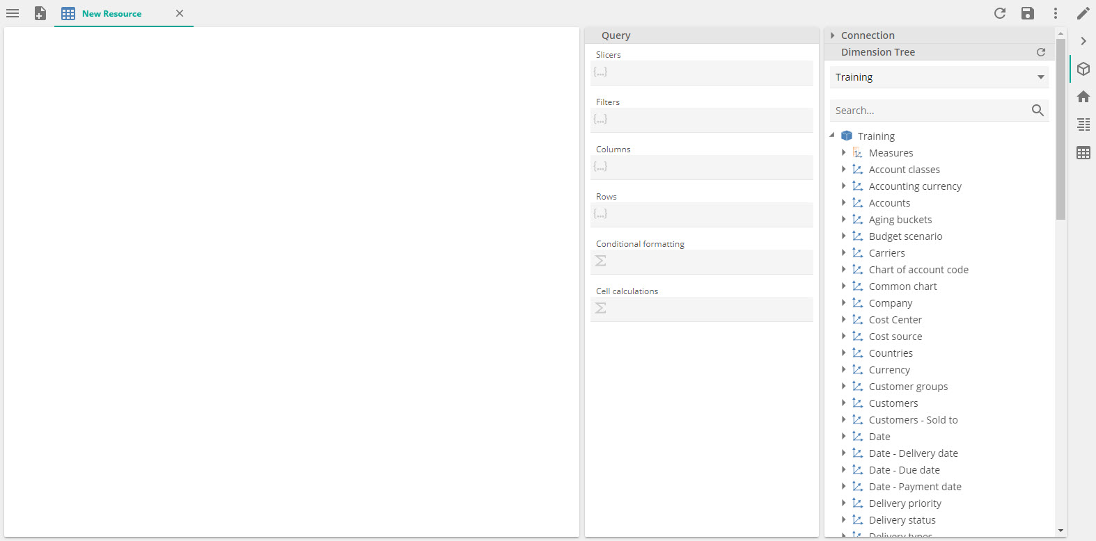
Assuming you have previously deployed the Data Hub Training solution and that this is the only processed model, you will see the following.
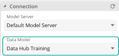
If you have multiple processed models, you may need to expand theConnection section to change the Data Model to Data Hub Training, as in the following image.
 |
The panel on the right holds the Dimension Tree. Expand the Measures item, then the Purchase invoice lines item, and select Invoice line amount. This is a measure. We’ll provide a definition for “measure” shortly, but for now, you need only know that this item represents the dollar value of invoiced purchases.
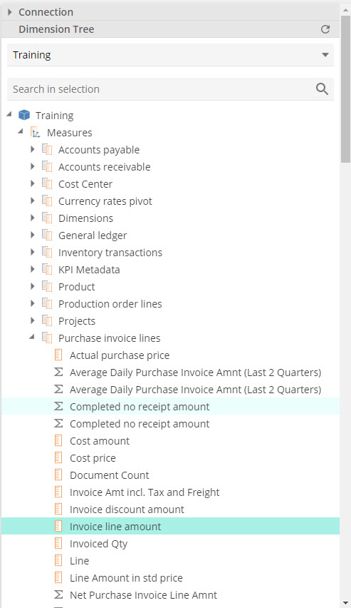 |
Now drag the Invoice line amount and drop it inside the grey square labeled Columns from inside theQuery design panel. We call this grey square a placeholder (or a query placeholder). Keep that in mind for the following instructions.
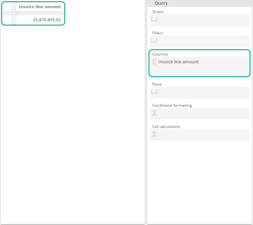 |
Note that we already have a table on the left from the image above. It provides a measurement of Invoice line amounts but given we’ve not qualified our request in any way, it is providing this measurement for all data available in the model. That is, we see the dollar value of all invoices for all time, all products, etc.
To qualify the data in our table, return to the Dimension Tree, scroll down to find the Vendors item, and expand it to find the Vendor item.
Now drag Vendor to the Rows placeholder (the grey square), as in the following image
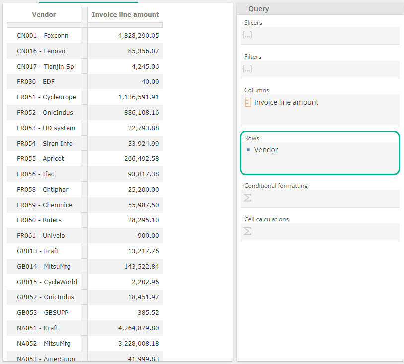 |
And now note the impact on the table. We have Invoice line amounts qualified for the vendor in question. We will need to subtract out the discounts to get to the Totals Spent as in the original, we will also want to limit the vendors to the top 10, but we’ll put these requirements aside until we address functions. For now, let’s sort by Invoice line amount. Right-click on the Invoice line amount column header on the table and select Sort Descending, as in the following image
Let’s build out the report a little more. Return to the Purchase invoice lines parent item on the dimension tree and now drag DocumentCount and Invoiced Qty to the Columns placeholder. Right-click or hit F2 to Rename each of the new column headers from the table. Name them Invoices and Purchase Qty, respectively.
We’re getting somewhere:
Finally, let’s add a slicer to compare these numbers against the original. Again, we’ll define a “slicer” shortly, but let’s first walk through the exercise to build some hands-on experience.
Return to the Dimension Tree, expand the Date item, and turn its child Calendar YQMD item. Now drag Calendar YQMD Month to the Slicers placeholder, the Query design panel's top placeholder. A drop-down will appear over the table to provide different slice options:
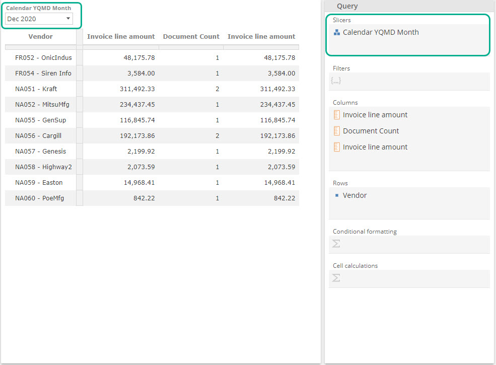 |
If you select the same value from the drop-down as was chosen on the Purchase manager dashboard (i.e., if you select the same slice), you should find your numbers line up very closely. Given we’ve not yet subtracted out discounts, there is a slight mismatch on the first column, but that’s it.
Congratulations, you’ve built your first Analyses Report. Save this resource as My first analytic, as we’ll later use it. You will only save this report at this stage. Saving it later with changes will change the data and, therefore, this report's results.
 |
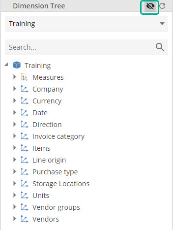
The Dimension Tree
Let’s review some of the concepts introduced in passing and some additional ideas that you will require to build out your analytics. We’ll start with the dimension tree.
A measure is a numerical value that you can summarize (totaled, averaged, etc.) for use in analytic resources. For example, recall Invoice line amount was the first of three measures we encountered.
A measure group is simply a group of related measures. You must first expand a measure group from the Dimension Tree to access its measures. From our example, we expanded the Purchase invoice lines measure, group. Placing a measure group on the Rows or Columns placeholder will show all the measures from that group in the table.
An Attributedescribes measures. Our example used the Vendor and Calendar YQMD Month attributes to qualify (or define) our measures. Recall the Vendor attribute was on the Rows placeholder, and Calendar YQMD Month was on theSlicers placeholder. This doesn’t change the fact that both attributes described the table measures.
A Dimension is simply a group of related attributes. For example, the Vendor dimension was a group-related attribute, and it included an attribute named Vendor. The Date dimension was also a group of date-related attributes, but we used it slightly differently, as we saw. We’ll talk about this shortly, but first.
A member is a particular describing or qualifying value for an attribute. For example, the row headers of our example table are the members of the Vendor attribute. We didn’t see these members on the dimension tree in our walk-through. Instead, we dragged the whole set of Vendors to Rows.
It’s important to note that to see the members, we didn’t just expand the Vendor attribute (which in turn lives under the Vendor dimension). Instead, we also had to expand the Vendor level. Please allow us to come back to this point and introduce levels.
A Hierarchy is simply a custom hierarchy of attributes. The Date dimension provides four example hierarchies (identified by the <> icon). Let’s use the Calendar YQMD hierarchy for our discussion. In our example, we referred to Calendar YQMD generically as an item, but it is a hierarchy.
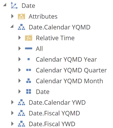 |
From the above image, you can see that Calendar YQMD holds four hierarchies, and there is indeed a natural hierarchy to these attributes, in that a year contains quarters, which include months, which have dates. You can access these attributes either through the Calendar YQMD hierarchy or expand the Attributes folder to find the same attributes outside of the hierarchy.
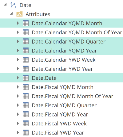 |
The above screenshot should be evidence that there is some convenience to using hierarchies. They provide structure to the Dimension Tree, but more than that, they give structure to your analytics. Hierarchies can provide expand and drill-down capabilities in your analytics. It is worth noting that the grouping of attributes into hierarchies and dimensions also has some performance implications, which we will discuss in a future performance section. We’re now ready to introduce our last fundamental Dimension Tree concept.
A level is a set of members for a given attribute. While a custom hierarchy-of-attributes define a hierarchy, the items below the Dimension Tree hierarchy are levels. That is, they provide the set of members for the given attribute. This is a little nuanced, but it is vital because differentiating between levels (sets of members) and attributes allows us to consider an attribute to be a single-level hierarchy. This will be useful later when we come to functions and also allows us to understand why we previously saw that the members of the Vendor attribute were available under a level.
You might wonder how it is that by dragging the Vendor attribute to Rows in our example, we could see a set of members. This was a piece of auto-magic. If you look carefully, the attribute icon you dragged does not match the level icon you dropped. The specific auto-magic here is that if you drag any hierarchy to the Rows or Columns placeholders (keeping in mind that an attribute is a single-level hierarchy), Data Hub will automatically replace the attribute with the first (and possibly only) level of that hierarchy.
To close out this discussion of the Dimension Tree, it’s worth pointing out that the order you drag members to the query placeholders matters. It is often the case that not all the available dimensions can describe any given measure (or set of measures). For example, it is not possible to qualify the Invoice line amount measure by the Employee attribute of the Employee dimension (at least for the Data Hub Training model). If you attempt this, you would see a table similar to the following.
Because the Employee attribute cannot qualify the Invoice line amount measure, each row provides the unqualified Invoice line amount. Another way of describing this situation is that the Invoice line amount (and more accurately, the whole Purchase invoice lines measure group) does not relate to the Employee dimension. Stated this anyone who has read the Complete Guide to the Semantic Layer should understand the underlying cause of this behavior.
Sensibly the table above is not useful, which brings us back to our point about the order of dragging. Take care to always first drag measures to your placeholders. You will find the Dimension Tree will automatically filter the list of available dimensions to only those related to the measures at hand. For example, take this Dimension Tree image before a measure is used.
Compare that to the following dimension-filtered image.
 |
As you can see, this filtering makes it a great deal easier to find the related dimensions, and it also ensures you don’t accidentally use an unrelated dimension. Without using this technique, it’s not always that obvious which dimensions are related to the report measures.
We strongly recommend that you take a few minutes to familiarize yourself with these concepts by dragging a few Dimension Tree items to the query placeholders. As you do so, be aware that you can drag a group of members by Ctrl-clicking to select the members. You can also drag a contiguous set of members by shift-clicking the first and last set members. Experiment, then come back. You may spot a few unfamiliar Dimension Tree item types. We’ll introduce this through this article, but what we provide above are all the fundamentals.
Placeholders
At this point, you’ve built your first Analysis Report, and we’ve reviewed the fundamentals of the Dimension Tree. Let’s discuss placeholders in a little more detail. To start with, the Slicers, Rows, and Columns placeholders that we’ve used to this point are all set placeholders. A set placeholder can hold a set of members, a set of measures, or a combination of both.
Recall from our example that we ended up placing three measures in the Columns placeholder; that is, the Columns placeholder held a set-of-measures. We also placed a level on the Rows placeholder. Recall from our Dimension tree discussion that a level is the set of members for a given attribute in a hierarchy. So, in that case, the Rows placeholder held a set-of-members.
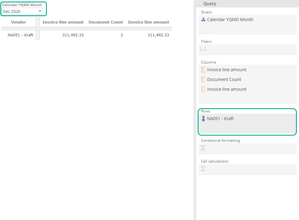
A single member or measure is still a set (a set of one), as in the following image where we’ve replaced the Vendor level with a single Vendor member, NA051 - Kraft.
 |
To add this member, we used the Dimension Tree’s search capabilities by selecting expanding the Vendor attribute (recall we treat an attribute as a hierarchy of one level) and then selecting the value level. We then enter the search string in the text box at the top, as in the following.
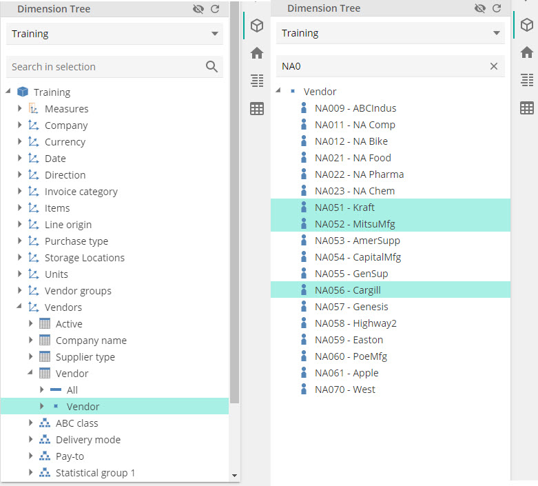 |
Let’s now use this to add a few more members from the Vendor attribute. In the following image, we’ve elected to search based on the vendor code's first few characters. In the following, we have the selected used Ctrl-click to select two members to drag to Rows.
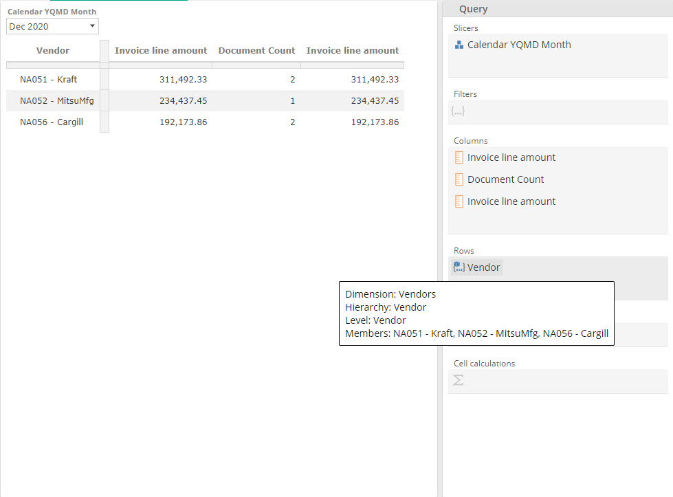 |
Once you’ve dragged this selection onto Rows placeholder, you should see the following and note that you can hover over the new set to see its constituent members.
It’s important to observe the resulting table. As you would expect by combing a single member with a set of two members, the Row placeholder instructs the table to append the same-hierarchy members.
As we have just seen, a set of sets is also still a set. And this leads us nicely to hierarchy-grouping. The following image now shows members from two levels: Group 1 and Vendor. Again, you can hover over any tab in a query placeholder to see the tab information.
In this case, our placeholder sets are from two different hierarchies, Items.Group 1 and Vendor. What is very important here is how the table reflects this design. Note that each Item.Group 1-hierarchy member combines with each Vendor-hierarchy member so that we now have vendor purchases for each item group. We’ve removed the ordering to simplify this discussion. Also, note that the table defaults to omit rows without values. More on this later.
So the rule is that same-hierarchy sets are appended (unioned) and different-hierarchy sets combined (cross-joined for the technical folk). This behavior is referred to as hierarchy-grouping, and it is significant for analytic design, but it will also quickly become intuitive as you work with a set placeholder.
Finally, we’ve not covered how you might remove something from a placeholder. Once an item is on a placeholder, we refer to it as a placeholder tab, and by right-clicking on a placeholder tab, a menu will show. The first option in that menu is removing the tab, as in the following image. And as you’d imagine, we’ll cover the other options in future sections.
Filtering and slicing
You may have noticed another placeholder in the Query design panel, namely the Filters placeholder. The Filters placeholder is also a set placeholder, so you interact with it the same as the Rows, Columns, and Slicers placeholders. Recall that when we placed the Calendar YQMD Month level on the Slicers placeholder, it resulted in a drop-down at the top of the table that an end-user could interact with. This slicer changed the context of the table. What’s key here is that the end-user could interact with that context. That is the definition of a Slicer in Data Hub, a context that an end-user can interact with.
On the other hand, a Filter is a static context for a given analytic. Instead of providing a slicer option, the designer has instead intended the previous table only ever to show data for the current month and not give the end-user the ability to change this. In such a case, the designer would use the Filters placeholder to define this static context. In such a case, the Slicers and Filters placeholders would have shown as follows.
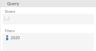 |
This is not an ideal solution as the report designer would need to update the Filters placeholder member every month to ensure it was always current. Still, we’ll look at how we address this in the Analytic Functions section.
We’ve discussed the difference between Filters and Slicers; let’s discuss a commonality. While it is nonsensical to place the same hierarchy on both Rows and Columns, you can place the same hierarchy in both Rows and Filters and or Slicers. For example, the following results from attempting to place the Vendors hierarchy on Columns, given it already exists on Rows.
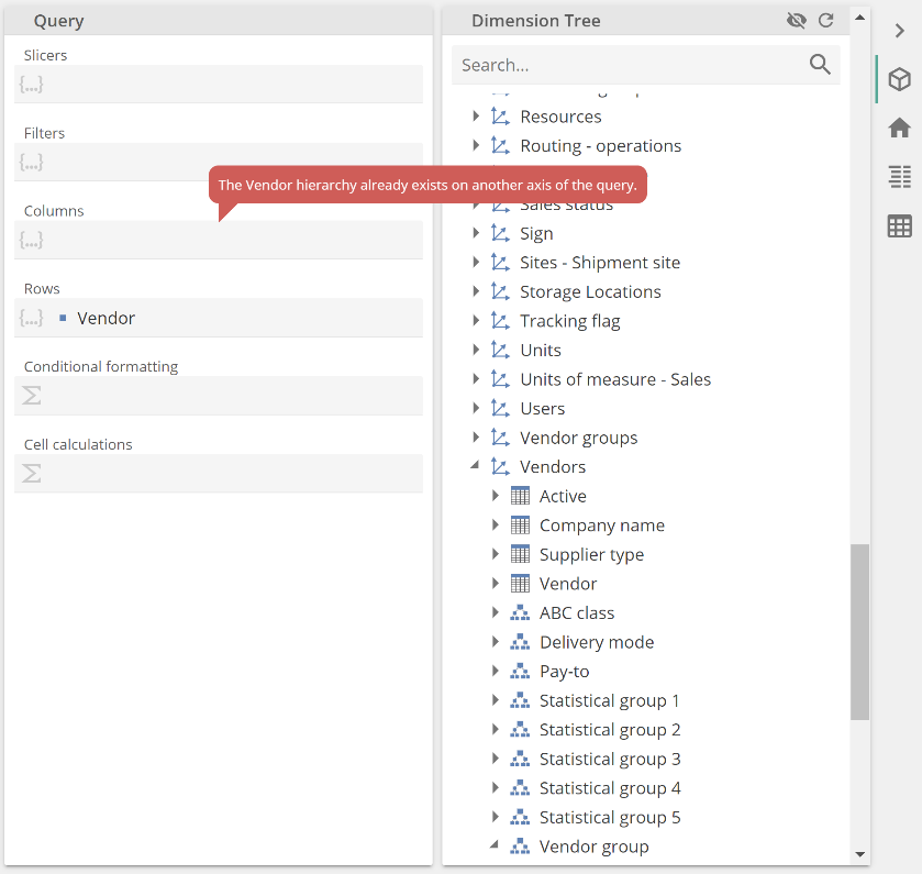 |
The computer says no. So, while you cannot place the same hierarchy on an opposite axis, you can filter or slice by the same hierarchy (with some caveats the product will guide you on), as in the following trivialized report example.
Note the Slicer now provides the end-user the option to choose which Vendors to show. This particular slicing pattern can also be useful if you want to provide more granular members on rows and a less granular member in the slicing, for example, months on rows and quarters in the slicer.
Resource composability
The last fundamental concept we’ll introduce is that of resource composability. This somewhat technical concept simply means that Dashboards and Report Packs are composed of Analysis Reports and Rich Texts. And these Analysis Reports and Rich Texts may, in turn, be composed of other resources, as we will see. Let’s quickly see this in action, then talk about the significant benefit of this approach. As with creating a new Analysis Report, start from the New resource button and this time select Dashboard from the menu. You should see an empty canvas.
Now click the Resource Explorer icon (the three bars) and select the Analysis Report we saved previously. Drag this tree not and drop it in the middle of the canvas, resulting in the following image.
Click the Edit button (top-right) to show only your new Dashboard. Click Save and specify a resource name. Your new Dashboard is now composed of the single Analysis Report (My first analytic). You could now add filters, slicers, and other analytics to build out this Dashboard. You may now require a second dashboard based on My first analytic, but with a different set of filters, Slicers, and complimentary analytics. A perfect example of this requirement is regional reporting, where each division may have common core analytics but different filtering and complimentary analytics.
Because each Dashboard is only a “container” resource, the analytics resources themselves are the single source of truth. If you change My first analytic, both dashboards will reflect the change. There is no risk of, in this example, one region seeing different numbers to another region (other than what the Filters and Slicers would imply).
Along the same lines, we’ll see what resources an Analysis Report may be composed of when we introduce additional resource types later in this article.