Consuming analytics
We’ll quickly cover consuming analytics with Data Hub to get things started. This section is not intended to be comprehensive, as Data Hub online documentation provides all relevant references and how-to material. Instead, this section will give you a feel for the design considerations that we will address in the remainder of this article. If you’re already familiar with consuming analytics in Data Hub, please move ahead to Foundational concepts.
The prerequisites to this section and the remaining exercises in this article are:
An instance of Data Hub with a deployed and processed Data Hub Training solution
Deployed Data Hub Training analytics
A login assigned the Report Designer role
If you have not yet deployed the Data Hub Training solution, the steps to do so can be found in the Create a Model from the Data Hub Training Solution article. Ensure you also deploy the analytics as from the steps.
Having logged into the application for the first time, you may wonder where to start. Click the Resource Explorer icon from the Toolbar.
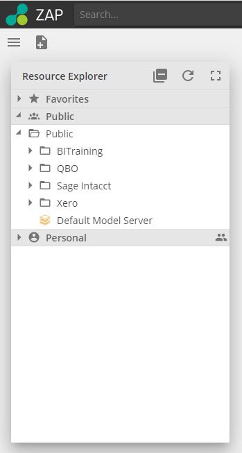
The Resource Explorer in Data Hub serves the same purpose as File Explorer on Windows or Finder on Mac. The key difference is that you navigate “resources” instead of files. For this article's purposes, you may consider resources to be the different analytics types (reports, charts, dashboards) and the sub-components of those analytics, which we will discuss in time. If you’ve come from The Complete Guide to Modeling in Data Hub, you will be aware that Data Models are also “resources” within Data Hub.
Navigate the folder structure by clicking the expander icons and open the resources by double-clicking. We provide a complete introduction to navigation in Data Hub in the Navigate in Data Hub [PROBLEM LINK] article. Expand the Procurement folder and open the Purchasing manager dashboard.
Your screen should appear as follows.
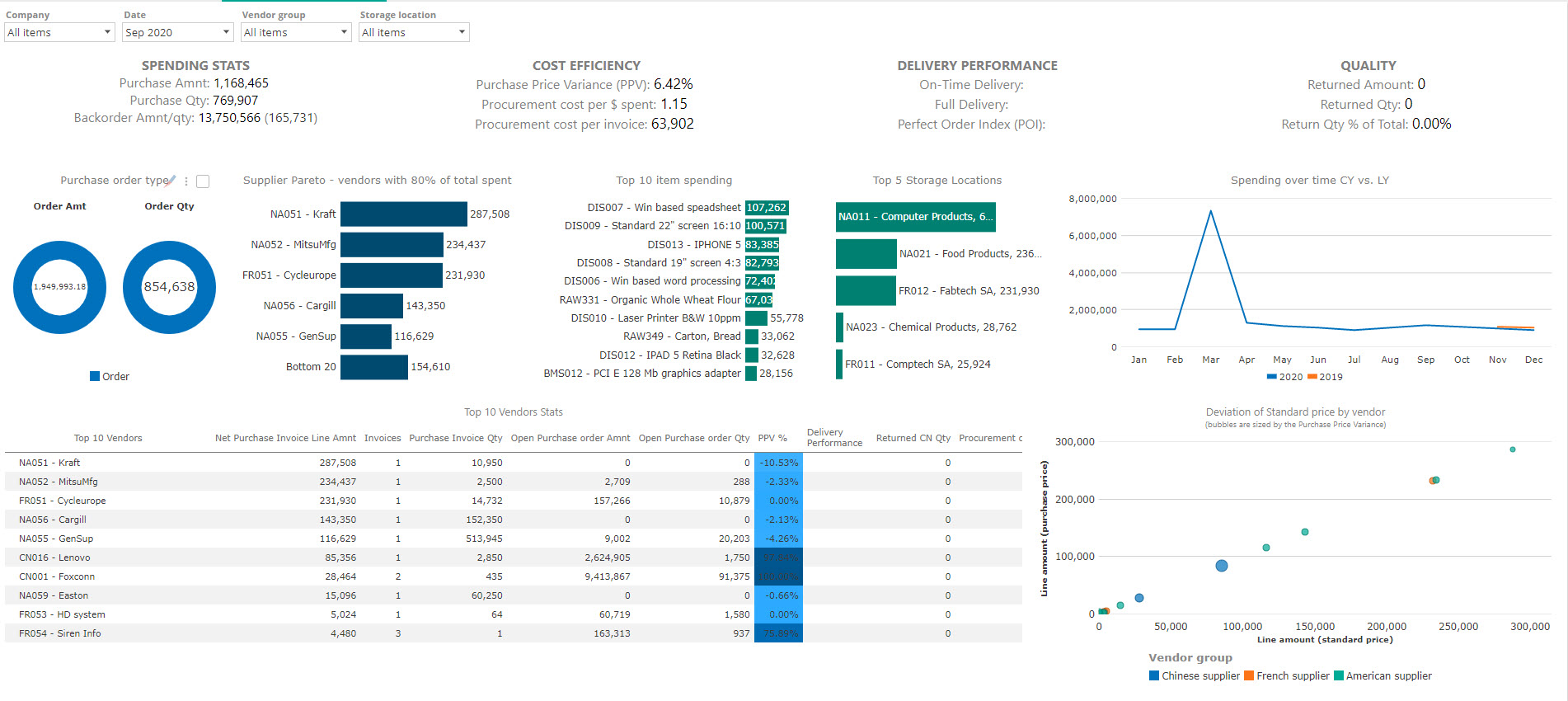
Note the slicer (a visual filter allowing you to filter your data by clicking on the type of data you want), as highlighted in the image, will reflect your current month. For this reason, your charts and reports may appear different from the image.
This Dashboard includes all three fundamental Report resource types:
An Analysis Report (Top 10 Vendor Stats bottom left)
Analysis Charts
Rich Texts (four of them together in the top)
We’ll cover each of these in turn, in addition to dashboards which are made up of these fundamental Report resource types. The Data Hub Training pre-built analytics uses only these four resource types to provide a complete picture of our imaginary company’s business operations.
Analysis Tables and Analysis Charts
We turn first to Analysis Reports and Analysis Chart. We discuss them together because they are two different views of the underlying Analysis resource type. Starting with an Analysis Report, you can hide the Table and show the Chart to translate the Analysis Report into an Analysis Chart. We’ll discuss this point further when we get to analytic design.
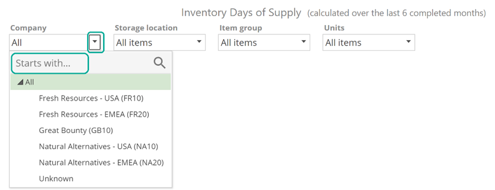
This point is relevant to consuming analytics because the slice experience is identical between the two different data views. For Analyses resources, the slicers are present at the top. Click the drop-down arrow for a given slicer to interact with it. You may also enter search criteria to filter the list of displayed members, as in the following image.
 |
Depending on the slicer-type configured by the designed multi-select and range-slice options may be available to you.
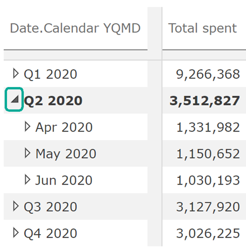
Whether you’re viewing a chart or table, you may wish to see the detail at a more “granular” level (think of grains of sand as an example of granular, where a large block of sandstone is non-granular). For example, in the following custom table built for these examples, quarters are presented on rows, and you may wish to look at specific months. The simplest solution to this uses the expander icons, as in the following image.
 |
As an alternative, you may wish to replace all the specific quarter from the previous example and replace it with the relevant months. This is a Drill Down and is available using right-click menu for the table or the chart.
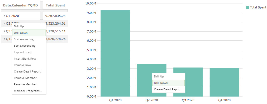
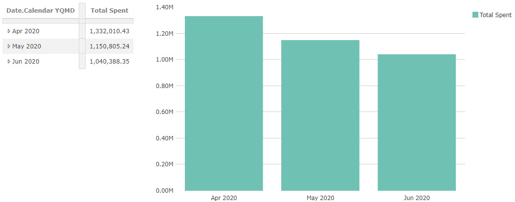
The results are as follows.
You reverse this action with Drill Up from the same right-click menu.
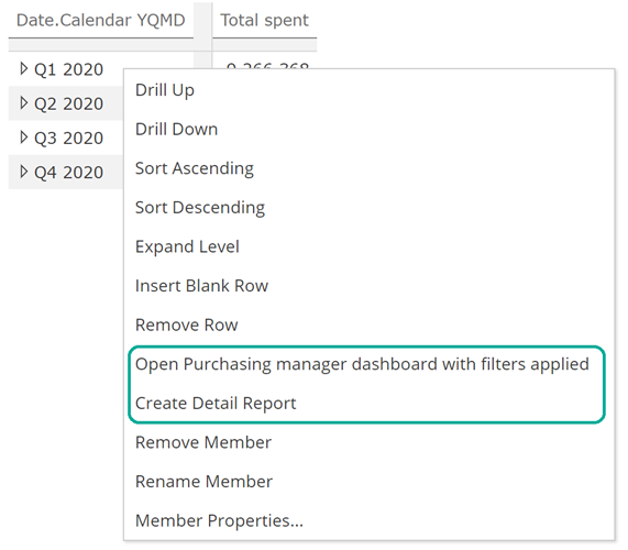
Lastly, you may wish to navigate to a different resource to provide an alternate view of the selected data. We consider this drilling-through the data to the target resource. The most common target view provides full detail on the records or transactions that compose the select values.
As with drill-down, drill-through can be performed on a table or a chart and is available from the same right-click menu. The Create Detail Report is always available and will provide a record or transaction level view of the selected data. If the analytic designer has added additional drill-through targets, these will show immediately above Create Detail Report, as in the following image.
 |
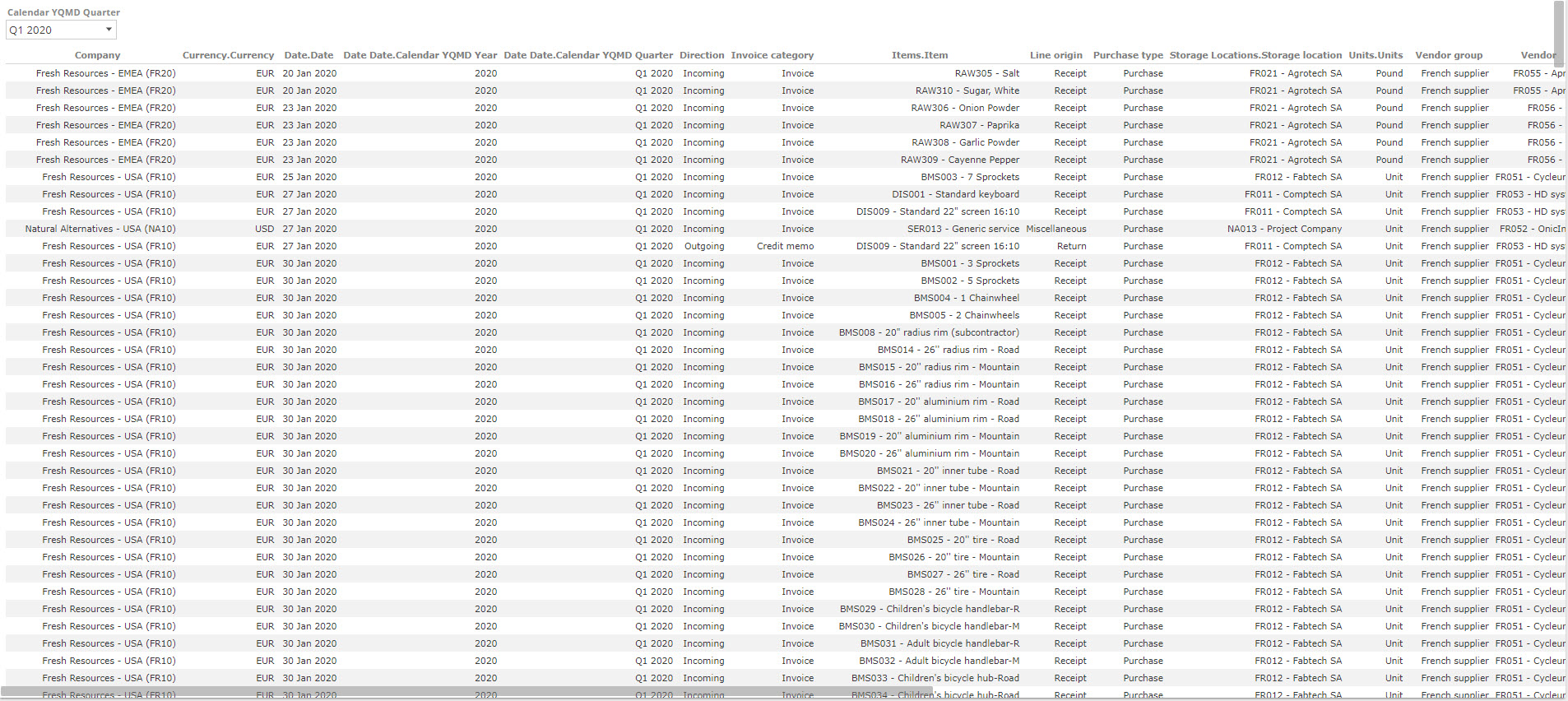
The selected Create Detail Report on Q1 2020 shows in the following. Note that a Quarter slicer was automatically added to make it easier to change your drill-through selection after the fact.
Dashboards and Rich texts
Returning to the Purchasing manager dashboard, we previously saw that dashboards are composed of Analysis Reports, Analysis Charts, and Rich Texts. All of these resources exist within the cells of a dashboard. While reports and charts present data in a very structured format, Rich Texts provide a more free form presentation of data. They can help convey multiple metrics in a dashboard cell, as in the following image.
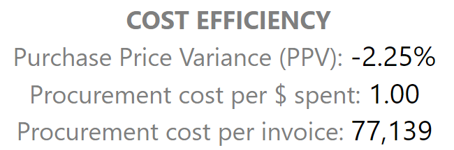 |
Rich Texts also cater for embedded images and HTML. It is unlikely you would ever consume a Rich Text resource directly. However, now that you’re familiar with them, you will see them used extensively in the Data Hub pre-built analytic suites.
Turning to dashboard slicing, you will see the now-familiar slicing controls from the top of the Purchasing manager dashboard. These work exactly as they do for Analyses slicing.
 |
Dashboards also introduce another form of slicing, inter-cell slicing, where-in making a selection in one cell then provides the slice context for another cell. We can see this by zooming in on the bottom row of cells.
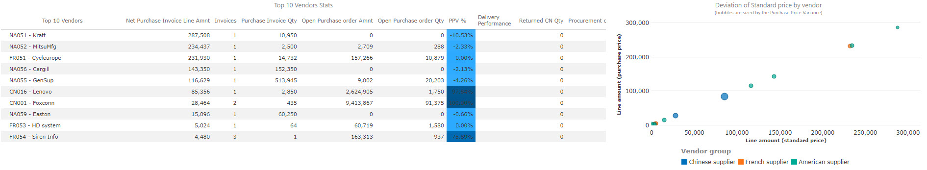
Observe the right-hand-side chart, and now by selecting vendors, we can slice the chart, as in the following image.
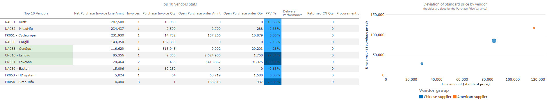
We selected multiple rows by holding down Shift while selecting the vendors in this image.
Dashboards also introduce another layer for drill-though. You can still drill down and drill-through on the Analysis Reports within cells using the method described above. This will navigate to a target resource filtered for the report selections You can also drill-through from the Dashboard’s cells. In this case, there is no report level selection so that a dashboard-cell drill-through will navigate for the target resource, filtered for the context of the dashboard cell.
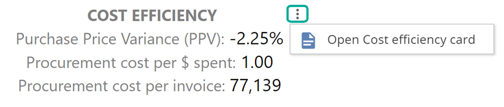
To drill-through on a dashboard cell, open the resource and then hover to show the vertical ellipsis, then select the desired drill-through target.
 |
Common resource actions
To round out consuming analytics, let’s discuss some common capabilities that apply to all the resource types we’ve discussed so far. You can print, email, or link-share from the Resource Context Menu, shown when you click on the vertical ellipsis.
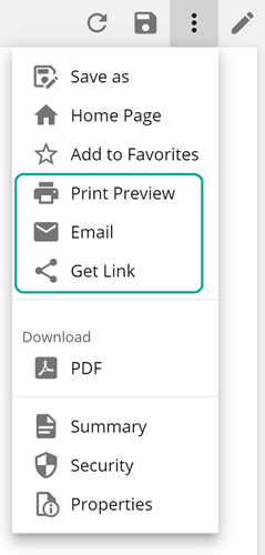
To print, select Print Preview, which generates a PDF you can then send to your printer. You can also see the Add to Favorites option to provide quick access to commonly-used resources from the Resource Explorer from the same menu.
Report Packs and Publication Rules
In driving this introduction from a dashboard, we haven’t had the opportunity to introduce two additional resource types that you may encounter. Report Packs offer a document-focused presentation alternative to dashboards by generating PDF documents. Report packs commonly combine with Publication Rules. Publication Rules define schedules and triggers on which to “publish” resources. The publish options are:
Email
Save to folder (in Data Hub)
We won’t look further at these two resources, as the online documentation has you covered. Again, this quick introduction intends to make you aware of what is available and provide context for the analytic building topics to come.
One final note on consuming analytics, Data Hub provides a separate touch-optimized mobile view. This mobile view will automatically show on mobile and tablet devices. Now that you’re familiar with the above topics, you will find the mobile view intuitive and easy to use, but should you need specific guidance, you can refer to this article.