New Data Hub UI
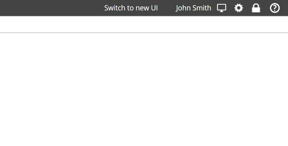
We have been busy reinventing the UI of Data Hub, aiming to give our product a more modern look, with an improved user experience that also adds new ways of navigating, designing analytics and provides a great platform for future enhancement. Rest assured, we will not simply force you straight on to this new UI; we give you the option to switch between the new and the legacy UIs for at least one year.
Design goals
Our core design goals for this new UI were to:
Improve the overall look and feel, improve the UX of the product and make it more modern.
Remove the ribbon to save real estate, reduce auto-resizing, and move every Analytics Design element to a Design side panel, similar to Data Models design.
Initially, focus on the Reporting UI experience to eventually provide a single view, i.e., merge the Consumer view and the Design view, for every use case and any device.
Replace some legacy components and improve the overall app performance when navigating. Outlined below are the changes you will find in the new UI.
New look and feel
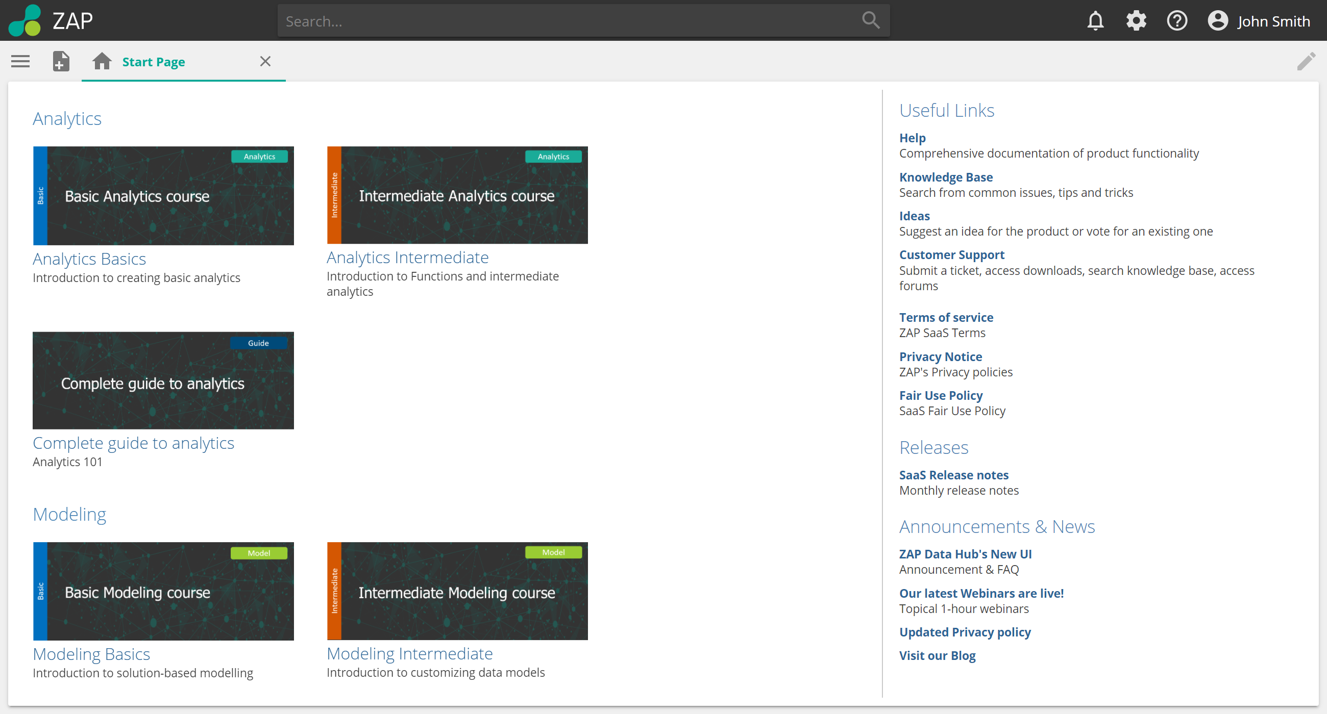 |
Number | Feature | Description |
|---|---|---|
1 | New Resource Explorer experience | The Resource Explorer is collapsed by default. |
2 | New Create Resource button | Create resources easier with all resources in one place. |
3 | New Search bar | Searching for resources is easier and improved. |
4 | Top Ribbon removed | No more top ribbon or chevron to expand. |
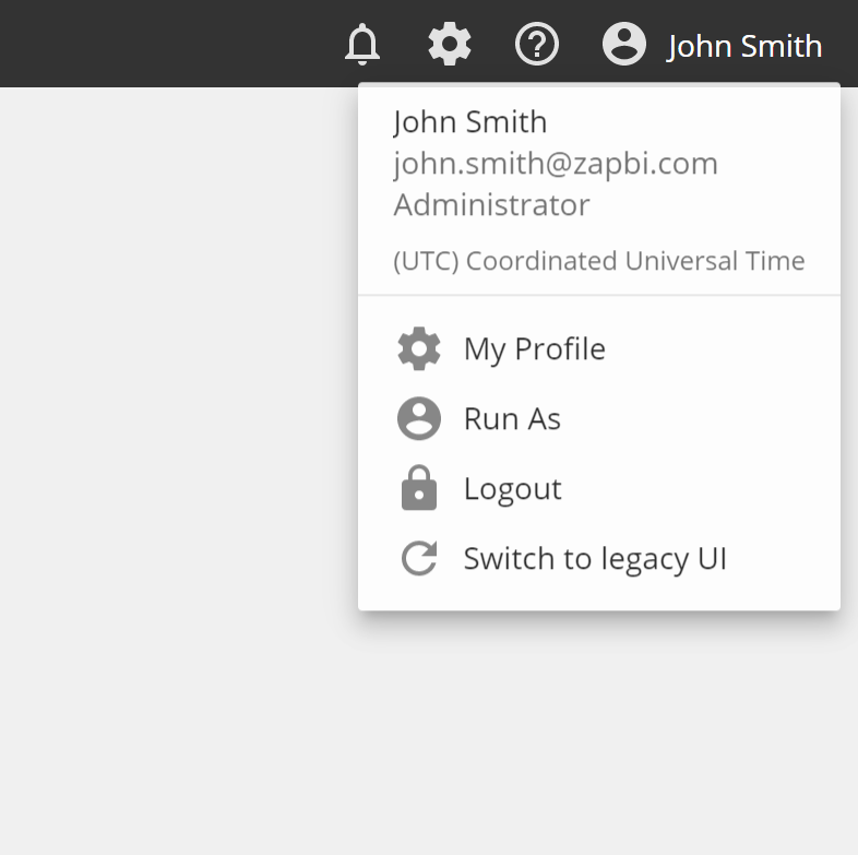
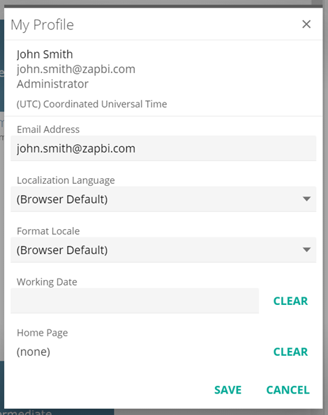
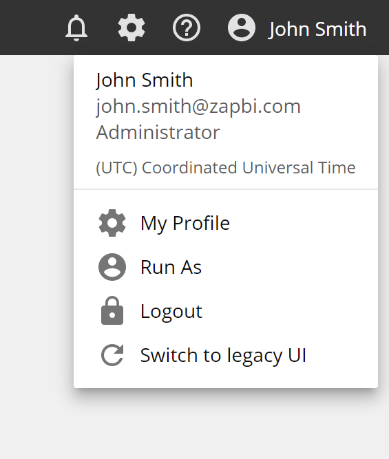
5 | New Profile, Notifications , and Settings menus | Easier access to everything you need. |
New Create Resource experience
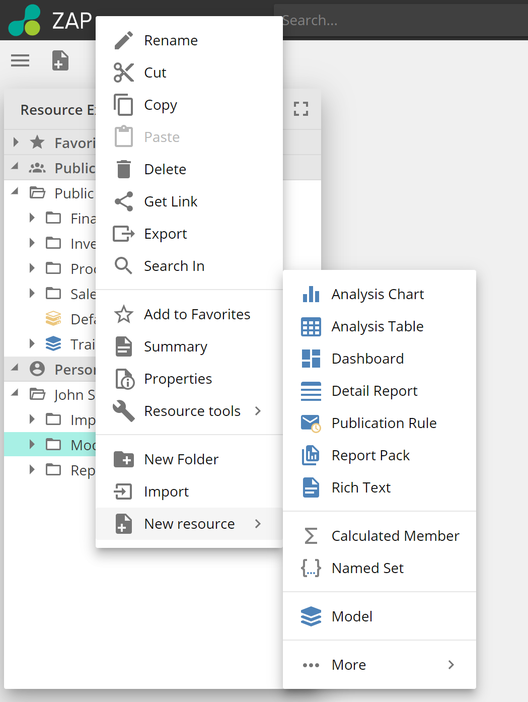
You can now create a new resource by either:
Clicking on New resource, or,
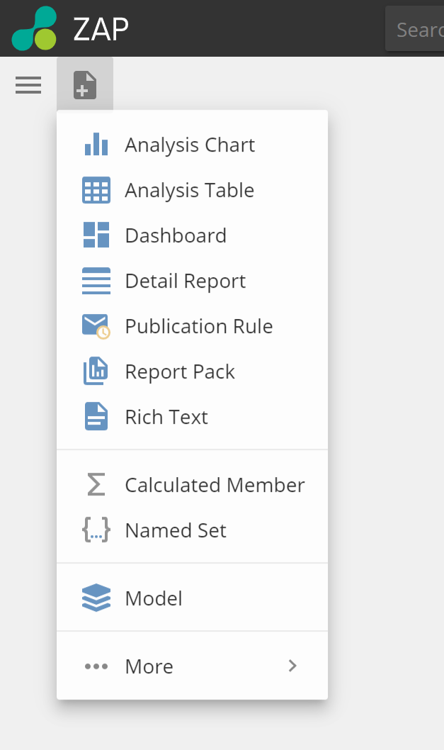
Opening the Resource Explorer and adding a new resource directly to a folder with the right-click menu.
Simplified Settings UI
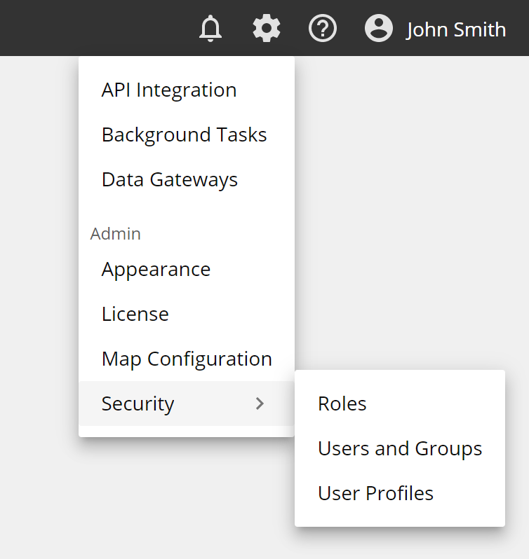
The Settings menu has become a simple drop-down menu that displays over resources and allows you to open multiple settings pages as separate tabs. The options displayed will still depend on the assigned role of the user.
 |
New Resource Explorer experience
New Resource Explorer improvements include:
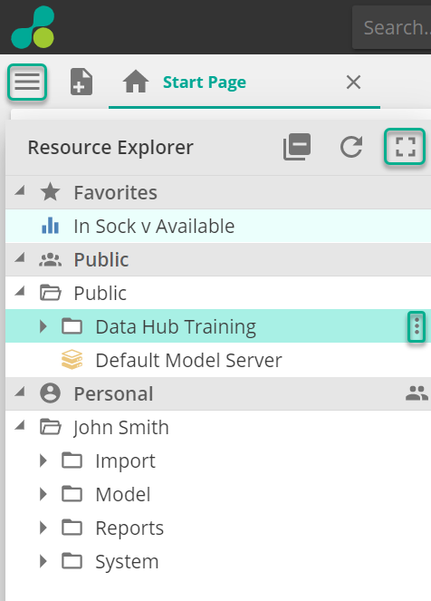
Collapsed by default, click the "hamburger" icon to open. The Resource Explorer expands over open resources to avoid resizing them.
New drag, hold, and drop control to move resources.
A double click is now required to open a resource. This prevents accidentally opening and better supports Shift-Click to select multiple resources.
Maximize the Resource Explorer to display more information such as Description, Last Modified by/date, and Created by/date.
Bigger font size and updated icons.
A new menu accessed by right-clicking on a resource or clicking the ellipses gives you the ability to create a resource directly in a folder. It gives access to New Folder, Translate Missing Members, and Import/Export, which was previously accessed via the ribbon.
 |
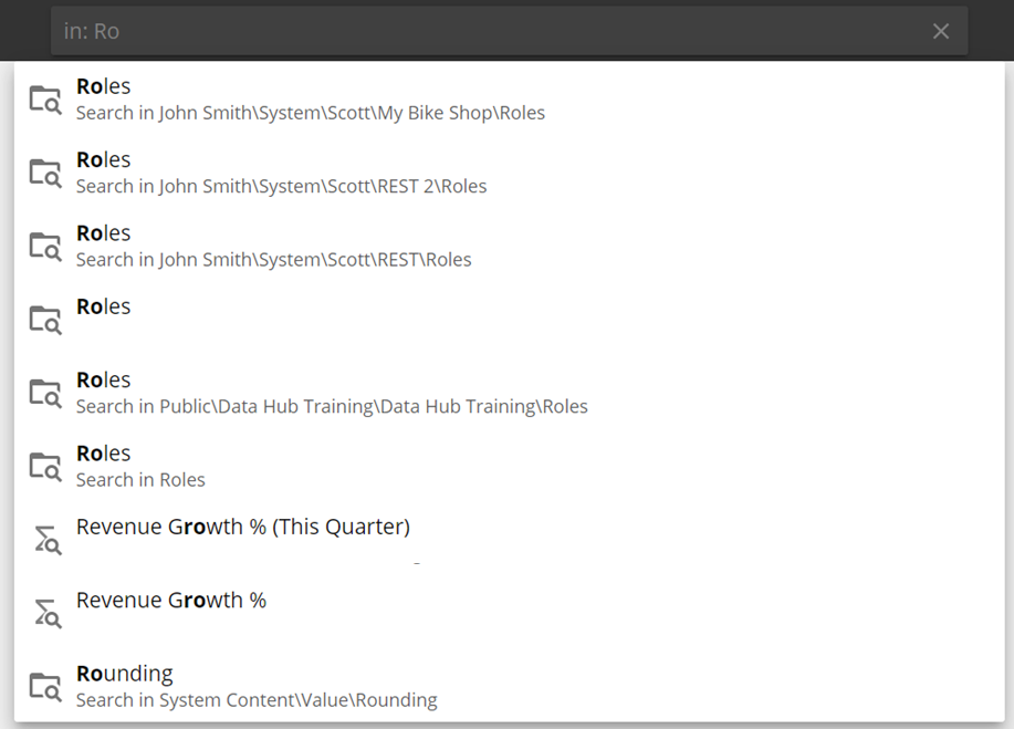
New Search experience
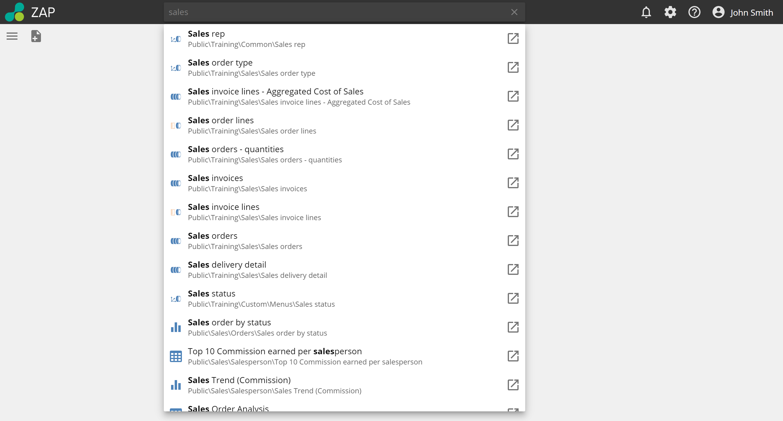
The new Resource Search feature is now more prominent in the application. It has been moved from the Resource Explorer pane to the new UI's top bar to improve usability. When not selected, its background color is dark.
To search:
Start typing the name of the resource you are looking for in the search bar.
Clicking on a result opens the Resource Explorer and focuses on the selected resource enabling more actions.
Clicking on the icon to the right opens the resource.
 |
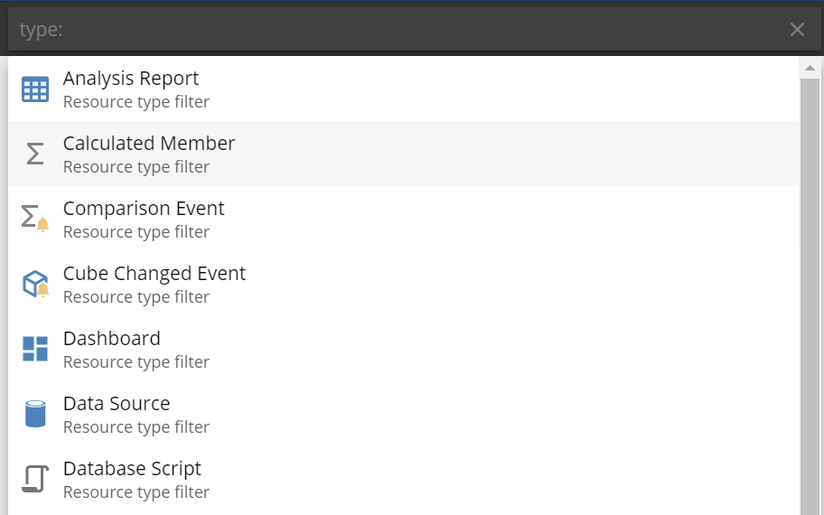
Search filters
By adding filters to your search terms, you can focus your search on only those areas you want. Type the search filter and the resource to return your results.
Search filter | Function | Example | |
|---|---|---|---|
in: | Searches within a parent folder or model. |
| |
tag: | Searches within resource tags that are applied to resources. |
| |
type: | Searches for a type of resource. |
|
New Resource options
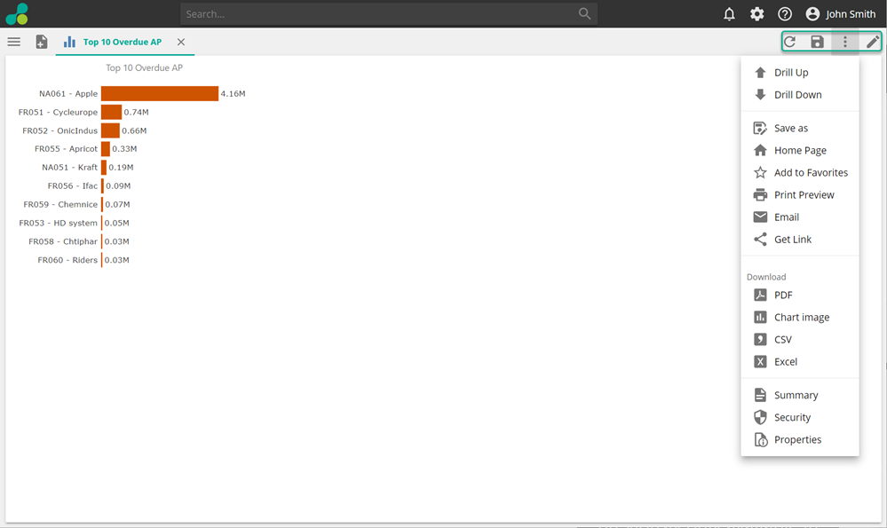
Options such as Refresh and Save have been moved to the Tab area's right side.
Opening an existing resource always opens it in View mode.
If the current user is a Report Designer or a Full Designer, then the option to Edit the resource is available.
The ellipses display Design and Consumer options. The Consumer options and the UI of this menu resemble the UI of the Consumer view in the Legacy UI and add Summary, Security, and Properties options, previously only available in the Ribbon.
 |
New Analytics design experience
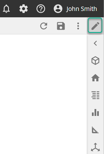
Vertical edit panel
Edit or Design Analytics by clicking the Pencil icon displays familiar categories in a vertical pane.
These categories almost exactly match the ribbon menus of the Legacy UI.
Panels always display on top of resources.
 |
Query panel
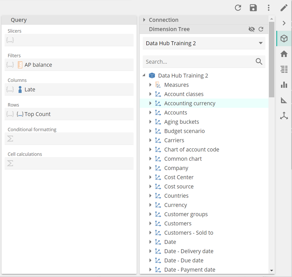
The Query panel (Cube icon) shows the standard Dimension Tree as the first panel from the right. The Dimension Tree is only available from this panel. When creating new Analytics, the Connection options can now be found on this panel.
The design placeholders have been moved to a sub-panel of the Query panel. They do not show on the Analytics canvas and editing a resource no longer resize the analytics.
The New UI’s design experience is still a drag and drop and right click experience from the Dimension Tree onto the placeholders.
 |
Right-clicking an element in a placeholder shows the usual Action and Function menu.
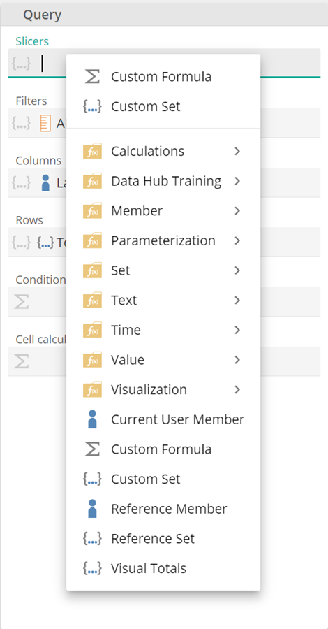 |
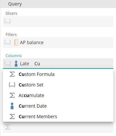
You can also type text in the placeholder to search and add a new Function.
 |
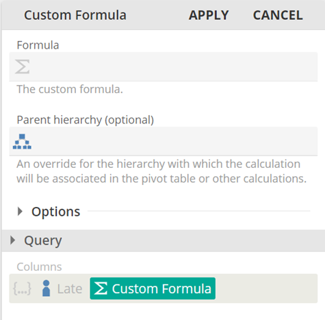
Editing or Creating a Function, such as a Custom Formula, collapses the Query sub-panel to display the Function's placeholders.
 |
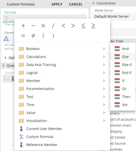
In addition to displaying the usual Functions, right-clicking a blank area in a placeholder also shows Calculator options. The Boolean options of the old Calculator pop-up have been moved here.
 |
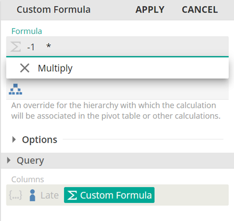
Operators are available by typing on your keyboard, press enter, or click the item to select.
 |
Improved error notifications.
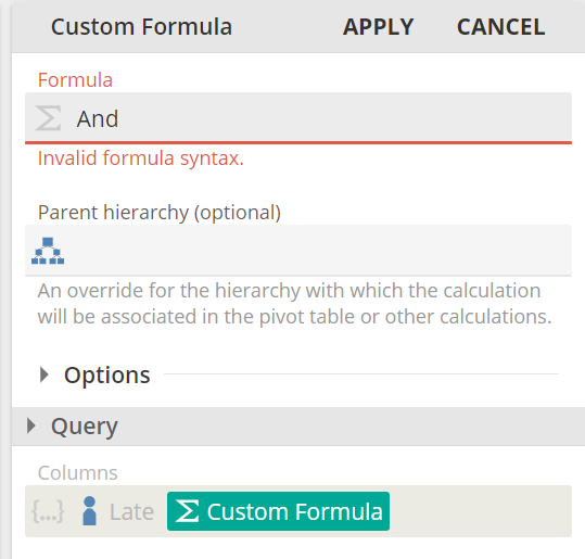 |
Type a number, then press Enter or select the number from the drop-down list. Single-click to edit numbers.
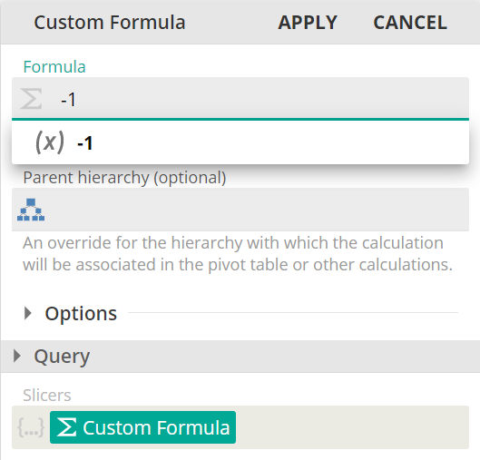 |
Remove items by selecting and pressing Delete, using Backspace, or right-clicking and selecting Remove.
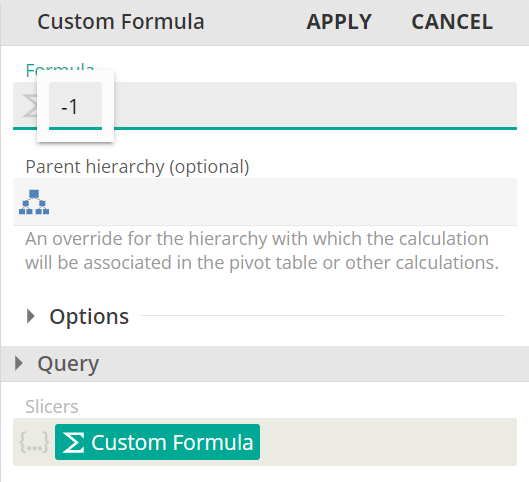 |
Other design panels
Home
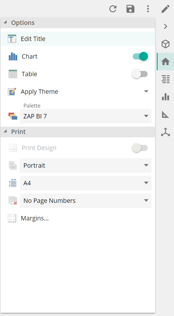 |
Data
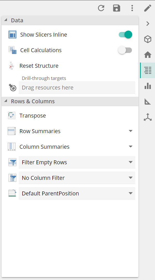 |
Table
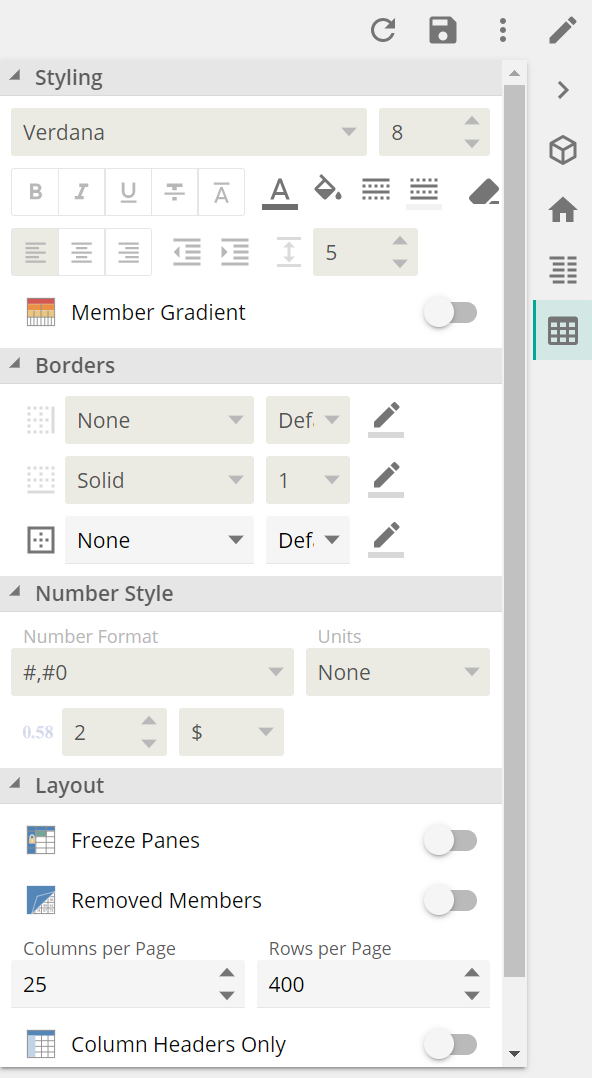 |
Chart
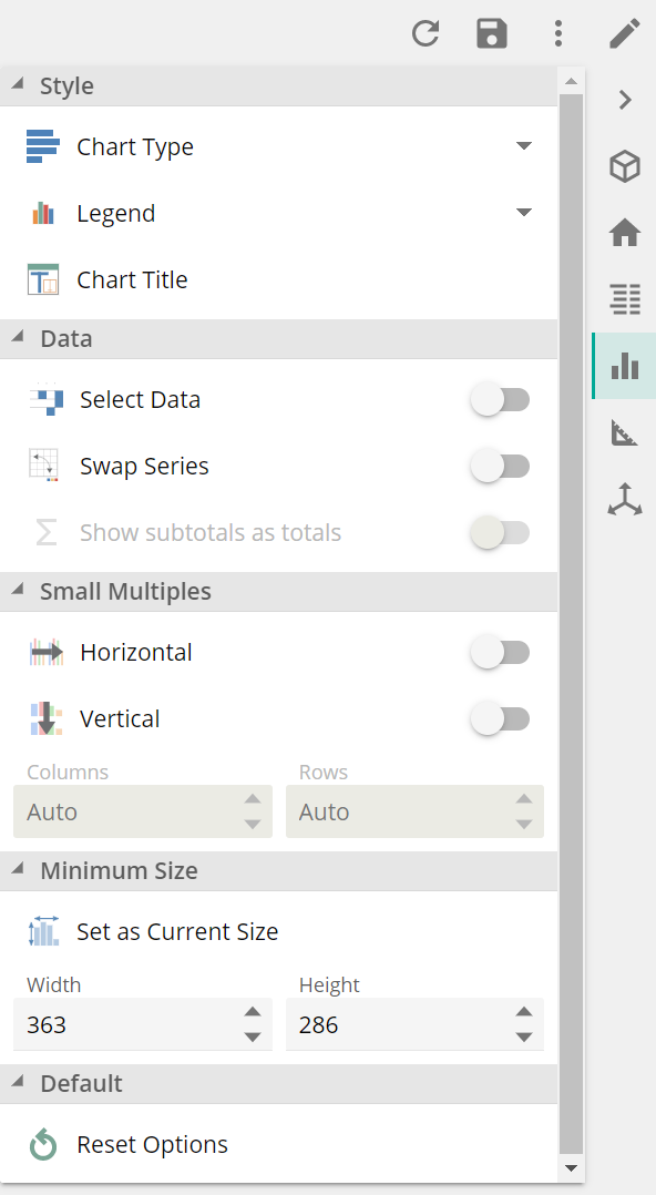 |
Design
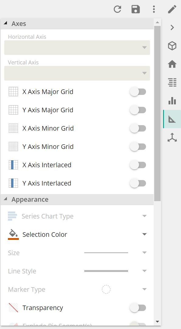 |
Axis
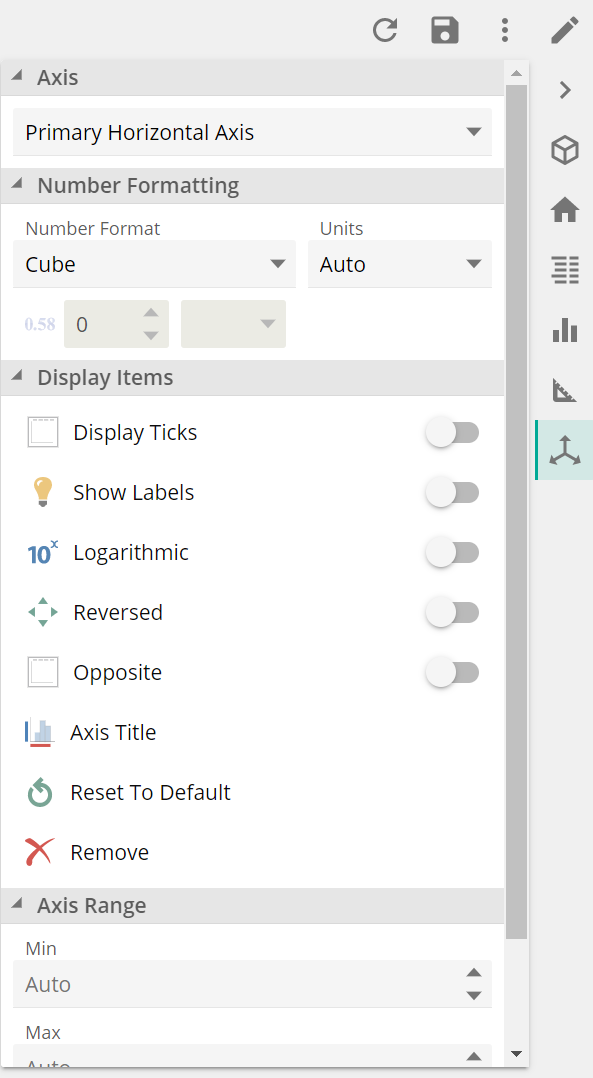 |
Data Model design UI
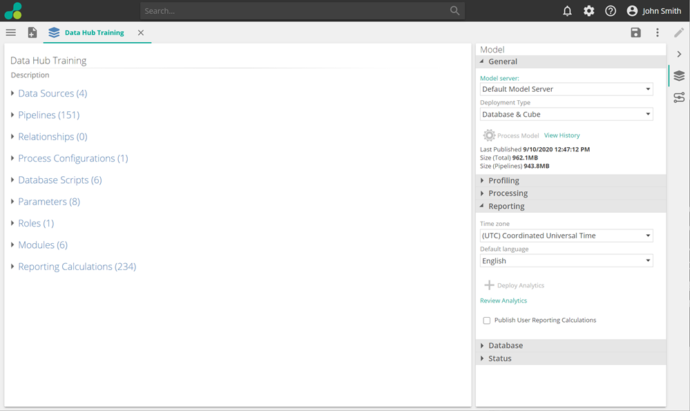
Although many changes to the Data Model UI are planned, the Data Model view has not received many UI changes in this current version. You will, however, notice the introduction of the same Vertical Design pane on the right and a new Connection option.
 |
New Connection panel for integration
The Connection panel summarizes everything required to connect to the Data Model’s Warehouse. It is a Usability and Integration feature that avoids navigating multiple Data Hub areas to source such connection information (e.g., Model Server, Data Model, Role). It is handy when configuring connections to a Model’s warehouse from a ZAP Power BI App.
Buttons let you Copy information or Edit the resource that provides such information.
This panel/option is also available in Simple Model View.
 |
Changes of behavior
The main Portal URL now redirects to the new UI on Desktop devices, not the Consumer view. The Consumer view is still used by default on mobile devices. The Consumer view can still be accessed from the Share menu or by adding /View to the URL.
Chart resources have been renamed:
Analysis Chart
Analysis resources: Analysis Table
Drill-through resources: Detail Report
Buttons and a Boolean function menu have replaced the Calculator pop-up in Formula placeholders. The Drill-through target placeholder has been moved to the Data panel.
